The shortest path to a bedroom wall that feels finished
- Start with the wall behind the bed unless another wall is clearly doing more visual work.
- Pick one main treatment first, then add smaller details only if the room still feels sparse.
- Match the wall style to the bedding: busy bedding needs quieter walls, and simple bedding can carry more personality.
- Use scale rules, not guesswork, so art and shelves do not look too small for the bed.
- Texture matters in bedrooms because it adds warmth without making the room feel loud.
- In 2026, the strongest bedroom walls feel layered, tactile, and personal rather than overly matched.
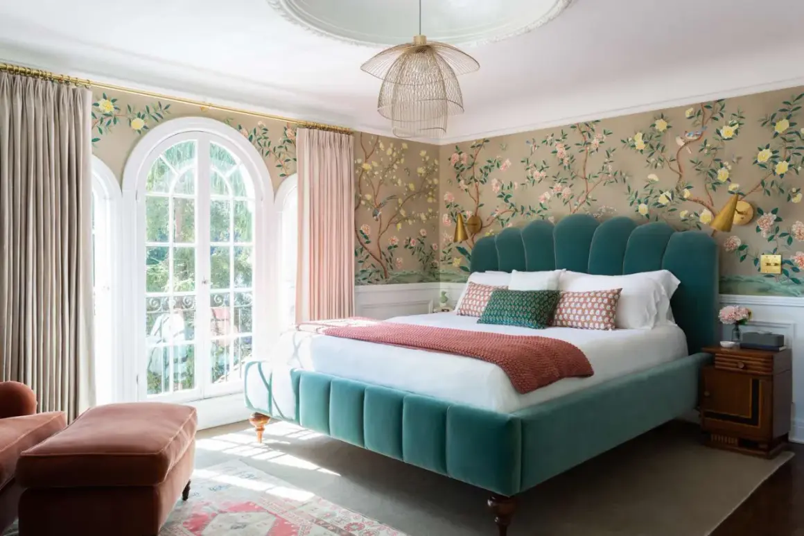
Start with the wall that does the most visual work
I always begin with the wall that sets the room’s hierarchy, and in most bedrooms that is the wall behind the bed. That wall naturally becomes the anchor because it frames the headboard, bedding, and bedside tables in one view. If you decorate every wall equally, the room often loses focus; if you give one wall a clear job, the whole space feels more composed.
There are a few exceptions. If the bed sits under a window, or if another wall is the first one you see when you enter the room, that may deserve the stronger treatment instead. In a narrow room, I usually avoid spreading decorative weight across both long walls, because the space starts to feel busy before it feels styled. One strong wall nearly always works better than three weak ones.
This is also where bedding matters. A detailed quilt, patterned pillows, or a textured coverlet already adds visual activity, so the wall should support that rather than compete with it. A simpler bed can handle more emphasis above it. That balance is what keeps the room restful, and from here the real decision is which treatment should lead.
Choose one wall treatment and let it lead
When people ask for bedroom wall decor ideas, they usually mean they want options, but the useful choice is not endless variety. It is deciding what kind of atmosphere you want the room to have, then selecting one treatment that carries that mood all the way through.
| Wall treatment | Best for | What it does well | Tradeoff |
|---|---|---|---|
| Large framed art | Most bedrooms, especially above a bed | Feels calm, easy to swap, and works with almost any style | Can look generic if the scale is too small |
| Gallery wall | Personal, collected rooms | Adds character and flexibility | Too many small frames can make the wall feel busy |
| Wallpaper or mural | Feature walls and rooms that need personality | Creates instant depth and a strong point of view | Harder to change than art |
| Mirrors | Smaller or darker rooms | Bounces light and visually opens the space | Too much reflection can feel cold in a sleep space |
| Wood slats or paneling | Modern, warm, or architectural bedrooms | Adds texture without clutter | Needs careful installation and clean proportions |
| Textile wall pieces | Rooms that need softness | Brings in warmth, sound absorption, and a relaxed feel | Works best when the piece is intentional, not accidental |
In 2026, I keep seeing walls move away from matchy sets and toward more layered, tactile looks: matte finishes, warm wood, plaster-like surfaces, linen textures, and art that feels collected over time. That shift makes sense in bedrooms, because a sleep space needs depth without visual noise. If you want a room to feel current without chasing a trend, choose one treatment that has texture, not just color.
My rule is simple: if the bed is already visually strong, let the wall be quieter; if the bed is plain, let the wall do more of the work. That balance is what makes the next step, scale, much easier to get right.
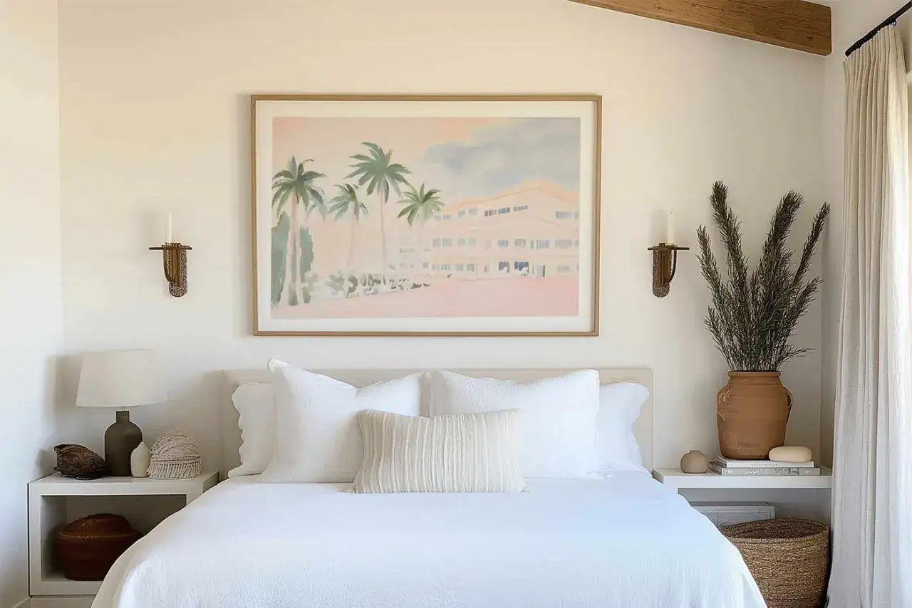
Get the scale and spacing right
Most bedroom walls look off because the decor is too small, too high, or too crowded around the bed. Scale matters more than almost anything else. A single large piece can look more luxurious than three small pieces, even if the large piece costs less, because the room reads it as deliberate.
- Above a headboard, aim for art or a composition that is about two-thirds to three-quarters the width of the bed or headboard.
- Leave roughly 6 to 8 inches between the top of the headboard and the bottom of the artwork or shelving.
- For standalone art on an open wall, center the piece so its middle sits around 57 to 60 inches from the floor.
- If you use a gallery wall, keep the overall shape aligned with the bed so the arrangement feels anchored, not floating.
- On a wide wall, one oversized piece usually looks calmer than a cluster of tiny frames.
I also like to think in visual weight. Dark frames, thick mats, and dense gallery layouts feel heavier than thin frames or open compositions. If your bedding is already patterned or heavily textured, the wall can stay lighter and simpler. If your bedding is neutral, the wall can handle a little more drama without making the room feel loud. Once the proportions are right, texture becomes the easiest way to add depth.
Use texture when color alone feels flat
Bedrooms usually benefit from softness, and texture is often the fastest way to get it. A wall does not need to be loud to feel finished; it just needs enough surface variation to catch light and create depth. That is why wood, woven fibers, fabric, and plaster-like finishes are so effective in sleep spaces.
Some of the most reliable textured choices are upholstered panels behind the bed, narrow wood slats, grasscloth-style wallpaper, woven wall hangings, and linen or canvas art. Each one changes the room in a slightly different way. Upholstered panels feel cushioned and quiet, wood feels architectural, woven pieces feel relaxed, and textured wallpaper adds dimension without demanding a full makeover.
I like this approach because it works even when the palette is restrained. A room in whites, taupes, sand, olive, or cocoa can still feel rich if the surfaces vary enough. If your bedding is simple, a textured wall prevents the room from looking flat. If your bedding already has pattern, texture can replace extra color and still give the room character. That is especially useful in smaller rooms where too many colors can quickly become visual clutter.
Adapt the plan to the room you actually have
Good wall decor is never one-size-fits-all. The right choice depends on the room’s size, light, ceiling height, and whether you can make permanent changes. A large primary suite can handle more structure and layering than a compact guest room, and a rental usually needs lighter, removable solutions.
- Small bedroom: use one oversized piece, a tall mirror, or a clean wall treatment instead of many small objects. Small rooms need clarity more than quantity.
- Rental: lean on removable wallpaper, adhesive hooks, framed art, and lightweight panels. The goal is style without damage.
- Low ceiling: choose vertical art, tall mirrors, or paneling that draws the eye upward. Horizontal clutter makes the room feel shorter.
- Dark bedroom: use lighter art, reflective surfaces in moderation, and finishes that bounce light without turning the room sterile.
- Guest room: keep the wall calm and easy to live with. Visitors respond better to comfort than to overly personal displays.
For shared rooms, the safest route is usually a neutral base with one expressive element, such as a meaningful print or a subtle wallpaper pattern. That gives personality without narrowing the room’s appeal. The last thing I look at is the kind of mistake that quietly undermines all of this work.
Skip the mistakes that make the room feel cluttered instead of calm
Bedrooms are easy to overdecorate because the wall space feels blank, but blank is not the same as unfinished. A room can become visually tired fast if every surface tries to do the same job. When that happens, the eye has nowhere to rest, and the room starts to feel more staged than restful.
The most common mistake is going too small. A tiny print over a queen bed almost always looks underpowered unless it is part of a larger arrangement. The second mistake is repeating too many finishes at once: glossy frames, metallic accents, bold wallpaper, patterned bedding, and decorative shelves can all work, but not all at full volume in the same room. The third mistake is ignoring the headboard. If the wall decor does not relate to the bed in size, color, or shape, the room feels disconnected.
I also see people hang too much at the same height. If every object sits at one line, the wall becomes rigid. Slight variation creates a more natural rhythm. And finally, many people forget to edit. If a wall has art, shelves, and a mirror, one of those elements often needs to go. In bedrooms, restraint is rarely boring; it is usually what makes the room feel expensive and calm. From there, the cleanest way to finish the room is to follow a simple sequence instead of decorating on impulse.
A simple order that keeps the wall intentional
When I am planning a bedroom wall, I work in this order: first the focal wall, then the largest anchor piece, then the supporting details, and only after that the smaller accents. That sequence prevents the room from becoming overbuilt too early. It also makes shopping easier, because you know what the room still needs instead of guessing from one item to the next.
Start by deciding whether the wall should feel soft, architectural, artistic, or highly personal. Then choose the biggest visual decision first: wallpaper, one large artwork, a mirror, or a textured treatment. After that, add one or two supporting pieces that connect to the bedding and furniture, such as bedside lighting, a narrow shelf, or a second frame that repeats the room’s color story. I usually keep the palette tight and repeat the main accent color two or three times at most so the room feels coordinated without looking themed.
If the room still feels unfinished after that, I do not add more objects immediately. I step back and ask whether the problem is scale, color, or empty space. More often than not, the fix is not extra decor; it is a stronger choice in the right place. That is the difference between a decorated wall and a room that actually feels designed.
The best bedroom wall decor supports sleep as much as style. If you keep the focal wall clear, choose one treatment with enough scale, and let texture or art do the heavy lifting, the room will feel calmer almost immediately. The smartest upgrade is rarely the most complicated one; it is the one that makes the bed wall feel like the natural center of the room.