A dark bedroom can feel cocooning rather than heavy when the palette, lighting, and bedding work together. In this guide, I focus on what actually makes the look succeed: how to choose a color direction, how to layer light so the room still functions, and how to use bedding and finishes to keep the space calm instead of flat. I also cover the mistakes that usually make moody rooms feel smaller than they need to.
The essentials for a restful moody bedroom
- Start with the room’s natural light before you choose paint or bedding.
- Use warm, layered lighting instead of relying on one bright ceiling fixture.
- Let bedding add texture so the room does not feel visually heavy.
- Mix wood, metal, and fabric finishes to create contrast and depth.
- Keep at least one lighter anchor in small or low-ceiling rooms.
Why this look feels calm when the balance is right
What makes this style appealing is not the darkness itself; it is the sense of enclosure. I think the best moody bedrooms feel like a good hotel suite after dusk: quiet, softened, and deliberately edited. In 2026, the strongest versions of the look lean away from stark drama and toward tone-on-tone warmth, with texture doing more work than contrast.
That matters because a room designed for sleep should lower visual noise. Too much brightness, glare, or visual clutter keeps the eye busy. When the palette is deeper, the room can feel more settled, as long as you avoid turning every surface into a black void.
Once you understand that the goal is calm, the next step is choosing the right palette for the room you actually have.
Choose a palette that fits the room
I always start with the room’s light exposure. A north-facing bedroom with limited sun needs warmer undertones than a bright south-facing room, and a low ceiling changes the equation again. If you get the undertone wrong, the space can read muddy instead of rich.
| Color direction | Best for | Why it works | Watch out for |
|---|---|---|---|
| Charcoal | Bright rooms or larger bedrooms | Feels tailored and flexible; pairs well with cream bedding and wood grain | Can look flat if every textile is also matte and dark |
| Navy | People who want calm without harsh contrast | Reads classic and restful; works with brass, oak, and white bedding | Cool light can make it feel colder than intended |
| Forest green | Rooms with natural materials | Feels grounded and organic; good with walnut and linen | Needs enough light to keep the green visible |
| Espresso or warm brown | Rooms that need warmth | Softens the mood and makes the space feel cocooned | Heavy furniture can make it feel dense if the ceiling is low |
| Aubergine or burgundy | Bedrooms that can handle drama | Adds depth and personality without relying on black | Works best as a measured choice, not an all-over impulse |
If I am unsure, I choose one dominant deep tone and let everything else sit one or two steps lighter. That usually gives the room breathing space without breaking the mood. From there, lighting becomes the next design decision that matters most.
Layer the light instead of asking one fixture to do everything
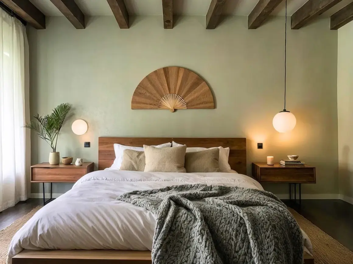
Light is where moody bedrooms succeed or fail. Sleep Foundation notes that light exposure at night can interfere with sleep cycles, so I treat bedside and evening lighting as part of the room’s comfort, not just its function. In practice, I want at least three layers: ambient light for general visibility, task light for reading, and accent light for atmosphere.
- Ambient light gives the room an overall glow, usually from a dimmable flush mount, small chandelier, or restrained ceiling fixture.
- Task light comes from bedside lamps or wall sconces that provide direct but soft reading light.
- Accent light can be a picture light, hidden LED strip, or small lamp that adds depth and shape.
For bedrooms, I usually stay in the 2700K to 3000K range. That warmth keeps dark paint from looking harsh and makes fabrics feel softer to the eye. If you want the room to work from evening into early morning, add dimmers everywhere you can and avoid cool-white bulbs unless the space doubles as a dressing room.
A good lighting plan also keeps your bedding from disappearing into shadow, which is the next place this look can either become luxurious or turn muddy.
Let bedding and textiles do the softening
This is the part many people underrate. In a dark-toned room, bedding is not decoration at the end of the process; it is one of the main tools that softens the palette. I like to think of the bed as the room’s visual anchor, so the sheets, duvet, throw, and pillows need enough texture to read clearly against deeper walls.
| Material | Feel | Best use | Tradeoff |
|---|---|---|---|
| Percale cotton | Crisp, matte, airy | Warm climates and people who sleep hot | Can look too plain if the rest of the room is minimal |
| Sateen cotton | Smoother, slightly lustrous | Rooms that need a softer, more polished finish | May show sheen more than texture in strong light |
| Washed linen | Relaxed, tactile, lived-in | Moody rooms that need movement and visible grain | Wrinkles easily, which is either charm or clutter depending on taste |
| Wool throw or blanket | Dense, warm, layered | Colder climates and rooms that need structure | Can feel heavy if the color is too close to the walls |
| Velvet cushion or bed runner | Rich, reflective, dramatic | Accenting a deep palette without repainting the room | Best used sparingly so the bed does not feel overdressed |
My practical rule is simple: use one main bedding story, then add two supporting textures. For example, linen sheets, a quilted coverlet, and a wool throw is enough; if you add five more pillows, the room stops feeling restful and starts feeling staged. In warmer U.S. climates, I lean toward lighter textiles with a matte finish, while colder rooms can support heavier layers and a richer hand.
Once the bed is working, the furniture and finishes around it need to echo the same restraint.
Furniture and finishes that keep the room from feeling heavy
The biggest mistake I see is building a dark room with dark everything. When the bed, dresser, rug, wall color, and drapery all land at the same visual weight, the room loses depth. I prefer one dominant finish and two supporting materials, not a dozen similar ones.
- Wood like walnut or smoked oak brings warmth without looking busy.
- Metal such as brass, aged bronze, or blackened steel adds definition and catches light at different levels.
- Upholstery in linen, wool, or velvet breaks up hard edges and softens the bed.
- Rugs with a slightly lighter tone or subtle pattern stop the floor from disappearing into the walls.
- One reflective surface, like a mirror or lacquered detail, is usually enough to keep the room from feeling sealed in.
If I am designing for a smaller room, I often keep the dresser or nightstands slightly lighter than the walls. That tiny shift matters more than people expect because it gives the eye a place to rest. It also keeps the room from feeling like a single block of color, which leads directly to the common errors I would avoid.
Common mistakes that make the room feel flat
A moody room does not fail because it is dark; it fails because it is under-designed. The most common problems are surprisingly basic.
- Relying on one overhead fixture, which leaves the room bright in the wrong places and shadowy everywhere else.
- Using the same dark value on every surface, which removes contrast and makes the room feel smaller.
- Choosing cool bulbs, which can turn rich paint into something sterile.
- Ignoring the ceiling, even though a slightly lighter ceiling can save a low room from feeling compressed.
- Buying heavy bedding without texture, which reads more like bulk than comfort.
- Adding too many decorative pieces, which fights the quiet mood the room is supposed to create.
Matte paint is often the right starting point, but it is not a cure-all. It hides some glare, yet it also absorbs light, so a matte-on-matte room needs more texture and better lamp placement than a glossy one. If the room is very small or lacks windows, I would be careful with all-black surfaces and keep at least one lighter anchor in the mix.
That brings me to the final piece: the details that hold up after the first stylish impression fades.
The details I would keep if I wanted the room to age well
If I were building this room for the long term, I would keep the palette limited, the lighting dimmable, and the bedding replaceable. Those choices age better than trend-driven accessories because they are about proportion and comfort, not novelty.
- One deep wall color or one clearly defined dark palette, not multiple competing darks.
- Warm bulbs around 2700K to 3000K with dimmers.
- Bedding that mixes at least one matte textile with one softer or more tactile layer.
- Natural materials like wood, wool, linen, and brass to stop the room from feeling synthetic.
- At least one lighter surface, whether that is the rug, the ceiling, the trim, or the bedding.
That combination gives you a room that feels calm at night, looks intentional in daylight, and does not depend on a heavy-handed trend to work. If you get the palette, light, and bedding right, the rest of the room becomes much easier to live with.