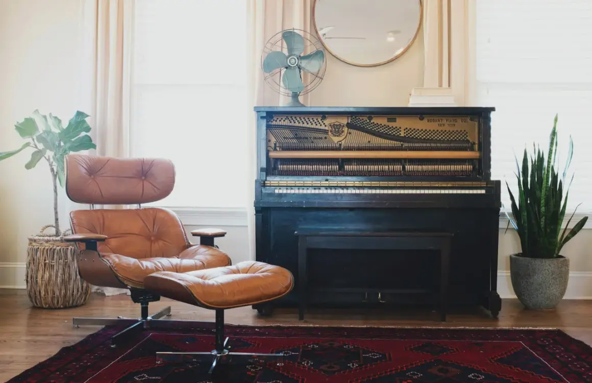
A mismatched chair and ottoman can look more curated than a perfectly matched set when the scale is right and one or two details quietly tie the pieces together. I focus on the parts that actually change the result: height, silhouette, material, and how the pair sits inside the room. This guide shows how to mix styles without creating visual noise, where the proportions tend to work best, and which combinations feel intentional rather than random.
The strongest pairings share one anchor and one point of contrast
- Keep the chair seat around 16 to 18 inches high, and let the ottoman sit about 1 to 2 inches lower for comfortable foot support.
- Choose one thing to repeat, such as color, texture, wood tone, or shape, so the pieces read as connected.
- A firmer, flatter ottoman works better if you want tray service or extra seating; a softer one is better for pure lounging.
- Use the surrounding room to connect the pair, especially a rug, lamp, or side table with a shared finish.
- When the room is small, reduce contrast and keep the silhouettes simple.
Why a mismatched pair can look better than a set
Perfectly matching furniture is easy to buy, but it often flattens a room. I usually prefer a little tension between the chair and the ottoman because it gives the eye something to notice without making the arrangement feel busy. The goal is not to prove that the pieces came from the same collection; the goal is to make them feel like they belong to the same story.
This is where intentional contrast matters. A tailored chair beside a softer ottoman, or a woven footrest under a smooth upholstered seat, creates depth that a boxed-in set rarely delivers. Cohesion still has to do the heavy lifting, though, because contrast without a common thread can look like a last-minute compromise. Once that mindset is in place, the next step is getting the proportions right.
Get the proportions right before you think about style
Scale is the part people misjudge most often. A beautiful ottoman can still feel wrong if it sits too high, blocks movement, or looks heavier than the chair that anchors it. I start with measurements, because good proportions make even an unusual pairing feel calm.
| What to check | My rule of thumb | Why it matters |
|---|---|---|
| Chair seat height | About 16 to 18 inches from the floor | Feels natural for most lounging and reading setups |
| Ottoman height | About 1 to 2 inches lower than the chair seat | Keeps your legs relaxed instead of forcing them upward |
| Close-in spacing | About 18 to 24 inches in front of the chair | Leaves enough room for comfort without stretching too far |
| Main walkway clearance | About 30 to 36 inches | Prevents the pair from feeling cramped in a real room |
| Visual weight | The ottoman should not overpower the chair | Helps the setup feel balanced instead of top-heavy |
In practice, I like a chair seat around 16 to 18 inches from the floor and an ottoman that lands just below that line. If the piece will do double duty as a coffee table, it helps to keep the top firm and the surface visually simple, because trays, books, and drinks need a stable base. With the scale settled, you can choose the design language with much more confidence.
Design formulas that usually work
Silhouette, meaning the outline and visual profile of a piece, matters as much as color. I often think in combinations rather than matching rules, because the best rooms usually repeat one idea and vary the rest. That approach keeps the setup lively without making it chaotic.
| Pairing formula | Best for | Why it works | Watch out for |
|---|---|---|---|
| Same color family, different texture | Transitional and family rooms | The color keeps the look calm while texture adds depth | Can feel flat if both fabrics are too smooth |
| Same silhouette, different finish | Formal rooms and reading corners | The shared outline creates order even when materials differ | Too much ornament can make the pair feel fussy |
| Different shape, shared material | Casual, modern, or coastal rooms | The repeated material acts as the bridge | Choose one finish to lead so the look does not splinter |
| Bold ottoman, quiet chair | Neutral rooms that need one accent | The ottoman becomes the visual anchor without overwhelming the chair | Keep the ottoman modest in size if the chair is already substantial |
A linen chair with a leather ottoman reads relaxed but polished. A velvet chair with a plain upholstered ottoman feels richer without tipping into excess. A boucle chair with a woven or lightly textured ottoman works when you want softness, but I would keep the palette restrained so the room does not start competing with itself. The room around the pair matters just as much as the pair itself.
What ties the pair to the rest of the room
The easiest way to make an unusual pairing feel deliberate is to repeat one material or color somewhere else in the room. A black metal lamp base, a walnut side table, or a rug that echoes one chair tone can keep the mismatch from feeling arbitrary. I usually repeat one material twice and one color three times across a room, but I keep those repeats quiet so the furniture still feels edited, not themed.
- Repeat the chair’s wood tone in a nearby table or frame.
- Echo the ottoman fabric in a pillow or throw.
- Use the rug to bridge warm and cool finishes.
- Keep one strong accent color limited to a few touches.
- If the room is open plan, reduce the number of competing patterns.
If the pair sits in a reading corner, a lamp can do more work than another decorative object because it creates a clear zone around the furniture. That idea matters even more once you start avoiding the common mistakes below.
Common mistakes that make the pairing feel accidental
Most problems come from trying to force too many ideas into one small pairing. I see the same errors again and again, and they are usually easier to fix than people think.
- Too much contrast everywhere. If the chair is sculptural, patterned, and colorful, the ottoman should usually stay quieter.
- Ignoring use. A soft pouf is comfortable, but it is a poor substitute for a stable surface if you want to set down a tray.
- Wrong height. Even a stylish ottoman feels awkward when your feet hover or your knees lift too high.
- No bridge between the pieces. A chair and ottoman can look unrelated if neither color, texture, nor line connects them.
- Letting the rug fight the furniture. A busy rug beneath already-bold pieces can turn a deliberate mismatch into clutter.
When I want to avoid that problem, I simplify one layer before I add another. Usually that means calming the rug, the wall art, or the side table rather than forcing the furniture to do all the work. Once those distractions are under control, choosing the final version becomes much easier.
The final checks I use before I buy
Before I commit, I ask three questions: does the ottoman height let my feet rest naturally, does one detail repeat between the pieces, and can the pair survive the rest of the room without looking overdesigned? If the answer is yes, I am usually comfortable with a deliberate mismatch. That small amount of contrast often gives a room more personality than a matching set ever could.
If you want the safest route, start with the quieter piece first and let the other one introduce the contrast. In most rooms, that creates a better result than trying to make both pieces compete for attention at the same time. The best combinations feel like they were chosen with care, not purchased as a preset, and that difference is usually easy to see from across the room.