Good furniture placement can make a room feel calmer, larger, and easier to live in. The best answer to what is the best way to arrange furniture is to start with how the room needs to work, then build the layout around movement, scale, and one clear focal point. I’ll walk through the spacing rules I rely on, the layouts that work in real homes, and the mistakes that make even expensive pieces look off.
The simplest layout rules that make a room feel finished
- Define the room’s main job before you move a single chair.
- Keep primary walkways about 30 to 36 inches wide.
- Leave 14 to 18 inches between a sofa and coffee table.
- Anchor seating with a rug and one clear focal point.
- Test the layout with tape before you lift anything heavy.
Start with the room’s job, not the furniture
I always begin by asking a simple question: what is this room supposed to do most of the time? A living room that mostly hosts conversation needs a different layout than one built around TV viewing, reading, or family game nights. If a room has two jobs, I still pick one as the primary function and let the second role stay lighter, otherwise the space starts to feel crowded and indecisive.
This is where a lot of arrangements go wrong. People often place the biggest sofa first, then try to force everything else to fit around it. I get better results when I work in the opposite direction: I define the use of the room, decide where people should naturally gather, and only then choose the furniture that supports that behavior. A small number of well-placed pieces almost always beats a full room of disconnected items. Once the room’s purpose is clear, the next step is protecting the paths people actually use.
Protect the walking paths first
Clear circulation is the difference between a room that looks styled and one that works. A good working baseline is 30 to 36 inches for a main walkway. If people need to pass each other comfortably, I lean toward the higher end. In tighter spots, I may accept a little less, but only if the room still feels easy to move through.
| Area | Practical target | Why it helps |
|---|---|---|
| Main walkway | 30 to 36 inches | Keeps movement smooth without making the room feel chopped up |
| Sofa to coffee table | 14 to 18 inches | Close enough to reach a drink, far enough to sit comfortably |
| Behind dining chairs | 36 to 48 inches, with 18 inches as a tight minimum | Lets chairs pull out and people sit without bumping walls or walkways |
| Between seating pieces in a conversation group | Close enough to talk without shouting | Helps the room feel social instead of spread out and formal |
I like to mark these distances with painter’s tape before I commit. If I can walk from the entry to the sofa, then to the window or desk, without turning sideways, the layout is usually on the right track. If the room is tight, I would rather make the furniture slightly smaller or simplify the plan than squeeze the walking lane into something annoying. That leads directly to the next layer: giving the room a focal point so the layout feels intentional, not random.
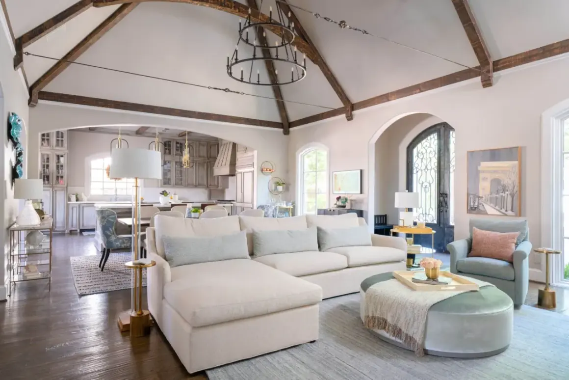
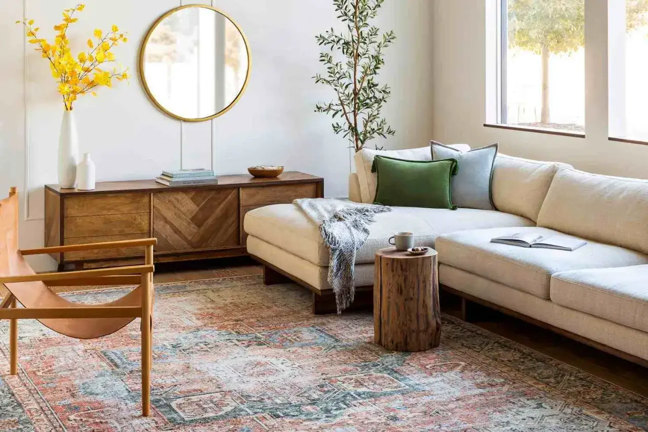
Build around one focal point and balance the visual weight
Every room needs something that tells the eye where to land first. Sometimes that is a fireplace, sometimes a TV, sometimes a window with a strong view, and sometimes it is a large piece of art. I do not like letting every wall compete for attention. One focal point should lead, and the rest of the furniture should support it.
In a living room, I usually place the main seating to face or flank that focal point, then I balance the room with chairs, a side table, or a lamp on the heavier side. That is also why I rarely push everything flat against the walls unless I am working with a very small room. Floating a sofa or a pair of chairs slightly off the wall can make the room feel more layered and more usable. A rug helps here too: if the rug is too small, the arrangement looks like it is hovering; if it is large enough to catch the front legs of the main seating, the room starts to feel grounded. Once the room has a clear center of gravity, I switch from theory to room-by-room decisions.
Room-by-room layouts that usually work
Living room
For a standard living room, I usually start with the sofa, then place one or two chairs to complete a conversation shape. If the room is small, a compact sectional can work better than a sofa plus several loose chairs because it uses less visual space and creates a cleaner zone. If the room is larger, I prefer to float the seating group so it has breathing room on all sides. That keeps the space from feeling like a waiting room lined with walls and leaves.
Bedroom
In a bedroom, the bed is the anchor. I place it on the largest uninterrupted wall whenever possible, then I build the rest of the room around the bed’s symmetry or asymmetry, depending on the space. Matching nightstands are useful when the room allows them, but I would rather use one nightstand and one slimmer alternative than crowd both sides. I also keep the main walking side generous enough to feel easy, especially if the room leads to a closet or bath. A bedroom should feel restful, not like an obstacle course.
Dining area
Dining rooms and eat-in kitchens need more clearance than people expect. A round table is often the smartest choice in a tight room because it softens corners and improves traffic flow. If the room is more generous, a rectangular table can feel more formal and better suited to longer gatherings. I still keep enough space around the chairs so people can sit down without scraping the wall or blocking the route to the kitchen. In an open-plan home, I often use a light fixture and an area rug to define the dining zone without adding physical barriers.
Read Also: Cabinet Furniture Guide - Choose the Right Piece for Your Home
Home office or multipurpose room
For a home office, I place the desk where the user gets the best balance of light, privacy, and sightlines. In many homes, that means avoiding a setup that stares straight into a blank wall unless the room is very small. In a multipurpose room, I let storage do some of the dividing. A bookcase, console, or rug can separate work from lounging without making the room feel cut into pieces. This is one of those cases where a few strong decisions are better than trying to make every corner do everything. Once the room type is right, the biggest problems usually come from a few very predictable mistakes.
The mistakes I fix first when a room feels awkward
- Pushing everything against the walls. That often makes the room feel wider but less connected. I pull the main pieces inward so they can actually relate to each other.
- Choosing furniture that is too small. Tiny pieces in a decent-sized room make the layout feel unfinished. Fewer, larger pieces usually look more deliberate.
- Ignoring door swings and traffic paths. A beautiful chair is still a bad choice if it blocks a door, window, vent, or walkway.
- Using a rug that is too small. If the rug does not anchor the main seating, the whole arrangement feels disconnected.
- Creating too many focal points. A fireplace, TV, gallery wall, and window can all exist together, but one needs to lead.
- Filling corners just to fill them. Corners are not automatically wasted space. If a corner does not need furniture, leave it open or use something genuinely useful.
When a room feels off, it is usually not because the style is wrong. It is more often a proportion problem, a path problem, or a focal-point problem. I fix those first because decorative accessories cannot rescue a layout that fights the room. After that, I like to test the plan before moving anything heavy.
The quickest way I test a layout before I move heavy pieces
- I measure the room and note every fixed element: doors, windows, radiators, vents, outlets, and built-ins.
- I mark the largest pieces on the floor with painter’s tape so I can see the footprint without lifting anything.
- I place the focal point first, then the biggest seating piece or bed, because those items control the whole room.
- I walk the room as if I actually live in it, checking how it feels to enter, sit, pass through, and reach surfaces.
- I add the secondary pieces last: side tables, lamps, ottomans, shelves, and the rug.
- I take a photo from the doorway, because a room often looks more balanced in a picture than it does while I am standing inside it.
If a layout works on paper but feels awkward in real life, I trust the real-life test. The best arrangement is the one that lets you move easily, use the room without thinking, and see a clear purpose the moment you walk in. If you start with function, protect the walking space, and let the room’s focal point guide the rest, you will get a result that feels calm now and still makes sense after the novelty wears off.