Learning how to decorate a room is much easier when you treat the process as a sequence, not a shopping spree. I usually start with function, then proportion, then color, then layers, because that order keeps the space from feeling random or overworked. This guide walks through the choices that matter most, from layout and lighting to scale, texture, and the finishing details that make a room feel lived in.
The fastest path to a room that feels finished is to get the layout, scale, and lighting right first
- Decide what the room must do before you buy a single accent piece.
- Choose one clear palette and repeat it through paint, textiles, and finishes.
- Place the biggest items first, then fill gaps with lighting and decor.
- Use scale rules for rugs, curtains, art, and walkways so the room reads as intentional.
- Mix texture and height to avoid a flat, showroom-like look.
- Leave some empty space; negative space makes good pieces stand out.
Start with the room’s job, not the accessories
I always ask four questions first: who uses the room, when do they use it, what has to stay, and what is missing. A bedroom should calm you down; a living room should handle conversation, TV, and maybe a laptop; a home office should support focus before style. If those jobs are unclear, the decor will fight the room instead of helping it.
Make a quick list of the non-negotiables, such as storage, a reading chair, a desk, or better circulation. In a tight room, I try to preserve 30 to 36 inches for main walkways and at least 18 to 24 inches where the space is truly constrained. That one decision usually does more for the room than buying extra pillows ever will.
Once the function is defined, everything else has a place to land, which is why I move straight into mood and palette after this.
Choose a color and material direction you can live with
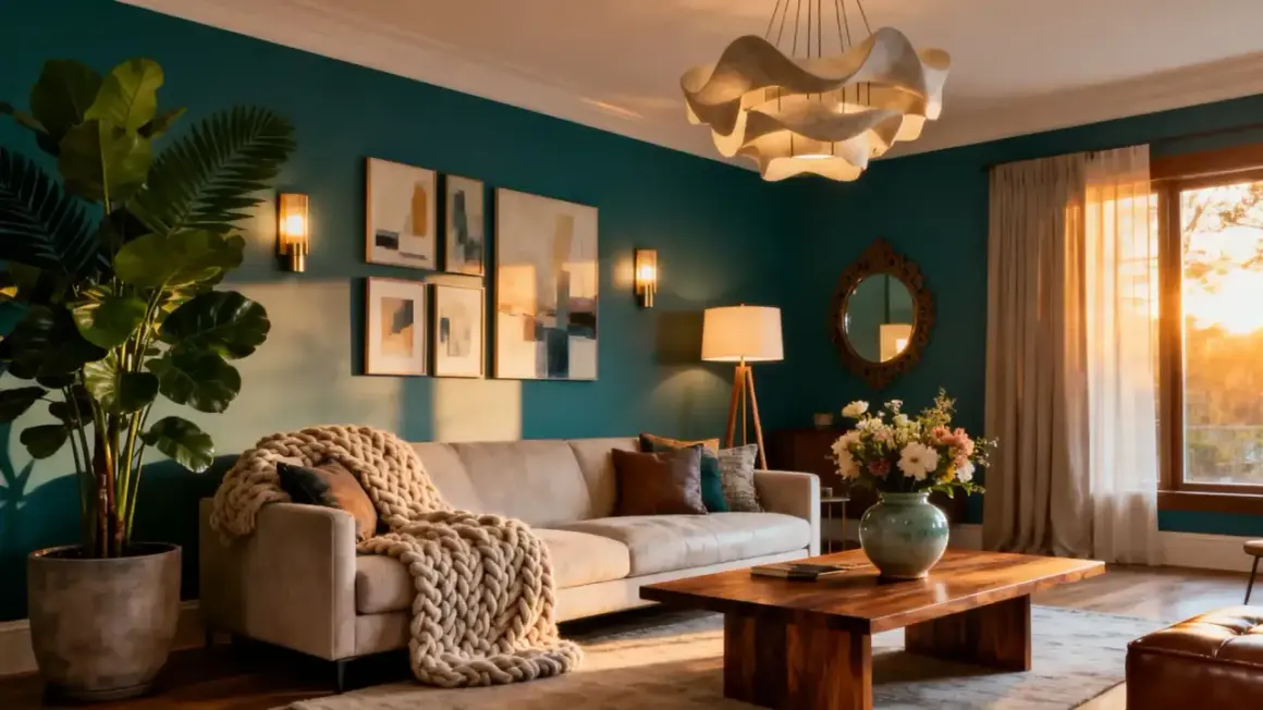
A room feels coherent when a few choices repeat on purpose. My simplest framework is 60-30-10: about 60 percent of the room is the dominant base, 30 percent is the secondary tone or material, and 10 percent is the accent. That could mean warm white walls, wood and linen for the middle layer, and a small hit of black, brass, or deep green for contrast.
Instead of building from a single color, I build from a mood. Do you want the room calm, crisp, moody, airy, or layered and collected? The answer changes the palette, the fabric choices, and even the shape of the furniture. For example, curved silhouettes and textured neutrals read softer, while sharper lines, glass, and cooler finishes feel more edited and modern.
If you are stuck, limit yourself to three main surfaces and repeat them. A room with too many competing woods, metals, and paint tones usually feels unfinished rather than eclectic.
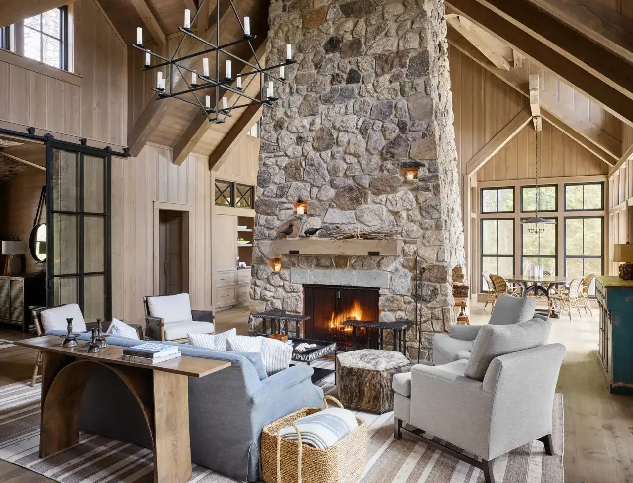
Place the biggest pieces before you buy decor
The large pieces set the room’s rhythm. Sofa, bed, desk, rug, dining table, and storage all need to be positioned before you start styling surfaces. If I ignore this step, I end up decorating around a layout problem, and that almost never looks right.
Begin with the focal point. In a living room, that may be a window, fireplace, or media wall. In a bedroom, it is usually the bed. In an office, it is often the desk and the view from the chair. Once that anchor is fixed, arrange the rest so the room feels balanced from the doorway and comfortable in motion.
One rule I trust: if the room allows it, do not force every piece against the walls. Floating a sofa, moving a chair off the edge, or centering a rug can make the space feel more deliberate and less like leftover furniture was pushed into place.
For a seating group, I like roughly 14 to 18 inches between the sofa and coffee table, because that keeps the room usable without feeling cramped.
That same logic carries into sizing and placement, which is where a lot of rooms quietly fall apart.
Use scale rules that make the room feel intentional
This is the part that separates a nice room from a room that feels professionally finished. Scale sounds technical, but it is really just the relationship between size, height, and distance. When those relationships are off, even expensive decor looks awkward.
| Element | Practical guideline | Why it works |
|---|---|---|
| Rug | For a standard living room, 8 x 10 feet or 9 x 12 feet is usually safer than a small accent rug. | It anchors the seating area and keeps furniture from looking disconnected. |
| Art | Center artwork about 57 to 60 inches from the floor, or 6 to 12 inches above furniture. | It keeps the eye line natural and stops the wall decor from floating too high. |
| Curtains | Mount rods 4 to 6 inches above the trim when ceilings are standard, and extend them beyond the window frame. | Higher, wider treatment makes windows feel larger and the room taller. |
| Walkways | Plan for 30 to 36 inches in main paths and 18 to 24 inches minimum in tight spots. | Comfortable circulation matters more than squeezing in one extra chair. |
| Decor groupings | Style in odd numbers, usually 3 items, with different heights and one textured piece. | Small clusters read cleaner than a row of unrelated objects. |
If you only remember one thing from this section, remember that bigger is often better for anchors like rugs and curtains, while smaller is better for the objects placed on top of them. A room usually feels more expensive when the foundation is generous and the accessories are edited.
That same logic carries into lighting, which is where a lot of rooms quietly fall flat.
Layer light and texture so the room works at every hour
I rarely trust a room with only one light source. A well-designed space usually has ambient light for general brightness, task light for reading or work, and accent light to draw attention to art, shelving, or architecture. Even a simple room feels calmer when those layers can do different jobs instead of fighting over the same one.
Warm bulbs in the 2700K to 3000K range usually flatter home interiors better than very cool light, especially in living rooms and bedrooms. If the room feels harsh at night, I look at bulb temperature and dimmers before I buy another lamp. That is often the cheaper fix.
Texture matters just as much. Linen softens a hard room, wool makes it feel grounded, wood adds warmth, metal adds edge, and glass or mirrored finishes bring a little light bounce. I like to repeat at least three textures in one space so nothing reads flat.
A knitted throw, a woven shade, and a matte ceramic lamp can do more for a room than three extra decorative objects ever will.
Add personality without clutter
The mistake I see most often is treating decor like inventory. People buy a little of everything, then the room never settles into one voice. I prefer a few pieces with presence: one strong artwork, one or two meaningful objects, a plant or branch, and textiles that feel specific rather than generic.
- Use one statement piece per view. A bold lamp, oversized print, or sculptural chair gives the eye a place to rest.
- Keep surfaces edited. Coffee tables and side tables usually look better with 2 or 3 items than with 6 small ones.
- Mix old and new. A vintage bowl, inherited frame, or worn wood stool keeps the room from feeling showroom-perfect.
- Make sure one thing is alive. A plant, branches, or fresh flowers softens even a very modern room.
What I am really protecting here is negative space, the empty breathing room around objects. Without it, even good pieces lose their impact, and the room starts to feel visually noisy.
The mistakes I would fix first
When a room feels off, I usually check the same handful of problems before anything else.
- The rug is too small. This is the fastest way to make a room feel cheap or disconnected.
- Everything sits against the walls. It wastes the center of the room and makes seating feel detached.
- Art hangs too high. Walls should support the furniture, not drift away from it.
- There is no lighting hierarchy. One overhead fixture is not enough for a room that is used after dark.
- Every object is the same size. Repetition without variation makes decor look stiff.
- Too many small accents compete at once. A room needs editing, not constant addition.
My rule is simple: if something is not improving scale, comfort, or personality, it is probably just adding noise. That is why I often tell people to remove one thing before they buy the next thing.
Adjust the plan for small rooms and rentals
The core method stays the same, but the tactics change. In a small room, I choose fewer, larger pieces instead of many tiny ones, because a crowded visual field makes the space shrink faster than the square footage does. In a rental, I lean on removable layers: curtains, rugs, lamps, wall art, peel-and-stick accents, and furniture that does not depend on permanent changes.
If the room is awkward, I stop trying to force symmetry everywhere. One strong chair, a tall plant, or a well-placed bookshelf can make a strange corner feel deliberate. For very compact rooms, mirrors help when they reflect light or an attractive view, but they are not a fix for bad layout. I use them as support, not as the whole strategy.
The real limitation is this: small rooms punish clutter faster, while rentals limit structural changes. Once you accept that, the design gets easier, not harder, because you stop fighting the space and start working with it.
The last five-minute check before you call the room done
- Can I tell where the focal point is within three seconds?
- Does the room have at least three light sources or at least one strong layered alternative?
- Are the rug, art, and curtains sized to the room instead of fighting it?
- Do I have one soft surface, one natural material, and one piece with personality?
- Is there at least a little empty space left on shelves, walls, and tabletops?
If the answer is yes to most of those, the room is probably ready. The best-decorated spaces do not look overloaded; they feel coherent, comfortable, and easy to live in, which is exactly what good room design should do.