A feminine black and white bedroom works best when the contrast feels tailored rather than severe. I would treat the palette as a backdrop for softness: layered bedding, curved furniture, gentle pattern, and just enough black to sharpen the room without cooling it down. The strongest versions feel calm, polished, and personal instead of flat or overly graphic.
The best versions of this look balance contrast, texture, and shape
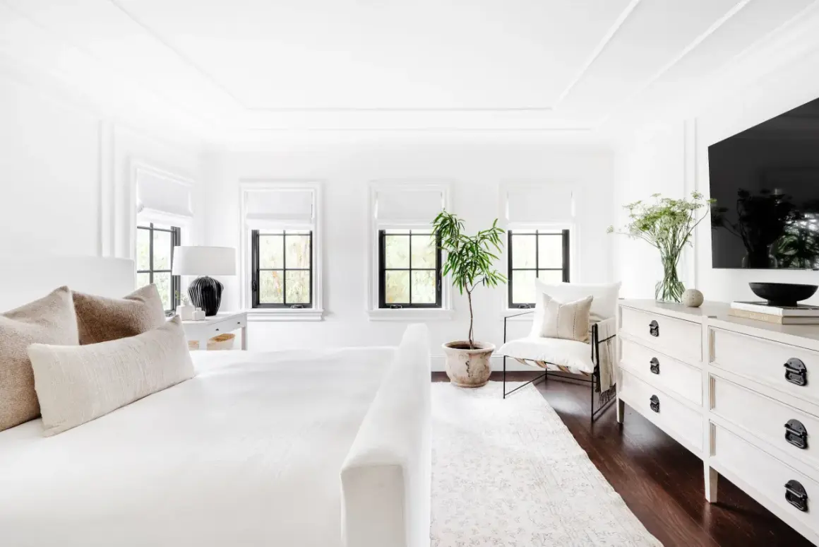
- White should lead in most rooms, with black used as an anchor rather than the main event.
- Bedding is the fastest way to make the room feel softer and more inviting.
- Curved furniture, warm metals, and textured fabrics keep the space from feeling harsh.
- One strong pattern is usually enough if the rest of the room stays quiet.
- A focused refresh can be affordable, but full room makeovers get expensive once furniture and drapery change.
What makes the palette feel feminine
For me, feminine does not mean pink by default. It means the room has a graceful rhythm, a little softness in the edges, and enough texture to keep the contrast from feeling graphic or cold. If the room only has black and white but no curve, depth, or tactile detail, it usually reads as stylish first and inviting second.
Softness comes from shape, not just color
Curved headboards, rounded bedside tables, scalloped lamp shades, and arched mirrors all work because they interrupt straight lines. In 2026, I think that matters more than adding extra decor. A room with fewer pieces but better silhouettes usually feels more refined than one crowded with accessories.
Choose whites and blacks with the right undertone
Pure optic white and jet black can look sharp in daylight, so I often lean toward ivory, bone, chalk, charcoal, and soft black. Those slightly muted versions feel kinder at night and more forgiving in a bedroom, where the light changes throughout the day.
Once the room’s tone is right, the next question is balance, because the ratio of black to white changes the mood more than most people expect.
Set the right black-and-white balance
I like white to do most of the visual work, then bring in black in smaller, purposeful hits. That keeps the room calm while still giving it enough contrast to feel deliberate.
| Balance | Best for | What it feels like | My recommendation |
|---|---|---|---|
| 80/20 | Small rooms, rentals, bright spaces | Airy, soft, easy to live with | Use black in frames, lamps, and one textile |
| 70/30 | Most bedrooms | Balanced, polished, still calm | Start here if you are unsure |
| 55/45 | Larger rooms, higher ceilings, dramatic styles | Bold and editorial | Keep textures warm so it does not feel severe |
If you want the room to stay feminine, I would avoid making every large surface dark. In smaller bedrooms, I keep most black below eye level and use it in legs, frames, or lamps rather than on broad walls. Black works better as an outline than as the whole drawing. From there, bedding becomes the fastest place to add warmth without introducing another color.
Choose bedding that does the heavy lifting
Bedding is where this look either succeeds or falls flat. I usually build from the bed outward: sheets first, then a coverlet or duvet, then one throw and a couple of pillows with texture. If the bed feels layered and relaxed, the whole room starts to feel finished.
Start with a quieter base
White or ivory percale gives a crisp, hotel-like feel, while linen softens the room and looks more relaxed. If you want a touch of sheen, sateen works well, but I would keep the rest of the room matte so the space does not become glossy and cold.
Build the bed in three layers
A simple formula works: two sleeping pillows, two Euro shams, and one accent lumbar pillow. If you like extra softness, add a folded throw at the foot of the bed in faux fur, bouclé, or a chunky knit. That gives the room a feminine finish without leaning on pink or floral overload.
Pattern should stay controlled here. Fine stripes, tiny checks, subtle embroidery, or a restrained floral can feel elegant; oversized graphics tend to overpower the bed and make the whole space look louder than it needs to be. Once the bed is settled, the furniture and lighting should echo that same softness.
Bring in shape with furniture, lighting, and mirrors
Furniture should support the softness of the bed rather than compete with it. A tufted or upholstered headboard, a curved bench, and rounded nightstands make the palette feel more intentional, especially when the room is small and every piece has to earn its place.
Read Also: How to Style a Nightstand - No Clutter, Just Calm
Lighting temperature matters more than most people think
I like warm bulbs in the 2700K to 3000K range for this style. Anything much cooler can make white bedding look blue and black accents look harsher than they really are. Soft brass, aged nickel, or ceramic lamp bases usually feel better than overly shiny finishes.
Mirrors and wall art should support the same idea. An arched mirror, a slim black frame, or a few black-and-white prints can bring rhythm to the room, but I would stop before the walls start looking busy. The goal is polish, not visual noise. After that, pattern can do the decorative work without taking over.
Use pattern as accent, not overload
Pattern is where a monochrome bedroom gets personality. I usually limit myself to one statement pattern and one quieter supporting pattern, because too many prints can push the room into a themed look that ages quickly.
- Stripes feel classic, clean, and easy to repeat on bedding or drapery.
- Toile or micro-floral reads gentler and more romantic when the scale stays small.
- Checkerboard or gingham adds playfulness in a pillow, ottoman, or rug.
- Abstract line art works when you want modern energy instead of sweetness.
If the walls are patterned, keep bedding mostly solid. If the bedding carries the pattern, let curtains and rugs stay quiet. That kind of restraint is what keeps the room from feeling dated six months later. The fastest way to lose that elegance is to let every surface compete.
Avoid the moves that make the room feel cold
- Too much pure black on walls or large furniture in a dim room.
- Flat white everywhere with no weave, sheen, or texture contrast.
- Overmixing finishes so the room loses a clear visual language.
- An undersized rug that makes the bed look like it is floating.
- Cool lighting that makes the palette feel harsher than intended.
- Decor clutter that hides the calm, tailored effect you were aiming for.
The fix is usually not more decor. It is better proportion, warmer materials, and fewer competing decisions. Once that is in place, the budget question becomes much easier to answer.
Plan the makeover around a realistic budget
In the U.S., I would treat this kind of bedroom in three spending tiers. The numbers vary by brand, but these ranges are realistic enough to plan with before you start shopping.
- $300 to $700 for a quick refresh: new bedding, one lamp, art, and maybe paint.
- $700 to $1,500 for a stronger update: rug, curtains, headboard, and better bedside lighting.
- $1,500 to $4,000+ for a full redesign: furniture changes, wallpaper, custom drapery, and layered lighting.
If money is tight, I would spend first on the bed, then the curtains, then lighting. Those three choices shape the room more than decorative extras ever will. After that, the only real question is what to keep so the room still feels good years from now.
The version I would keep if I wanted it to stay elegant for years
If I were designing this room for long-term use, I would keep the walls light, the bedding mostly white, and the black concentrated in a frame, a lamp, a headboard detail, or a single piece of art. Then I would add one romantic note: a curved silhouette, a textured throw, or a slightly scalloped edge that makes the room feel personal.
That balance is what holds up. It gives you contrast without harshness, femininity without excess, and a bedroom that looks considered even when the bed is unmade. That is the standard I would use every time.