
Blending weathered wood, stone, and tactile fabrics with clean-lined furniture can make a room feel warm without looking heavy. This article breaks down the design logic behind a rustic modern interior, the materials and colors that support it, and the practical choices that matter most in real homes. I am focusing on the parts that change how a room actually feels, not just the decor labels.
The best rooms rely on balance, not on themed decor
- Start with simple, current silhouettes, then add texture and age on purpose.
- Keep the palette tight: warm neutrals, muted earth tones, and a few darker anchors.
- Use natural materials at the largest scale first, then layer in textiles and lighting.
- Avoid too many distressed finishes, faux-cabin details, or competing wood tones.
- In many American homes, the look works best when the room feels edited rather than packed.
What actually defines the style in a real home
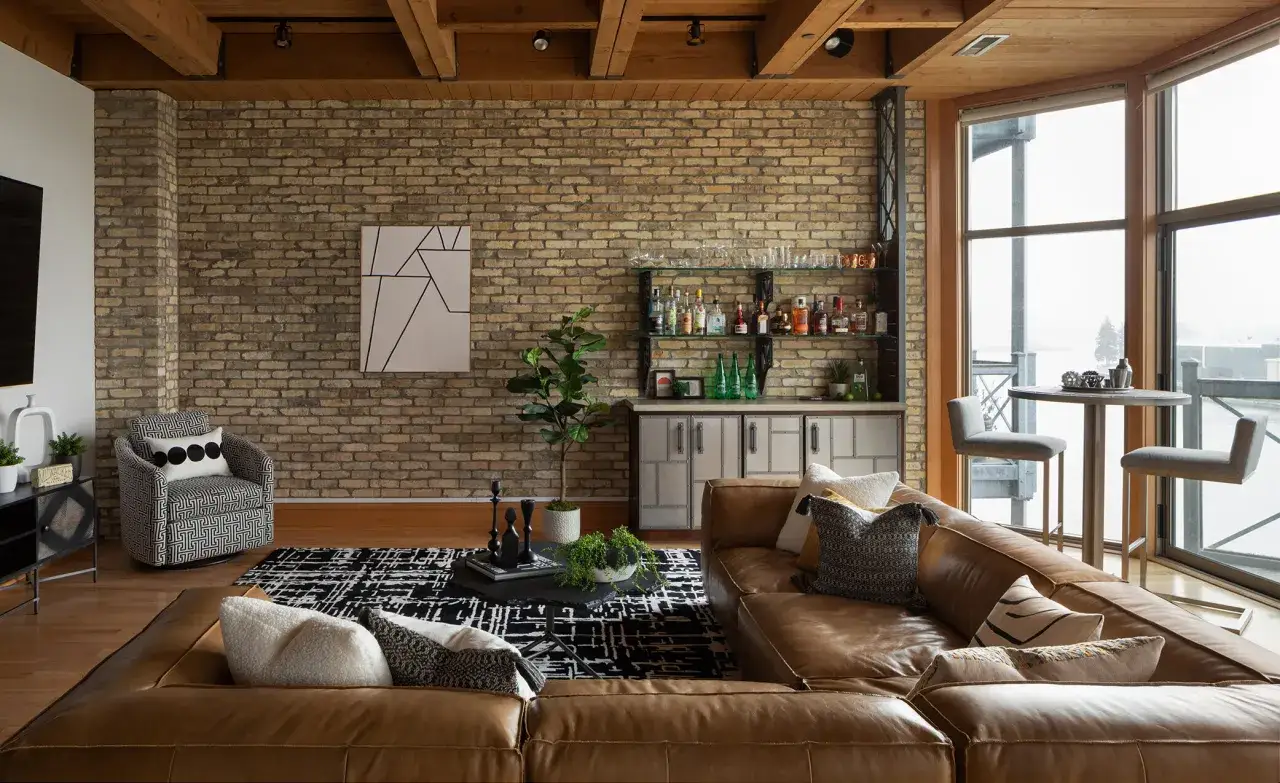
I usually think of this look as a ratio problem more than a decorating theme. About 70 percent of the room should feel calm, current, and structurally simple; the remaining 30 percent can bring in grain, patina, stone, or handmade texture. That balance keeps the room from turning into a lodge set or, on the other extreme, a plain minimalist box.
The modern side shows up in the silhouettes: a low sofa, a square-edged coffee table, a streamlined cabinet, or a lamp with a clean profile. The rustic side shows up in the materials: visible wood grain, matte metal, honed stone, woven fibers, or a piece that clearly has age or character. The goal is contrast, not equal volume.
If you already have a strong architectural element, such as beams, a fireplace, or wide-plank floors, let that do the heavy lifting. In a newer house with drywall and builder-basic finishes, you will need texture, scale, and lighting to create the same feeling. Once that balance is clear, the palette becomes much easier to choose.
The materials and colors that do most of the work
I like to keep the palette to three to five core tones. Warm white, mushroom, taupe, clay, charcoal, and muted black are reliable because they let texture do the talking. Pure white can work, but it usually needs warmer companions; cool gray tends to flatten the room.
Material choice matters more than ornament. Reclaimed wood and oak bring grain and age. Honed stone, which has a matte, lightly polished surface, feels softer than glossy marble. Linen and wool temper harder surfaces, while matte black or aged brass hardware adds contrast without glare. Patina, the soft aging that builds on metal and leather, is useful here because it gives a room visual depth without making it look distressed on purpose.
| Material | Best use | Why it helps |
|---|---|---|
| Wood with visible grain | Tables, shelving, beams, sideboards | It adds warmth and keeps simple furniture from feeling flat |
| Honed stone | Countertops, fireplace surrounds, tabletops | Its matte finish feels grounded instead of shiny or cold |
| Linen and wool | Upholstery, drapery, pillows, throws | They soften the harder surfaces that define the style |
| Matte metal | Hardware, lamp bases, frames, brackets | It creates contrast without visual noise |
For lighting, I usually stay in the 2700K to 3000K range. That warmer temperature flatters wood, stone, and fabric better than a cool white bulb, which can make the whole room feel harder and less inviting. One practical rule I use: keep to one dominant wood tone and at most two supporting tones in a single room. More than that, and the eye stops reading the room as intentional. From here, the question becomes where to place those materials so the whole home feels consistent rather than copied from one corner to the next.
How I would apply it room by room
The safest way to build the look is to let each room play a different role. One space can carry more wood, another more fabric, and another more metal, as long as the overall house stays consistent.
Living room
Use the living room to establish the tone: one simple sofa, one substantial wood or stone coffee table, and one oversized rug with a natural-fiber feel. If the room has a fireplace, I prefer to keep that surface as the roughest or heaviest element, then let the seating and shelving stay cleaner. A cluttered mantel is usually the fastest way to lose the look.
Kitchen
In the kitchen, the biggest wins usually come from cabinetry and countertops. Flat-panel doors or simple shaker fronts work better than ornate profiles, and a warm wood or muted painted finish usually feels more current than glossy finishes. Keep the backsplash quiet, choose hardware with a matte surface, and let the countertop texture do more of the talking than decorative accents.
Bedroom
The bedroom needs less contrast and more softness. I would use an upholstered headboard, wood nightstands, linen bedding, and dimmable bedside lamps. This is the room where too much stone or metal starts to feel cold, so let textiles carry the comfort and keep the rustic notes subtle.
Read Also: Modern Traditional Interior Design - Your Complete Guide
Entryway and hall
The entryway is a good place for a bench, a mirror with a straightforward frame, and one storage basket or tray. Hallways should stay restrained; they are connectors, not showrooms. If you can make the transition spaces calmer than the main rooms, the whole home will read as more deliberate.
Once you see the style room by room, the next useful step is comparison, because a lot of confusion comes from how closely related styles borrow from one another.
How it differs from nearby styles
This is where the distinctions matter. I am often asked whether this look is just modern farmhouse with darker wood, or organic modern with more character. The answer is no, but the overlap is real, which is why the details matter.
| Style | Main feeling | Common materials | Typical risk |
|---|---|---|---|
| Rustic and modern blend | Grounded, edited, tactile | Wood grain, stone, linen, matte metal | Feeling heavy if every surface is rough or dark |
| Modern farmhouse | Casual, familiar, bright | White paint, black accents, painted wood | Looking generic if it leans too hard on signs and shiplap |
| Organic modern | Calm, soft, understated | Curved shapes, pale woods, boucle, plaster | Feeling flat if there is not enough texture or contrast |
The biggest difference is texture density. The style I am describing can tolerate more visible grain, more aged surfaces, and a slightly stronger contrast between old and new. Modern farmhouse usually stays brighter and more literal, while organic modern tends to smooth the edges down further. If you are deciding between them, I would ask a simple question: do you want the room to feel more collected, more polished, or more serene? That answer usually points you in the right direction.
The mistakes that make the look feel forced
Most bad versions fail for the same reason: they confuse rustic materials with rustic styling. Those are not the same thing, and the difference shows immediately once the room is finished.
- Too many distressed pieces - Random sanding, fake aging, and barn-style decor can make a room look staged instead of lived in.
- No dominant wood tone - Mixing five or six finishes without a hierarchy makes the room feel accidental.
- Cool paint with warm materials - A blue-white wall next to oak and stone usually drags the whole scheme colder.
- Small accessories doing too much work - If every shelf needs a rustic object, the room starts reading as a theme, not a home.
- Overuse of black metal - A little contrast is useful; too much turns the space harsh and repetitive.
- Poor lighting - If the bulbs are too white or the fixtures too thin, even good materials can look flat.
The fastest fix is usually subtraction, not addition. Remove one finish, simplify one shelf, or replace one light source before you buy more decor. That is also why budget matters: some upgrades change the room far more than others.
What the budget usually looks like in the US
For planning, I group this style into three spending tiers. These are rough US ranges, not fixed prices, because labor, region, and material quality move the numbers quickly.
| Scope | Rough budget | Best use |
|---|---|---|
| Accessory refresh | $300 to $1,500 | Rugs, pillows, lamps, art, baskets, hardware |
| Room refresh | $1,500 to $8,000 | Paint, lighting, one or two major furniture swaps, window treatments |
| Full remodel or custom build-out | $10,000 to $50,000+ | Cabinetry, flooring, fireplaces, built-ins, structural changes |
If I had to prioritize, I would spend first on the sofa or dining table, second on lighting, and third on the largest rug in the room. Those three decisions shape scale, comfort, and mood before the accessories even enter the picture. If the budget is tight, save on decorative objects and spend on the pieces you touch every day.
The pieces I would invest in first
If I were starting from scratch, I would build the room around five anchors: a clean-lined main seat, one wood piece with visible grain, one substantial natural-fiber rug, one warm light source, and one textured accent that feels genuinely handmade. Everything else can be layered later. That order keeps the room from becoming overdesigned before it becomes livable.
- Main seating - Choose a shape that is simple enough to age well, but not so plain that it disappears.
- A hero surface - This might be a coffee table, dining table, or fireplace surround; it should provide the room’s strongest texture.
- Warm lighting - Dimmable fixtures and 2700K to 3000K bulbs usually flatter the palette best.
- A grounded rug - The rug should define the zone instead of floating under the furniture like an afterthought.
- One or two handcrafted accents - Ceramic, woven, or forged pieces add character more reliably than a shelf full of little objects.
If you keep the structure simple and let the materials do the storytelling, the room will feel calm, warm, and believable. That is the version of the style I trust most, because it still works after trends move on.