Blending contemporary lines with classic details works best when a room feels edited, not themed. That is the promise of modern traditional interior design: the calm of clean silhouettes, the character of heritage pieces, and enough contrast to keep the space from feeling stiff. In this guide, I break down what the style really means, how to balance the two sides, where it works best in a home, and the mistakes that usually make the mix fall apart.
What matters most before you start mixing styles
- The look works best when one style leads and the other supports it.
- Architecture and large furniture should be chosen before smaller decor.
- Warm woods, linen, wool, stone, and a restrained metal palette do most of the visual work.
- Living rooms, entries, and dining rooms are the easiest places to test the balance.
- The biggest risk is a room that feels half-finished because every piece is fighting for attention.
What modern traditional interior design really means
At its core, this is a room that pairs the clarity of modern design with the depth of traditional interiors. Modern brings clean lines, lighter silhouettes, and visual breathing room; traditional contributes symmetry, texture, and pieces that feel collected over time. I usually describe it as a room with a strong present-tense base and a few well-chosen pieces that carry history.
This is where people confuse it with transitional design. Transitional spaces usually sit in the middle and stay fairly neutral, while this mix can lean more classic, more tailored, or more architectural depending on the home. Architectural Digest notes that traditional rooms often rely on symmetry, classic silhouettes, and layered textiles, and those are exactly the cues that give this style its spine when they are used sparingly.
| Style | What it looks like | What to borrow | What to avoid |
|---|---|---|---|
| Modern | Clean profiles, open space, fewer decorative layers | Simpler silhouettes and lighter visual weight | Over-ornamented pieces and too many small objects |
| Traditional | Symmetry, richer textures, classic forms | Structure, warmth, and collected character | Heavy matching sets and overly dark finishes |
| Hybrid | A room that feels current but grounded | One lead style, one supporting style, restrained color | 50/50 mixing, where nothing clearly leads |
Once that framework is clear, the real skill is deciding how much of each side the room should show.
The balance that keeps the room from looking flat
I almost never start with decor. I start with a ratio. In practice, a strong room usually reads as 70/30 or 80/20: one style leads, the other supports. That gives the eye a clear story, which is why the mix feels intentional instead of random.
The easiest formula is architecture first, furniture second, accents last. If the house already has crown molding, paneled walls, a fireplace, or arched openings, let those classic features stay visible and keep the furniture cleaner. If the room is plain, do the opposite: use tailored upholstery, a traditional rug, and a couple of heritage-looking finishes to add weight.
Negative space matters here too. That is simply the open room around furniture and objects, and it is what keeps the blend from feeling crowded. A mix of eras needs room to breathe; without it, the eye stops reading design and starts reading clutter.
From here, the next question is which materials and finishes actually make the balance work.
Furnishings, finishes, and colors that do the heavy lifting
The safest palette is warm, not cold: ivory, oat, camel, taupe, soft black, muted blue, olive, and wood tones with visible grain. I prefer to keep the base quiet and let one or two richer notes do the character work, because too many strong colors make the room feel like a sampling board rather than a home.
On furniture, use clean lines in the large pieces and more classic shape in the accents, or reverse it if the architecture is already ornate. A streamlined sofa, a skirted side chair, a simple pedestal table, or a reeded wood console, which has shallow vertical grooves, can each pull their weight; you do not need all of them in one room. Millwork means built-in trim, paneling, and cabinetry, and it is one of the fastest ways to add traditional structure to a space without making it heavy.
Houzz’s 2026 trend coverage is leaning into plaid, grid patterns, and layered textures, which is useful here because those motifs bridge old and new without looking costume-like. I would rather see one restrained plaid pillow and a wool rug than three competing patterns fighting for attention. Brass, bronze, matte black, and unlacquered metal can all work, but keep the finish palette limited so the room feels edited.
Once the materials are right, the style gets easier room by room.
Where I would use it first in the home
For most homes, I would start in the living room or entry because those spaces can carry contrast without feeling busy. In a kitchen, the mix has to be quieter; cabinetry already dominates, so a traditional light fixture or a classic counter stool is usually enough. Bedrooms are forgiving if you keep the furniture simple and let textiles do the rest.
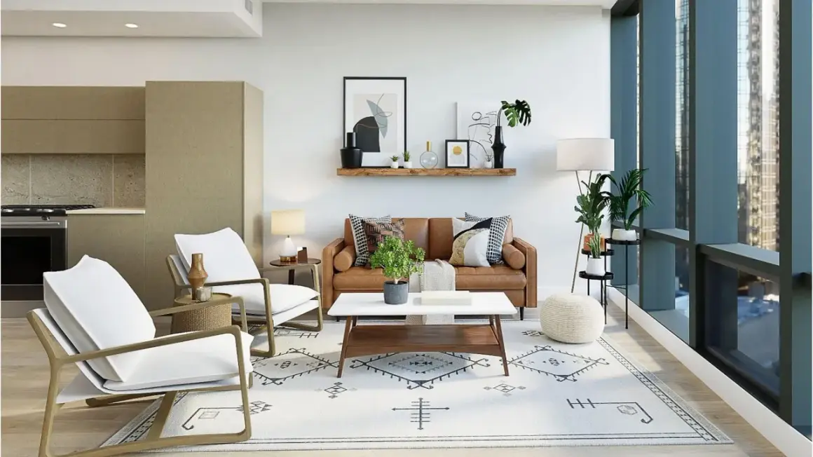
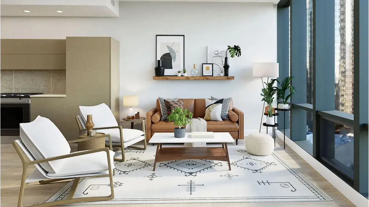
- Living room - The easiest starting point. Pair a clean-lined sofa with an antique side table, a classic rug, and one strong artwork. The room reads collected without becoming formal.
- Entryway - Great for first impressions. A simple console, a shaped mirror, and one lamp can immediately signal the style without much expense.
- Dining room - Naturally suited to contrast. A traditional wood table under a more current pendant is one of the cleanest ways to make the blend feel intentional.
- Kitchen - Best when the details stay restrained. Shaker or slab cabinetry, simple hardware, and warm stone can sit comfortably beside a more classic stool or light fixture.
- Bedroom - Works well when the bed and nightstands are calm. Let bedding, drapery, and a vintage bench or mirror add the older layer.
The larger point is that the room should answer a single question: what is the anchor piece, and what is the supporting cast? Once you can name that, the design starts to feel deliberate rather than improvised.
Mistakes that make the mix feel awkward
- Equal weighting of both styles - A room that is half modern and half antique often has no hierarchy, so the eye never settles.
- Too many ornate pieces - Carved legs, heavy drapery, and decorative molding everywhere make the room dense instead of layered.
- Ignoring scale - Slim furniture can disappear next to tall traditional architecture, while bulky pieces can crush a smaller room.
- Using trendy decor as the bridge - Trend-led accessories age faster than classic furniture and rarely solve a balance problem.
- No texture variation - If every surface is smooth or shiny, the room feels flat even when the shapes are correct.
I also see people overrely on matching sets. The result is polished, but not in a good way; it feels bought in one visit. Better rooms look collected, even when they were planned quickly.
That is why the final step is not buying more pieces, but choosing the first ones carefully.
What I would buy first if I were starting from scratch
If the budget is tight, I would put money into the largest upholstered piece, the rug, and the main light fixture before I worried about smaller decor. Those three choices control most of the visual balance, so they do more work than a pile of accessories ever will.
My first picks would be a sofa or bed with a clean silhouette, one traditional anchor such as a wood dining table or console, a rug with quiet pattern and enough scale, and a light fixture that has either sculptural simplicity or a classic form. After that, I would layer in a vintage mirror, one framed artwork, and a couple of textured pillows or drapery panels to connect the eras.
For American homes in 2026, I would keep the room a little warmer and a little less perfect than many showroom images suggest. The most convincing version of this style looks collected, not staged, and that usually comes from mixing a few periods, a few textures, and enough restraint to leave some air in the room. If you remember only one thing, make it this: choose a clear lead style, then let the other one sharpen it.