A ranch style house asks for a different interior strategy than a two-story home. The best rooms in this kind of home use the long footprint, open sightlines, and easy circulation to create a space that feels relaxed rather than stretched, and that is exactly what I cover here: layout, color, furniture scale, and the updates that preserve character while making the interior feel current.
The design priorities that matter most in a single-level ranch
- Use the horizontal layout on purpose by creating clear zones instead of leaving one oversized open room.
- Choose warm, layered materials so the house feels inviting instead of flat or overly neutral.
- Keep furniture scaled to the room and leave enough space for easy movement.
- Repeat a small set of finishes across the main level so the interior feels connected.
- Preserve original character where it adds texture, but update the pieces that make the home feel tired.
- Fix lighting, rugs, and window treatments early, because those changes shift the feel of the whole house fast.
What the layout asks of the interior
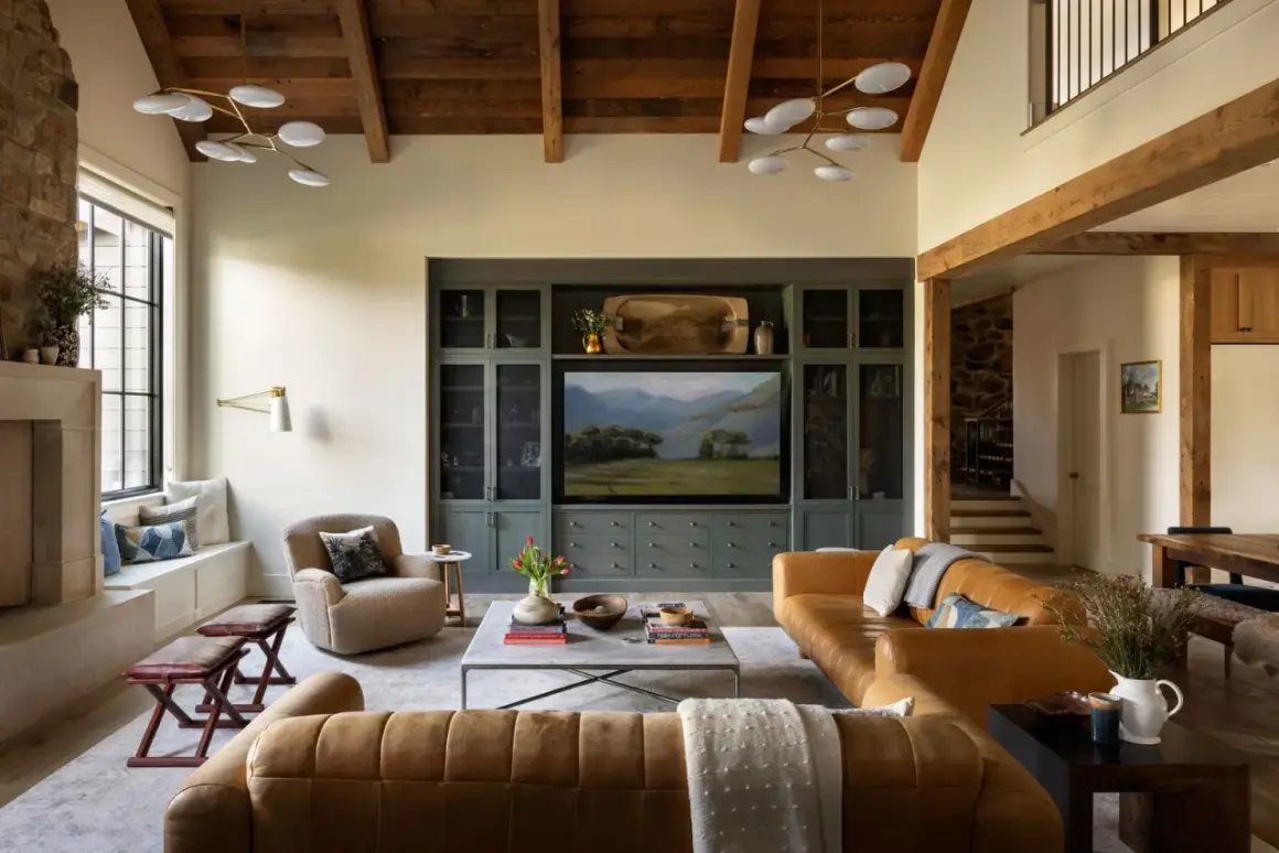
The main challenge in a ranch home is not lack of space. It is the way space is distributed. Because everything happens on one level, the eye moves across long walls, connected rooms, and often one uninterrupted public zone, so every decision reads more clearly than it would in a house with multiple floors. I usually think of these homes as a sequence of connected scenes, not a stack of separate rooms.
That means the interior should have a sense of rhythm. A seating area needs enough definition to feel intentional, but not so much furniture that it blocks the natural flow. A dining zone should support the kitchen visually, not compete with it. Even hallways matter, because they are part of the experience rather than dead space. The goal is calm structure, not visual emptiness.
This is also why ranch interiors tend to work best when they feel lightly edited. A few strong pieces and consistent finishes usually do more for the home than a crowded mix of styles. Once the layout is working, the next question is what kind of palette can support it without flattening the personality of the house.
The palette and materials that make the home feel warm
If I were choosing a direction for a ranch interior in the United States, I would start with warmth. Not heavy darkness, and not the cool gray look that dominated for years. The strongest ranch interiors right now lean toward creamy whites, sand, mushroom, soft taupe, muted sage, clay, and other tones that let the natural light do the work. These colors suit the low, horizontal profile because they create softness instead of sharp contrast.
Materials matter just as much as paint. Wood with visible grain, matte or lightly textured finishes, linen, leather, stone, and simple woven fabrics help a single-level home feel layered without becoming fussy. I also like when one wood tone repeats in a few places, especially if it has a natural oak or walnut character. That repetition gives the house visual stability.
What I try to avoid is theme overload. A ranch home does not need to scream rustic, and it does not need to be stripped so bare that it feels generic. The sweet spot is usually a mix of clean lines and tactile surfaces. A few honest materials beat a room full of decorative gestures. With that base in place, furniture placement becomes much easier to solve.

How to arrange furniture so the main level still feels open
Furniture scale is where many ranch interiors go wrong. People often buy pieces that are either too bulky for the room or so small that the space starts to look accidental. I prefer furniture that feels grounded but visually light, especially in long living rooms and open kitchen-living combinations. If the house has a low ceiling, raised legs on sofas, chairs, and side tables can help the room breathe.
There are a few practical rules that keep the layout from feeling awkward:
- Leave about 36 inches for primary walkways so people can move through the room without turning sideways.
- Keep roughly 16 to 18 inches between a sofa and a coffee table.
- Use a rug large enough to catch the front legs of major seating pieces; in many U.S. homes, 8x10 or 9x12 is more realistic than a small accent rug.
- Float furniture away from the wall when the room is long, because that often creates a better conversation area.
- Hang art with the center usually around 57 to 60 inches from the floor so the room feels visually aligned.
I also like to break a large ranch living room into two use zones when the footprint allows it. One side can focus on conversation, while the other handles reading, music, or watching TV. That approach keeps the room from feeling like a runway. Once the furniture is right, the bigger challenge is making the kitchen, dining, and living areas read as one idea.
Make the kitchen, dining, and living areas feel intentional together
Open-plan ranch homes can look either seamless or messy depending on how much repetition they have. I do not mean repetition in a boring sense. I mean repeating enough visual cues that the home feels coherent. The easiest place to start is with the finishes that connect one room to the next.
For example, if the kitchen uses brushed brass hardware, I would echo that finish in the dining light, a floor lamp, or a mirror frame nearby. If the cabinetry has a warm oak tone, I would bring that tone into a dining table, shelving, or a console rather than introducing four unrelated woods. The same logic applies to paint: one family of warm neutrals usually works better than sharp jumps from room to room.
Lighting should also work as a set. Ambient light, task light, and accent light all matter, but in a ranch home I pay close attention to how fixtures look from one space to the next. A pendant over the island, a pair of table lamps in the living room, and a simple chandelier in the dining area can coexist well if the forms are related. That connection becomes even more important when you want to keep original character, which is the next thing I would handle.
Keep character where it helps, update where it matters
One reason ranch homes still have such a strong following is that they often come with details worth saving. A good fireplace, well-proportioned built-ins, solid trim, or original woodwork can give the house more depth than any amount of new décor. The trick is knowing what to preserve and what to modernize so the room feels fresh instead of stuck.
| Feature | Usually worth preserving | Usually worth updating |
|---|---|---|
| Brick or stone fireplace | When the masonry is in good condition and it anchors the room | When it is damaged, visually too heavy, or fighting the rest of the palette |
| Built-in shelving | When the proportions fit the wall and storage is genuinely useful | When the shelves are too shallow, awkwardly divided, or overtrimmed |
| Original wood trim or beams | When the finish still has depth and does not make the room feel dated | When the stain is orange, worn out, or clashing with newer materials |
| Flooring continuity | When it helps the home feel longer and calmer | When multiple flooring changes make the main level feel chopped up |
If the house is going to serve long-term living, I also pay attention to access and movement. A single-level plan is already friendly for aging in place, but wider openings, better threshold transitions, lever handles, and a more efficient bathroom layout make that advantage real instead of theoretical. From there, it becomes much easier to see the mistakes that quietly flatten the whole interior.
The mistakes that flatten a ranch interior
The most common problem I see is not bad taste. It is overcorrection. People worry the home feels too plain, so they add too many small objects, overly themed décor, or dark accents in scattered places. That usually makes the interior feel busier, not richer. In a ranch home, restraint almost always reads better than clutter.
- Using furniture that is too small, which makes the room feel oddly incomplete.
- Pushing every piece against the wall, which turns the room into a corridor.
- Mixing too many wood tones, especially when they do not share the same warmth.
- Hanging art and mirrors too low, which shortens the wall visually.
- Choosing window treatments that are heavy enough to block the natural light that gives ranch homes their best quality.
- Letting the patio or back yard feel disconnected from the interior, even when the architecture is built around that connection.
Another subtle mistake is treating every room as if it needs a different personality. In a one-story home, that can create a jarring step from space to space. The rooms do not have to match perfectly, but they should feel related. Once those traps are out of the way, the remaining upgrades are straightforward and surprisingly effective.
The upgrades I would tackle first in a ranch home
If I were starting a refresh in 2026, I would begin with the changes that reshape the whole atmosphere fast. Warm lighting is first on my list. Bulbs in the 2700K to 3000K range usually feel more inviting than cooler light, especially in a home with a lot of hard surfaces. After that, I would look at window treatments, because they can either soften the long walls or make the rooms feel bare.
- Swap harsh or cool bulbs for warmer lighting so the house feels less clinical.
- Choose one main paint direction and repeat it across connected rooms.
- Size up the rug before buying new decorative objects.
- Replace heavy, dated window coverings with something cleaner that still filters light.
- Improve entry storage so the main living areas stay visually quiet.
- Carry the design outdoors with simple seating, durable textiles, and a few plants so the inside-outside relationship feels intentional.
After that, I would focus on the details that make daily life easier: a better place to set down bags, stronger task lighting in the kitchen, and a more forgiving arrangement in the family room. When those basics are right, a ranch home stops feeling like a boxy leftover from another era and starts reading as what it is at its best: practical, relaxed, and easy to live in.