The strongest coastal rooms are edited, textured, and easy to live in
- Start with a quiet base of warm white, sand, or foggy blue instead of loud, theme-heavy color.
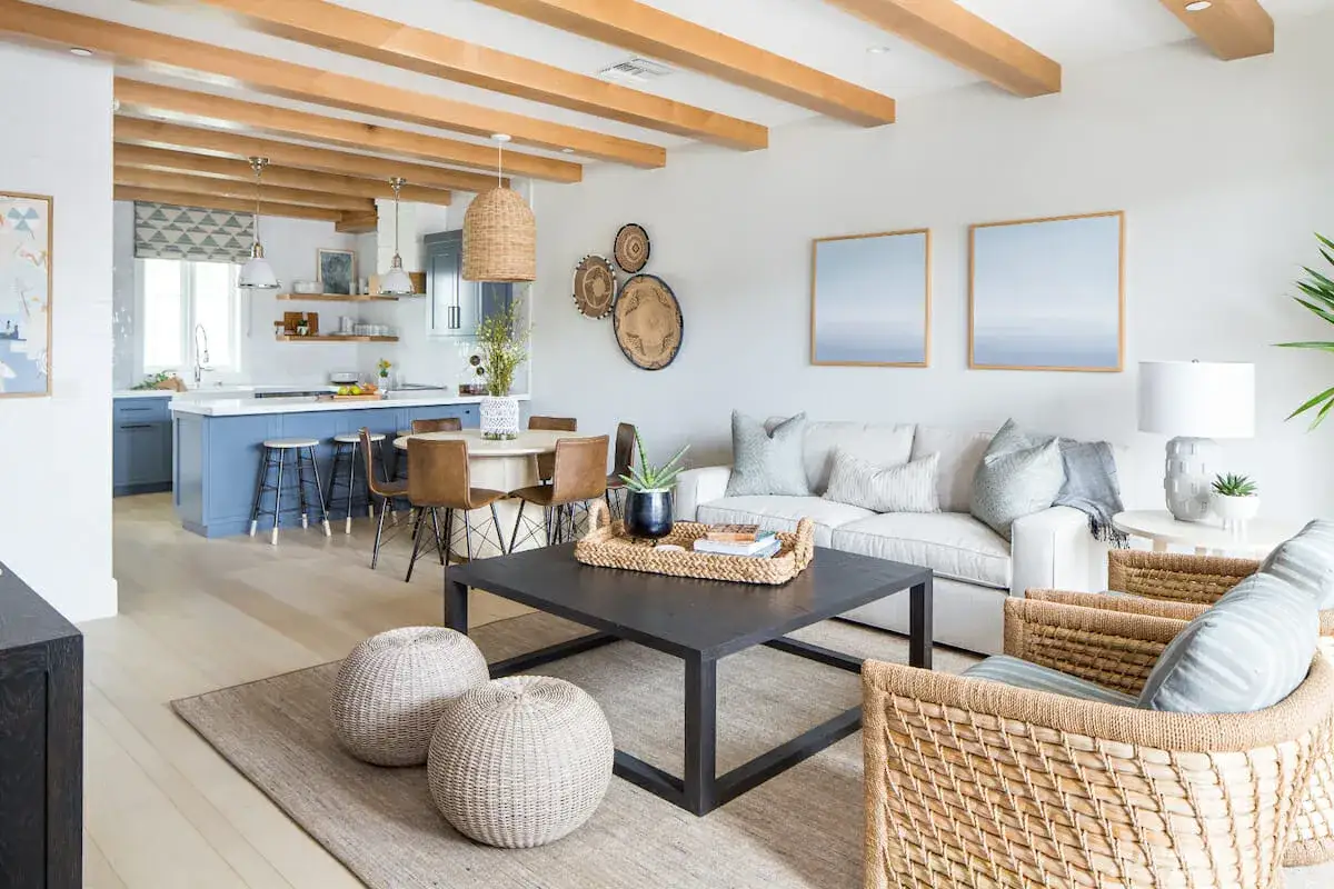
- Let natural materials do the heavy lifting: linen, wood, jute, rattan, plaster, stone, and woven fibers.
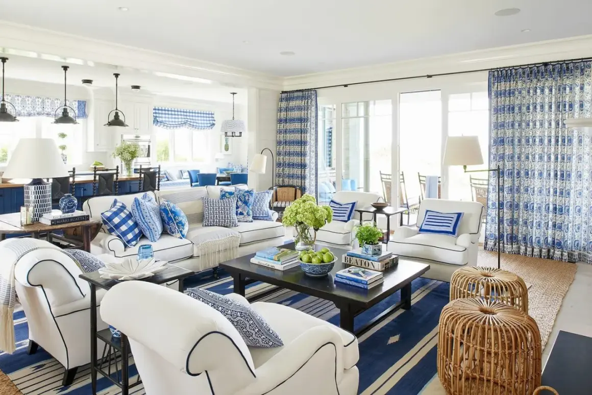
- Keep nautical motifs rare; one shell object can work, but anchors and stripes should not carry the room.
- Use at least 3 tactile layers in every main room so the space feels warm rather than flat.
- For 2026, the look is leaning warmer, more personal, and less literal than the old beach-house formula.
What makes the style feel coastal without becoming themed
Architectural Digest describes the look as a sophisticated, relaxed approach shaped by natural materials and generous light, and that is the standard I would keep in mind. The goal is not to make a room look like a souvenir shop. It is to borrow the ease of the shoreline: softer light, breathable fabrics, clean lines, and a palette that feels lifted from sand, water, and weathered wood.
When I separate coastal interiors from related looks, I usually think in three lanes. That distinction matters because the wrong lane pushes people toward the wrong objects, and that is where rooms start to feel dated or overly staged.
| Style | What you usually see | Overall mood | Best use |
|---|---|---|---|
| Coastal | Soft whites, sand tones, muted blue-green, wood, linen, woven textures, clean silhouettes | Calm, refined, airy, slightly tailored | Homes that want a light but not overly casual feel |
| Beachy | Brighter whites, lighter woods, breezier fabrics, more relaxed styling | Loose, casual, easygoing | Vacation homes or rooms that should feel very relaxed |
| Nautical | Navy, white, stripes, rope, darker wood, ship-like details | Graphic, more literal, more traditional | Spaces that want a sharper maritime reference |
I prefer the coastal lane because it gives you more room to build a real interior, not just a theme. You can keep the mood serene while still making the room feel tailored, finished, and mature. Once that is clear, the next question is simple: which colors and materials do the work without needing decoration to rescue them?
The palette and materials that do most of the work
In practice, this style is mostly won or lost by restraint. I often start with a 60-30-10 balance: 60% quiet base color, 30% supporting natural tone, and 10% deeper accent or contrast. That does not mean every room must be pale. It means the color story should feel layered, not busy.
Color choices that feel current
The safest base is still a warm white, but not a cold, blue-white that makes everything feel sterile. I like sand, oyster, putty, fog, pale stone, muted sea glass, and washed blue-gray as supporting tones. A deeper navy, charcoal, or olive can work as an anchor, especially if the room needs definition.
Homes & Gardens notes that the 2026 version of coastal decorating is moving away from flat, themed beach-house references and toward warmer, more tactile rooms. That shift makes sense to me. Warmer whites, plaster-like finishes, subtle wallpaper texture, and soft wood tones feel more timeless than high-contrast blue-and-white styling.
Materials that create the feeling
The material mix matters more than the accessories. If I only had room for a few elements, I would choose:
- Linen or linen-blend upholstery for softness and movement.
- Wood with visible grain, especially oak, white oak, or weathered finishes.
- Jute, sisal, or seagrass for rugs and baskets.
- Rattan or wicker in controlled amounts, not everywhere at once.
- Plaster, limewash, honed stone, or matte tile for quiet depth.
The practical rule I use is this: at least 3 textures should be visible in the same sightline. A linen sofa, a woven rug, and a smooth wood table already give the room enough variation to feel coastal without adding a single shell.
If the home is near the ocean, I would be even stricter about performance. Salt air, humidity, and strong sun are unforgiving, so sealed wood, corrosion-resistant hardware, and washable or performance-grade upholstery matter more than they would inland. That is where style and function stop being separate topics and start shaping the same decision.
How I would style each room so the look feels lived in
The easiest way to make a room feel believable is to give each space one clear job. I do not try to repeat the same coastal formula everywhere. Instead, I adjust the balance of softness, structure, and texture room by room.
Living room
This is where the style usually lands best. I would start with a low- to medium-profile sofa in a natural fabric, then pair it with one wood coffee table, one woven accent chair, and a large rug that anchors the seating area. A single oversized rug usually looks better than several small ones because it keeps the room visually calm.
Keep the window treatment light. Sheers, relaxed linen drapes, or simple woven shades work better than heavy fabric, especially if the room has strong daylight. Add two or three pieces of art with enough breathing room around them. In a coastal room, negative space is not empty; it is part of the composition.
Bedroom
A coastal bedroom should feel quiet before it feels decorative. I like a fabric headboard, crisp bedding, a soft throw, and one tactile accent such as a woven bench or a small rattan chair. If the palette is already pale, add one deeper note in the pillows, artwork, or bedside lamps so the room does not flatten out.
Lighting is often overlooked here. Warm bulbs in the 2700K to 3000K range usually read better than bright, cool light because they preserve the softness of the fabrics and make the room feel more like evening by the sea than a hotel corridor.
Kitchen and dining area
In kitchens, the style should stay disciplined. Too many decorative coastal references make the room feel fake fast. I would rather see wood cabinetry or open shelving, honed counters, matte hardware, and a few woven stools than a wall covered in seaside objects. If you want the room to feel coastal, let the finishes do the talking.
Dining spaces can handle a little more character. A weathered wood table, slipcovered chairs, or a pendant with a natural fiber shade can bring in enough warmth. The trick is to keep the forms simple so the room feels intentional, not rustic for its own sake. Clean shapes keep the look from slipping into farmhouse territory.
Read Also: Maximalist Interior Design - Rich, Not Messy. Your Guide
Bathroom and entry
Bathrooms need the most restraint because humidity and visual clutter work against the style. Matte tile, a simple vanity, soft stone, and a restrained mirror are enough. I like one woven basket, one plant if the light allows it, and not much else. In an entry, the goal is the same: a bench, a mirror, a tray, and one textural accent are usually enough to signal the style without overwhelming the space.
The rooms that work best are the ones where every object earns its place. Once that discipline is in place, the next challenge is avoiding the mistakes that make the style look cheap or temporary.
Where the look breaks down in real homes
The fastest way to weaken a coastal room is to treat it like a mood board instead of a living space. The style can handle personality, but it does not survive overstatement well. I see a few problems over and over again.
| Common mistake | Better move | Why it works |
|---|---|---|
| Too many shells, anchors, or stripes | Use one restrained coastal motif, or none at all | It keeps the room from feeling themed |
| Cold, bright white everywhere | Choose a warmer white with texture around it | The room feels softer and less clinical |
| Glossy finishes on every surface | Mix matte, honed, plastered, and woven finishes | Light reads more gently and the room gains depth |
| Matchy furniture sets | Mix pieces that share tone, scale, or texture | The room feels collected rather than staged |
| Ignoring humidity, sun, and wear | Use performance fabrics, sealed wood, and durable metals | The look lasts in real coastal conditions |
I would also be careful with oversized trend pieces. A statement can be useful, but if every object tries to announce the theme, the room loses the quietness that makes it appealing in the first place. That is why I usually recommend spending on the large, long-lasting pieces first, then letting smaller accessories carry the seasonal character.
There is also a practical difference between a house near the water and a house that simply wants the feeling of the coast. In a humid climate, I think about maintenance, fade resistance, and cleanability much more seriously. In a landlocked home, I can lean harder into softness and atmosphere because the materials are under less environmental stress.
The details I would keep for a home that still feels current in 2026
If I were designing this look today, I would keep the room quieter than most social-media versions of it. I would use one deeper anchor tone, one or two personal objects, and more architectural texture than literal decoration. That is what makes the room feel intentional instead of temporary.
- Keep the palette to 3 core colors and 1 deeper contrast tone.
- Repeat one main wood tone in at least 2 places so the room feels coherent.
- Limit obvious coastal motifs to 1 or 2 items per room, if you use them at all.
- Mix 3 tactile families in each main space: something soft, something woven, and something solid.
- Choose art and accessories that feel personal, not generic or overly nautical.
That is the version of the style I trust most in 2026: calmer, warmer, and less literal, but still unmistakably tied to the sea through light, proportion, and material honesty. If you keep the palette restrained, the textures layered, and the decor selective, the room will feel relaxed without looking temporary, and that balance is what makes the style hold up long after the trend cycle moves on.