Transitional interior design works when you want a room that feels calm, polished, and lived in without leaning too far toward either classic formality or modern minimalism. In practice, that means making the right choices about shape, color, texture, and scale so the space feels intentional rather than pieced together. I’m going to break down what the style actually looks like, how it differs from adjacent looks, and how to use it in real rooms without ending up with something bland or overstyled.
The essentials at a glance
- It balances traditional warmth with contemporary simplicity, so the room feels timeless instead of trendy.
- Neutral color palettes, layered texture, and comfortable furniture do most of the work.
- The best results come from mixing soft curves with clean lines, not from pairing extremes.
- One or two strong finishes are enough; too many metals, woods, or patterns quickly muddy the look.
- This style is especially effective in living rooms, kitchens, and bedrooms because it adapts easily to different functions.
- If you want longevity, invest in the base layers first and use accessories for seasonal change.
What makes this style feel so balanced
The heart of the style is restraint. I like to think of it as a room that borrows the comfort of traditional design and the clarity of contemporary design, then edits both so neither one dominates. You still get warmth, but not clutter; you still get clean lines, but not the coldness that sometimes comes with a purely modern room.
That balance usually shows up in a few consistent ways. Furniture tends to have simple silhouettes with just enough softness to feel inviting. Color stays quiet. Texture does more of the visual work than pattern. And ornament, if it appears at all, is used as a controlled accent rather than the main event.
The reason this formula holds up so well is that it gives a room structure without making it feel stiff. You can introduce a traditional table lamp, a tailored sofa, a shaker-style cabinet, or a classic rug, and the space still reads as current because the overall composition stays light and edited. That same flexibility also makes it easier to blend in personal pieces, which is why the style works so well in real homes instead of just in showrooms.
That balance becomes clearer once you compare it with the styles it sits between.
How it differs from traditional and contemporary rooms
| Style | What it usually emphasizes | How the room feels | Best if you want |
|---|---|---|---|
| Traditional | Ornament, symmetry, richer finishes, classic profiles | Formal, layered, established | A more decorative, heritage-driven look |
| Transitional | Neutral colors, mixed silhouettes, clean but comfortable furnishings | Warm, calm, edited, timeless | A space that feels current without chasing trends |
| Contemporary | Current shapes, sharper contrast, minimal detail, more trend sensitivity | Sleek, crisp, often more graphic | A room that feels of the moment |
The most useful distinction is this: traditional rooms often lean more decorative, contemporary rooms often lean more minimal, and transitional rooms try to sit in the middle without looking indecisive. That does not mean the style is boring. It means the details have to be chosen with more care, because the room cannot rely on heavy ornament or dramatic contrast to create interest.
If you are deciding between these looks, ask yourself how much visual energy you want to live with every day. If you like a room that calms you down the moment you walk in, this middle ground is usually the safest bet. Next, the specific colors and materials will show you why it works so well in everyday spaces.
The colors, materials, and finishes that make it work
Color is the first place where the style either succeeds or falls apart. I usually start with a quiet base: white, cream, greige, taupe, warm gray, or a very soft stone tone. The point is not to erase personality. The point is to give the room a background that can hold both traditional and modern pieces without fighting them.
A practical starting ratio is 70 percent base neutral, 20 percent secondary tone, and 10 percent accent. That does not have to be exact, but it gives you a useful discipline. If you go much louder than that, the room tends to lose the calm that defines the style.
Material choice matters just as much. Transitional spaces usually look best when they mix a few familiar textures rather than chase novelty. Think wood, linen, wool, velvet, stone, glass, and brushed metals. The idea is to make the room feel layered and tactile, not shiny and overdesigned.
Finishes should also stay controlled. I would usually limit a room to two dominant wood tones and one or two metal finishes. More than that can make the space feel scattered, especially if the silhouettes are already varied. Warm brass, matte black, and brushed nickel can all work, but they need a clear hierarchy.
Lighting is another quiet hero here. A classic drum shade, a tailored chandelier, or a simple pendant can anchor the room without overwhelming it. In my experience, lighting is often where people accidentally make the style feel too formal or too modern, so I prefer pieces that have a familiar shape but a clean profile.
Once the base palette is in place, the style becomes much easier to adapt room by room.
How I would style it room by room
One of the strengths of this look is that it adapts well to different rooms without needing a total design reset. The trick is to let each room respond to its function while keeping the same visual language running through the home.
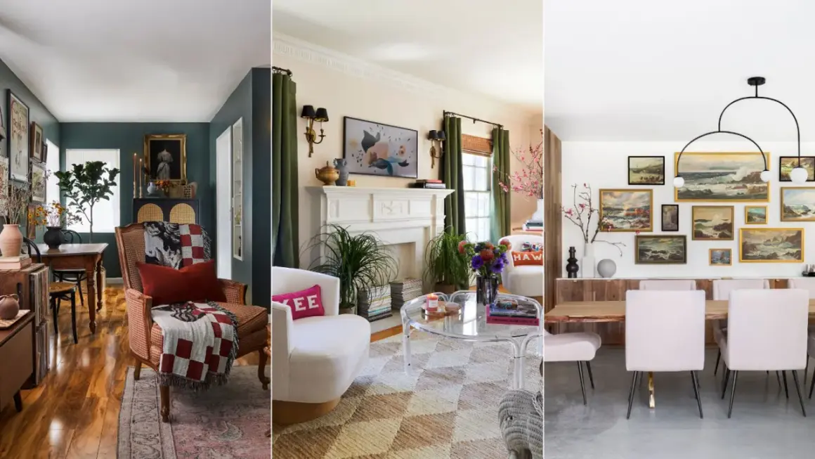
Living room
This is where the style usually feels most natural. Start with a sofa that has a clean shape but comfortable proportions, then add a rug with enough texture to warm up the room. A pair of upholstered chairs, a simple coffee table, and one traditional detail, such as a carved wood side table or a classic lamp, are often enough to ground the space.
I like to keep the art coordinated but not matching. A single large-scale piece or a small, carefully edited gallery usually works better than a wall full of mixed frames. The goal is calm, not emptiness.
Kitchen
Kitchens benefit from the style because it naturally balances function and softness. Shaker cabinets, quartz countertops, understated hardware, and simple pendant lights are a reliable combination. If you want the room to feel more tailored, choose a classic tile backsplash with clean grout lines instead of something overly decorative.
In kitchens, I would rather spend on cabinetry and lighting than on trendy surfaces that will date quickly. That is where the style earns its longevity. The room still feels polished, but it also works hard every day.
Bedroom
A bedroom needs more softness than a living room, so this is a good place for layered bedding, upholstered furniture, and warmer finishes. A curved headboard paired with crisp side tables is a nice transitional move because it mixes softness with structure. Keep accessories low and purposeful so the room feels restful rather than staged.
Read Also: Victorian Interior Design - Modern Elegance, Not Overdone
Entryway or hallway
Small connecting spaces can use the style beautifully because they do not need much to feel finished. A console table, one mirror with a classic profile, a lamp, and a runner are often enough. If the rest of the home is more expressive, these areas can act as a quiet bridge between different rooms without breaking the visual flow.
These room examples also point to the biggest trap in the style, which is assuming that “simple” means “easy.” In reality, it only works when the editing is disciplined.
The mistakes that break the look
The most common mistake is pushing the room too far toward one side. If everything is ornate, the space stops feeling transitional and starts feeling traditional. If everything is sharp and minimal, the warmth disappears and the room feels generic. The style lives in the middle, which means extremes are usually the first thing I remove.
Another issue is overmixing finishes. A little variation is good. Too many competing metals, wood tones, and surface sheens can make the room feel busy even if the furniture itself is simple. I usually recommend choosing one dominant story for the room and letting the rest support it.
People also underestimate scale. A delicate table next to a heavy sofa can look accidental, not curated. Transitional spaces depend on proportion, because the style uses subtle differences in shape to create interest. If the scale is off, the room loses its quiet balance.
Finally, there is the problem of overdecorating. Because the style is neutral, people sometimes try to “fix” it with too many accessories. That usually backfires. It is better to use a few objects with real presence than to scatter small decor everywhere. In this style, editing is part of the aesthetic, not an afterthought.
If you avoid those mistakes, the design becomes much easier to build intentionally, which is exactly what the next section is for.
A practical order for designing it
When I work through a room like this, I do not start with decor. I start with structure, then shape, then texture. That sequence keeps the space coherent and prevents impulse purchases from setting the tone too early.
- Choose the base palette first, and keep it calm enough to support both traditional and modern pieces.
- Lock in the largest items next, especially the sofa, bed, dining table, or main cabinetry.
- Add one or two secondary pieces that introduce contrast through shape rather than through loud color.
- Layer texture through rugs, fabric, wood grain, stone, and lighting so the room does not feel flat.
- Finish with accessories that feel personal, then remove anything that repeats the same idea too many times.
If you are working with a budget, spend first on the pieces you touch every day: sofa, rug, dining chairs, lighting, or cabinet hardware. Those details affect the room’s daily feel far more than a shelf full of decor objects. For many homes, that means the style can be achieved with fewer changes than people expect, provided the core pieces are chosen well.
The other practical advantage is that this approach ages gracefully. You can swap pillows, art, or a table lamp later without changing the whole room. That flexibility is part of why the style has stayed relevant for so long.
The choices that keep the room relevant for years
If I had to describe the long-term appeal of this style in one sentence, I would say it is built for people who want a room to age well rather than announce itself. That means choosing durable fabrics, familiar silhouettes, and finishes that will still feel appropriate when trends move on.
For the biggest pieces, I would lean toward investment items with modest profiles instead of highly trend-driven shapes. A sofa with clean tailoring, a dining table with honest materials, or a cabinet with classic lines can survive multiple refreshes around it. Accessories can be more current, because they are easier to replace when your taste shifts.
This is also the style where performance fabrics make a lot of sense. If a room is meant to feel comfortable and refined at the same time, a fabric that handles daily use without sacrificing texture is a smart tradeoff. The same goes for washable rugs, durable finishes, and lighting that can be dimmed rather than blasting the room with a harsh overhead glow.
The best transitional rooms do not feel frozen in time. They feel edited, calm, and adaptable. That is what makes them useful in real homes, not just visually appealing in photos. If you keep the base quiet, the proportions balanced, and the details intentional, the room will stay relevant long after the novelty of a more rigid style has faded.