Minimalist home decor is easiest to get right when you treat it as a system, not a look. The goal is not to strip a room bare; it is to decide what deserves space, what supports daily life, and what makes the room feel calm instead of unfinished. In this guide, I’ll break down the style, the pieces that matter most, room-by-room priorities, common mistakes, and how to build the look on a realistic budget.
The style works when every piece has a job and a reason
- Minimalism is about editing, not emptiness. Keep what supports function, comfort, and visual balance.
- Texture matters as much as color. Linen, oak, wool, stone, and matte finishes keep the room from feeling flat.
- One strong focal point is enough. A sofa, light fixture, rug, or piece of art can anchor the whole space.
- Good storage is non-negotiable. If everyday items have no home, the room will drift back into clutter.
- Warm neutrals and layered lighting are the safest way to avoid a cold, echoing result.
- In the US, a targeted refresh can start around $300 to $500 and scale up fast if you replace anchor furniture.
What minimalist design really means in a modern home
Good minimalism is not a visual vacuum. It is an editing process: keep the pieces that carry function, shape, and comfort, then remove the rest. When I style a room this way, I always start with the essentials first and only add decor after the space already works.
That matters more in 2026 than it did a few years ago. Recent coverage from Architectural Digest and The Spruce points in the same direction: the stark, all-white version of the style is giving way to warmer neutrals, more texture, and rooms that feel collected rather than staged. In other words, the best version of the style is now less about strict rules and more about restraint with personality.
If you want a practical definition, this is the one I trust: minimalism means every object earns its place. If it does not improve how the room functions or how it feels, it probably does not belong there. Once that foundation is clear, the next question is which elements actually do the work.
The elements that do the heavy lifting
Minimal rooms succeed or fail on a few core choices. I like to think of them as the structural pieces of the design, because they shape the room before any decorative accents come in.
| Element | What works best | Why it matters |
|---|---|---|
| Color | Warm white, ivory, oatmeal, taupe, soft gray, muted clay | Keeps the room quiet without making it feel sterile |
| Texture | Linen, boucle, wool, jute, travertine, oak, brushed metal | Adds depth when the palette is restrained |
| Lighting | Layered ambient, task, and accent light at 2700K to 3000K | Prevents the room from feeling flat at night |
| Storage | Closed cabinets, baskets, concealed drawers, low-profile shelving | Protects the calm look from everyday clutter |
| Scale | Fewer but larger pieces with breathing room around them | Small decor in excess can make a pared-back room look busy |
| Negative space | Open floor area, clear tabletops, visual gaps between objects | Gives the eye a place to rest |
If I had to choose only one rule, it would be this: buy less, but make each choice count more. A well-shaped lamp or a substantial rug does more for the room than five tiny objects fighting for attention. That logic becomes even more important when you start styling, because the same room can feel serene or cold depending on how you layer it.
How to keep it calm without making it cold
A minimalist room gets cold when the eye has nowhere to land. The fix is rarely “add more stuff.” More often, it is better color temperature, better texture, and better spacing.
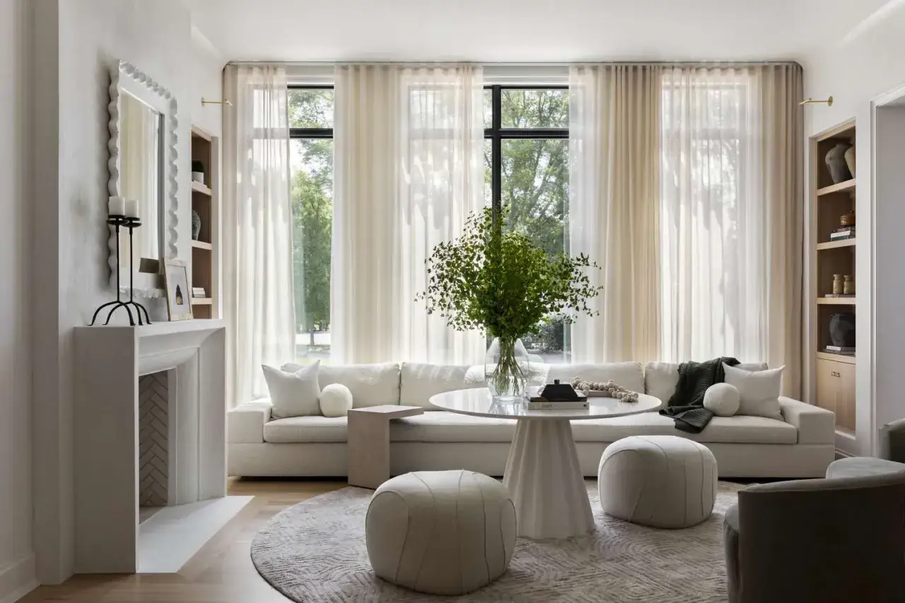
Start with the softest possible neutral palette
I usually begin with a base that leans warm rather than icy. Think creamy white instead of clinical white, oatmeal instead of flat beige, and a soft gray with a brown or green undertone instead of blue-gray. These shades are forgiving, and they age better because they work with natural light at different times of day.
Use texture before adding more objects
If a room feels empty, a textured rug, woven shade, linen drape, or matte ceramic lamp can solve the problem faster than another decorative object. This is where a lot of people get stuck: they keep adding small items when what the room actually needs is material contrast. One boucle chair or a wood coffee table often does more than a shelf full of accessories.
Light the room in layers
Minimalist spaces need more lighting strategy than people expect. One ceiling fixture is not enough if you want the room to feel finished at night. I prefer a mix of ambient light, a reading lamp or two, and a softer accent source such as a wall sconce or picture light. In practical terms, warm bulbs in the 2700K to 3000K range usually feel best in living areas.
Leave some things out on purpose
Negative space is not wasted space. It is what makes the room feel edited. A console table does not need five objects on it, and a sofa wall does not need to be covered from edge to edge. When the empty areas are intentional, the room feels calmer and more expensive without actually being busier.
Once the room feels balanced, the next step is adapting the style to the way people actually live in each space.
Room by room priorities that make the style livable
Minimalism only works long term when it fits the room’s real job. A living room needs different support than a bedroom, and a kitchen has even less patience for decorative clutter.
Living room
Start with seating, a correctly sized rug, and one clear focal point. That focal point can be a fireplace, a substantial art piece, a sculptural lamp, or a well-proportioned coffee table. I also like to hide the mess-makers here first: remotes, chargers, games, extra throws, and anything that tends to land on the nearest surface.
Bedroom
The bedroom should feel especially edited. A strong bed frame, two useful bedside tables, good lamps, and one or two textiles are usually enough. I would rather see a beautiful duvet, a solid headboard, and one framed piece of art than a room crowded with small accents. If storage is weak, the bedroom stops feeling restful very quickly.
Kitchen
The kitchen is where minimalism either proves itself or falls apart. Keep counters as clear as possible, group everyday items by use, and hide visual noise in cabinets or closed drawers. Open shelves can work, but only if you are genuinely disciplined about what stays on them. A kitchen that looks airy in photos but functions badly is not a win.
Read Also: Industrial Loft Style - Avoid Coldness, Get the Look Right
Entryway and bathroom
These smaller spaces benefit from a tight edit. In an entryway, a mirror, a tray, one catchall basket, and a hook or bench can be enough. In a bathroom, think in sets: towel, soap, storage, and one or two tactile details such as a wood tray or stone dish. Small rooms look better when surfaces stay mostly open.
When each room has its own priorities, the style stops feeling like a design exercise and starts feeling like daily life. The main thing left is avoiding the mistakes that make the whole approach look unfinished.
The mistakes that make a pared-back room feel unfinished
Most bad minimal interiors fail for the same predictable reasons. None of them are hard to fix, but all of them are easy to miss when you are focused on decluttering.
- Too many small objects. A shelf full of tiny pieces reads as clutter, even if each item is pretty. Use fewer, larger accents instead.
- One-note color. A room made from only one shade of beige or white can flatten fast. Add depth with undertones and texture.
- No visible storage plan. If daily items have no home, the room will keep drifting back into visual noise.
- Underlighting. Minimalism needs multiple light sources, especially in winter or after dark.
- Ignoring scale. A tiny coffee table, thin rug, or undersized art can make a sparse room feel oddly temporary.
- Trying to remove personality. A neutral room is not the same thing as an anonymous one. The best spaces still say something about the person living there.
The fix is usually not more decor. It is better proportion, better storage, and a clearer point of view. Once those are in place, the question becomes how to spend money without overbuying.
How to build the look on a realistic US budget
In the US, the price range for a minimalist room can swing widely depending on whether you are editing what you already own or replacing the anchor pieces. I would budget from the floor up: lighting, rug, seating, storage, then decor. The small accents should come last because they are the easiest thing to overbuy.
| Budget level | What it can usually cover | Typical spend |
|---|---|---|
| Starter edit | Decluttering, paint touch-ups, lamps, baskets, one accent textile | $150 to $500 |
| Targeted refresh | Rug, side tables, window treatments, art, one accent chair | $500 to $1,500 |
| Full room reset | Sofa or bed, storage furniture, lighting, rug, window treatments | $1,500 to $5,000+ |
If I were shopping for this style, I would spend first on the pieces that carry the room visually and physically. A well-made sofa, a substantial rug, and good lighting matter far more than a pile of decorative objects. After that, I would add just enough texture to soften the space: one woven element, one natural material, and one object with a bit of character.
That approach keeps the room from looking thin, even if the overall budget is modest. It also makes the style easier to maintain, because you are investing in fewer items that have to work harder.
What I would keep if I were styling this for 2026
If I were starting from scratch, I would keep the palette warm, the furniture lines clean, and the materials tactile. I would avoid the temptation to turn the room into a showroom, because the strongest version of this style now feels lived in rather than perfect. One or two meaningful objects, repeated materials, and enough negative space to let the room breathe will do more than a long list of decor purchases.
The real test is simple: when you walk into the room, does it feel calm, useful, and intentional? If the answer is yes, the space is doing its job. If not, remove one more thing before you add anything else, because restraint is usually what makes the whole design work.