The last Wright house is a useful reminder that a home can feel calm, specific, and deeply modern without relying on excess. More than a late blueprint made real, it is a lesson in how proportion, built-ins, materials, and light do the heavy lifting inside a room. In this article, I break down what makes the final residential design so compelling and how to borrow its ideas in a real interior.
The core idea is that architecture, furniture, and light work as one system
- RiverRock House turns a 1959 Frank Lloyd Wright drawing into a built interior instead of a preserved idea.
- Its strongest moves are built-ins, a restrained material palette, and circulation that feels intentional.
- The rooms stay current because they solve practical problems like clutter, poor daylight, and wasted space.
- You can borrow the look with lower furniture, better storage, and one clear focal point.
- The style works best when you respect scale; if you ignore proportion, the whole effect weakens.
What the final Wright house actually is
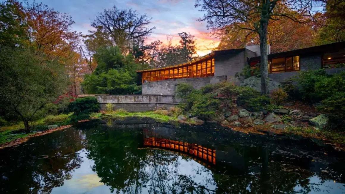
RiverRock House in Willoughby Hills, Ohio, is the built version of Frank Lloyd Wright’s final residential commission, Project #5909. The plans were drawn in 1959 for the Penfield property, then sat unbuilt for decades before being realized on the same land near the Chagrin River.
That context matters for interior design because this is not just a revived facade or a nostalgia project. Wright was already thinking about how the rooms would sit on the site, how the house would be entered, and how the interior would respond to a tall client and a wooded landscape. The nearby Penfield House had already been shaped around Louis Penfield’s 6-foot-8 frame, with slender ribbon windows, tall narrow doors, and unusually high ceilings, so RiverRock feels like a continuation of a very specific design logic.I find that useful because it explains why the house feels personal without becoming fussy. The interior is doing something more disciplined than decoration, and that discipline is what makes the whole project worth studying. Once you look at it that way, the room experience starts to make sense before you even think about style.
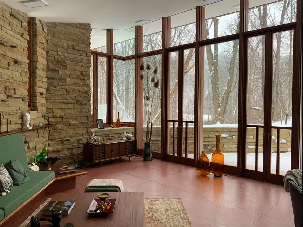
Inside the house, Wright uses restraint as the main decorative tool
The interior language is classic Wright: built-in shelving, banquette seating, tall windows, tight hallways, and natural finishes that keep attention on the room itself. Cherokee Red concrete floors, radiant heat, stone, wood, and a working fireplace give the house warmth without visual noise. Even the mullions, the vertical supports that break up the glass, feel tuned to the landscape rather than used as ornament.
What stands out to me most is the way the house balances compression and release. Narrow passages lead into brighter, more open rooms, so movement through the house feels choreographed instead of accidental. In design terms, that means the plan uses a tighter threshold to make the next space feel more generous. It is a small trick, but it changes the emotional rhythm of the interior.
The furniture is not an afterthought here either. Built-ins lock the room proportions in place, while banquettes and low seating keep the eye close to the horizontal line of the house. That is one reason the interior feels cohesive instead of staged. The room is not being decorated from the outside in. It is being built from the inside out.
The result is not minimalism in the modern Scandinavian sense. It is a more grounded simplicity, where every visible surface has a reason to be there. That is also why the house still feels relevant now.
Why the plan still feels current in 2026
RiverRock feels current because it solves problems modern homeowners still have: clutter, poor daylight, dead hallways, and rooms that never quite know what they are for. Wright’s answer was to integrate storage, control views, and make the house feel larger through careful geometry rather than excess square footage. That is a better lesson than simply copying the look of midcentury furniture.
The house also avoids the trap of a fully open layout. Instead of turning everything into one undifferentiated space, it uses transitions, built-ins, and sightlines to define where you pause, gather, and move. That makes the interior feel intimate without feeling cramped. It is open enough to breathe, but structured enough to feel intentional.
I think that is the real reason people keep returning to Wright. His rooms are not just beautiful, they are psychologically legible. You understand where to sit, where to walk, and where the focus belongs. That kind of clarity matters even more now, when many homes are visually busy but functionally vague.
If you want to borrow from that clarity, the next section is the one I would start with.
How I would translate the look into a modern home
You do not need a Wright house to borrow the logic. I would start with five moves that keep the look grounded and livable.
| Design move | Why it works | How to use it at home |
|---|---|---|
| Built-ins and banquettes | They reduce visual clutter and make seating feel architectural. | Replace a bulky sideboard or extra chairs with a bench, niche, or wall unit. |
| Natural material palette | Wood, stone, and matte finishes create warmth and continuity. | Limit the room to a few core finishes and repeat them instead of mixing too many textures. |
| Low, horizontal furniture | It reinforces calm and makes the room feel wider. | Choose sofas, tables, and lighting with a lower profile and longer visual lines. |
| Framed daylight | It makes the landscape feel like part of the decor. | Keep window treatments light, use clean lines, and leave sills free of clutter. |
| One focal hearth | It gives the room an emotional center. | Arrange seating around a fireplace, media wall, or sculptural object instead of spreading attention around the room. |
If I were advising a client, I would also keep the palette to three or four core finishes. Once you exceed that, the room starts to look decorated rather than composed. You can add personality later, but the architecture should read first.
That approach works because it preserves Wright’s discipline. The wrong approach does the opposite, which is why the style can fail so quickly when people copy only the surface details.
Where the style can go wrong if you copy it too literally
The biggest mistake is treating the house like a mood board for brown wood and midcentury furniture. Wright’s interiors are successful because the materials are doing spatial work, not because they are trendy. If you remove the logic and keep only the palette, the room loses its force.
- Too many wood tones make the space heavy.
- Too little contrast makes the room flat and lifeless.
- Oversized decor breaks the horizontal rhythm.
- Cheap built-ins or fake paneling expose the concept instantly.
- Heavy drapery blocks the calm daylight the style depends on.
Another common problem is ignoring proportion. Wright changed dimensions to fit Louis Penfield’s height, which is a reminder that scale is not cosmetic. A room that feels “Wright-inspired” but ignores ceiling height, window placement, and circulation will only look approximate. The body has to fit the architecture, not just the furniture plan.
If you want the atmosphere, be honest about the limitations of your own house. Some rooms can handle a strong bench wall or a low ceiling line; others need a lighter touch and more visual breathing room. That is not a weakness. It is the difference between a good adaptation and a costume.
That leads to the broader point of what RiverRock changes in the way we read Wright interiors now.
What RiverRock changes in the way we read Wright interiors today
RiverRock matters because it keeps Wright’s interior ideas attached to use, not nostalgia. In 2026, that makes it a strong benchmark for any home that wants to feel warm, ordered, and human without becoming predictable.
For me, the takeaway is simple. Start with the room’s bones, not the accessories. Get the proportion, the storage, the light, and the focal point right, and the rest of the design becomes easier to make coherent.
If I had to reduce the lesson to one sentence, it would be this: build the room so that furniture, architecture, and movement belong to the same sentence. That is why the final Wright home feels memorable, and it is also why its ideas can still work in ordinary American homes today. Begin with one room, strip out the excess, and let the structure do more of the talking than the decor.