An industrial loft can feel dramatic, but the best versions are not bare or unfinished in the accidental sense. They rely on open volume, honest materials, and a tight edit of furniture so the room feels spacious without turning cold. In this guide, I break down what defines the style, which finishes actually matter, how to furnish and light it, and how to adapt the look to a real home in the U.S.
Key things to know before you commit to the look
- The style works because of contrast: hard surfaces need soft layers.
- Expose structure only when it feels intentional; not every pipe or beam deserves attention.
- Black metal, brick, concrete, leather, and weathered wood are common, but one or two strong materials are enough.
- Lighting matters as much as furniture, especially in large open rooms.
- In smaller U.S. homes and rentals, the look is easier to create with texture, scale, and restraint than with major remodeling.
What gives this style its character
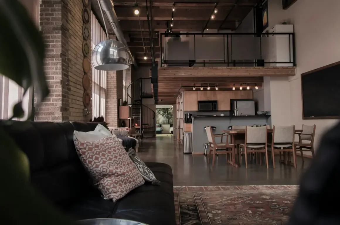
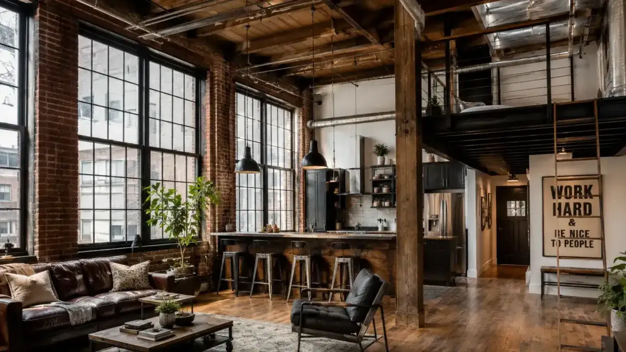
I think of the look as a design language built around utility. You see the bones of the room instead of hiding them: brick, steel, beams, ducts, concrete, big windows, and simple forms that do their job without decoration for decoration’s sake. That honesty is what makes the space feel specific rather than generic.
The appeal is not just visual. Open layouts change how a room is used, and raw materials change how it feels under daylight. A loft-inspired interior reads as relaxed and urban when the proportions are right, but it can feel harsh if every surface is hard and every object is dark. The style succeeds when the room still has rhythm, softness, and a sense of human scale. Once that structure is clear, the next question is which materials should carry the most visual weight.
The materials and finishes that do the heavy lifting
Most of the personality comes from a small group of surfaces, not from dozens of decorative pieces. I usually start by choosing one or two dominant materials and letting everything else support them. If the room already has brick or exposed concrete, I treat those as anchors. If not, I bring in texture through furniture, flooring, wall treatments, or lighting finishes.
| Material | Best role in the room | What it adds | Common mistake |
|---|---|---|---|
| Exposed brick | Feature wall or backdrop | Texture, history, warmth | Painting it too uniformly or pairing it with too many busy finishes |
| Concrete or microcement | Flooring, fireplace surround, counters | Weight, calm, visual continuity | Using it everywhere so the room feels flat and cold |
| Blackened or powder-coated steel | Frames, shelving, lighting, railings | Graphic contrast and structure | Mixing several black metals with no unifying plan |
| Reclaimed wood, oak, or walnut | Tables, cabinets, shelving, beams | Softness and organic relief | Choosing orange-toned stain that fights the rest of the palette |
| Leather, linen, wool | Sofas, chairs, curtains, rugs | Comfort, depth, sound control | Stopping at hard surfaces and forgetting tactile balance |
My rule is simple: keep the number of dominant finishes low. Three strong surfaces are usually enough in one room. After that, the eye stops reading the space as intentional and starts reading it as cluttered. That is why furniture choice matters so much once the shell is set.
How to furnish it without making it feel cold
Furniture is where many people lose the plot. They buy pieces that look industrial in isolation, then wonder why the room feels like a furniture showroom or a warehouse set. I prefer to treat the space like a composition: one large anchor, a few supporting pieces, and enough softness to prevent echo and visual fatigue.
In a living area, I usually start with a substantial sofa, one or two chairs with visible legs, a solid coffee table, and at least one closed storage piece so the room does not fill up with visual noise. If the layout is open, the rug matters more than people think. An 8x10 rug is often the minimum for a standard seating group, while a 9x12 rug usually works better in larger zones because it helps define the footprint. Keep main walkways at about 30 to 36 inches so the room stays easy to use instead of only looking good in photos.
Texture does the softening. I like linen curtains, wool rugs, leather or boucle seating, and a wood tone that is visibly warmer than the metal details. The contrast is what gives the room depth. If everything matches too neatly, the space loses the lived-in quality that makes this style feel credible. After the furniture is in place, lighting and color are what decide whether the room reads inviting or severe.
Lighting and color are what stop the room from feeling like a warehouse
Daylight is the greatest asset in this style, so I always start there. Large windows, sheer treatments, and fewer obstacles around the glass make a bigger difference than most decorative purchases. If the room lacks natural light, the answer is not simply brighter bulbs; it is layered lighting. You need ambient light for the whole room, task light for reading or cooking, and accent light to pull attention to art, shelves, or texture.
For warmth, I usually keep bulbs in the 2700K to 3000K range. That temperature feels comfortable without turning yellow. Go much colder and the room can start to feel clinical, especially if it already has a lot of metal or concrete. A dimmer is worth adding wherever possible because industrial-style rooms often shift from daylight-heavy to evening-heavy very quickly.
Color works best when it stays controlled. I often use a 60-30-10 approach: 60% quiet base color, 30% secondary material or tone, 10% accent. In practice, that might mean warm white walls, wood and black metal as the middle layer, and a restrained accent such as rust, olive, deep blue, or charcoal. A small hit of color is usually stronger than a room full of competing accents. Once you understand that balance, the style becomes much easier to adapt to different kinds of American homes.
How to adapt the look to apartments, rentals, and suburban homes
Most homes in the U.S. do not come with factory bones, so the trick is adaptation rather than imitation. I rarely recommend trying to fake a warehouse from top to bottom. A better strategy is to borrow the language of the style and adjust it to the actual building.
| Space type | Best strategy | What to avoid |
|---|---|---|
| Rental apartment | Use plug-in sconces, art with oversized scale, metal-framed furniture, and a strong rug | Permanent demolition and too many heavy finishes |
| Small city apartment | Choose fewer materials, lighter fabrics, and furniture with open bases to preserve visual space | Dark walls, bulky sectionals, and multiple distressed surfaces |
| Suburban house | Introduce one industrial anchor, such as a steel light fixture, brick veneer, or reclaimed wood piece | Covering every surface in the same hard finish |
| Family home | Prioritize washable textiles, hidden storage, and durable surfaces that can handle everyday use | Fragile décor and shiny finishes that show wear too quickly |
That table reflects the real difference between a concept and a livable room. In a rental, the goal is atmosphere. In a house, the goal is consistency. In both cases, the look works best when one or two industrial cues are allowed to lead instead of every object competing for attention. The next step is avoiding the mistakes that make the style look forced.
The mistakes I see most often
- Making everything black or gray. Dark metal needs relief. Without wood, fabric, or a lighter wall color, the room quickly turns flat.
- Using too many distressed finishes. One worn surface has character. Five of them start to look staged.
- Ignoring acoustics. Hard floors, bare windows, and metal furniture can create echo. Rugs, drapery, books, and upholstered seating fix that faster than repainting.
- Buying furniture that is too small. Large rooms need presence. Tiny pieces make a loft feel awkward rather than airy.
- Relying on one ceiling fixture. One dramatic pendant is not enough. Without layered light, the room feels dim at night and harsh in photos.
- Exposing structure just because it is visible. A pipe or beam only adds value if it looks intentional. Random exposure reads as unfinished work, not design.
What saves the style is restraint. When I see a room go wrong, it is usually because someone tried to add every possible industrial cue at once. A better room has fewer moves, but each one is stronger. That leads to the final question: what should stay in the room once the obvious pieces are in place?
The details that make the room feel finished
If I were styling one from scratch, I would choose one architectural feature, two dominant materials, and three softeners: a rug, curtains, and upholstered seating. That formula keeps the room legible. It also makes it easier to edit later, which matters because the style improves when it is allowed to breathe rather than when it is over-accessorized.
Plants, framed art, and a few personal objects matter more than most people expect. They interrupt all the straight lines and hard edges without fighting the character of the room. I also like to mix old and new on purpose: one vintage chair next to a simple contemporary sofa, or a reclaimed wood table under a clean-lined metal light. That tension is where the style gets its personality.
The best industrial loft feels edited, not copied: one or two raw surfaces, enough softness to absorb sound and light, and furniture that looks chosen rather than themed. If you keep the structure honest and the rest of the room calm, the style becomes livable fast and stays that way.