Wrapping a room in one hue can make it feel calmer, richer, and more intentional than a standard walls-and-trim setup. Color drenching can turn a small powder room into a jewel box and a larger living room into something more cohesive, but the result depends on light, sheen, and texture as much as the paint itself. In the sections below, I break down how the look works, where it shines, and how to plan it so it feels designed rather than simply painted.
What matters most before you commit to a single-color room
- The effect comes from carrying one hue across multiple surfaces, not from using a flat wall color alone.
- Light, undertone, and sheen matter more than the paint chip itself.
- Texture keeps the room from feeling one-note, especially on walls, trim, and ceilings.
- Small enclosed rooms, bedrooms, dining rooms, and home offices are usually the safest starting points.
- Test the color in morning light, afternoon light, and under lamps before you buy full gallons.
Why a single-color room works so well when it has texture
At its best, this approach creates a room that feels visually settled. When walls, trim, ceilings, and sometimes doors or built-ins sit inside the same color family, the eye stops jumping from one boundary to the next. That makes the space feel calmer, and in many homes it also makes architectural details read more clearly.
I think of it as a monochromatic scheme with depth. The hue stays consistent, but the value of the color changes as light hits it, and the finish changes again when you move from a matte wall to a satin door or a slightly glossier ceiling. Value simply means how light or dark a color reads. That shift is what keeps the room from feeling flat.
The strongest versions of the look are rarely the most literal. They rely on shadow, surface texture, and small finish changes to do the heavy lifting. A painted room with plaster, linen, wood grain, or paneling often looks far more refined than a room that uses the same color everywhere but has nothing else going on.
That is why I usually start with the room’s bones, not the paint fan deck. Once the structure is doing some of the work, the next question is where the effect feels most natural and where it needs restraint.
Where I would use it first and where I would be careful
Some rooms are almost built for this treatment. Others need more discipline, especially in American homes where open-plan layouts and builder-grade trim can make a color choice do more visual work than expected.
Best rooms to start with
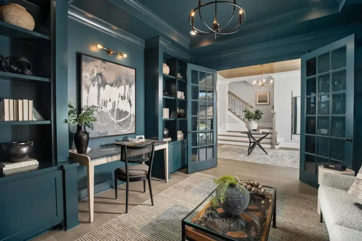
- Powder rooms - These are low-risk and high-reward. A compact room can handle a darker or more saturated color without feeling heavy, and the result often reads as intentional right away.
- Dining rooms - Enclosed rooms are easier to unify, and the color can make the space feel more formal without needing extra pattern.
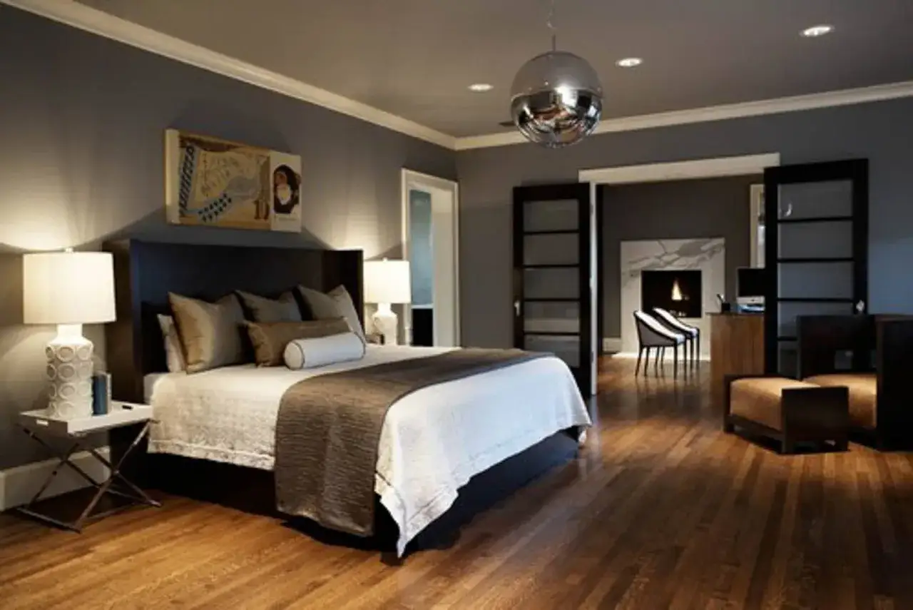
- Bedrooms - A full-color envelope can make a bedroom feel softer and quieter, especially if you want the space to feel like a retreat.
- Home offices - A cohesive palette reduces visual noise, which helps if the room already has screens, shelves, and paperwork.
- Mudrooms and entries - These smaller transition spaces can handle boldness and often benefit from the cleaner read of one color family.
Read Also: Mediterranean Interior Design - Get the Authentic Look!
Rooms that need more restraint
- Low-light spaces - North-facing rooms or rooms with very little natural light can turn muddy if the color is too cool or too dark.
- Very open main floors - Large open plans can feel monotonous if the same deep color runs too far without a visual break.
- Rooms with already busy finishes - Strong stone veining, patterned flooring, or highly detailed cabinetry can fight with a saturated wall color.
- Spaces you want to redecorate often - If you switch furniture and art constantly, a heavily committed palette can be harder to live with.
My rule is simple: if the room already has good shape, this treatment can make it feel more polished. If the room has weak light or too many competing finishes, I slow down and test more carefully. That leads directly to the part most people underestimate, which is choosing the right color family in the first place.
How to choose a color that still feels dimensional
The safest choices are rarely the brightest ones. In 2026, I am seeing the strongest results in earthy neutrals, olive, clay, smoky blue, mushroom, and muted burgundy. Those shades have enough depth to feel designed, but they do not scream for attention the way a pure primary color can.
I also pay close attention to undertone. A warm taupe with a pink base will behave very differently from a taupe with green or gray notes, especially once it lands next to wood floors, brass, stone, or upholstery. Undertone is the subtle color hiding inside the color, and it is usually what makes a room feel harmonious or slightly off.
| Room condition | Color direction I would try | Why it works |
|---|---|---|
| North-facing or dim room | Warm white, mushroom, soft clay, muted tan | Keeps the room from reading cold or flat |
| South-facing room | Smoky green, deep blue, burgundy, olive | Handles richer saturation without losing clarity |
| Small powder room | Ink blue, forest green, charcoal brown | Creates a jewel-box effect without competing with much else |
| Open-plan main level | Muted khaki, taupe, sage, dusty blue | Unifies the space without overwhelming adjoining areas |
I also check LRV, or light reflectance value, when I want a quick read on how much light a color bounces back. Lower LRVs feel deeper and moodier. Higher LRVs feel lighter and more forgiving. That matters because the same shade can feel elegant in one room and muddy in another.
My practical test is straightforward: I paint large sample boards, not tiny patches, and move them around the room for at least a full day. I want to see the color beside a window, on the darkest wall, and under artificial light. Once the color itself is right, the finish plan is what makes the whole thing feel intentional.
The surfaces and finishes that make the look feel custom
This is where the room stops looking like a single painted box and starts looking designed. I rarely use the same sheen everywhere unless the space is extremely simple. The color stays unified, but the finish changes enough to give the eye something to read.
Walls usually do best in flat or matte finishes because they soften glare and make the color feel richer. Trim and doors often work better in eggshell or satin, especially if you want a subtle edge that catches the light. Ceilings can be painted in the same hue as the walls, either in a slightly softer sheen or, in some rooms, a touch glossier to reflect light upward.
Different materials matter just as much as different sheens. Wood grain, woven upholstery, plaster, stone, and unlacquered metal all keep the space from reading as too uniform. If the room has paneling, crown molding, built-ins, or a fireplace surround, this treatment can be especially effective because the architecture gives the color more places to live.
I am careful with very glossy finishes. They can look dramatic, but they also highlight wall imperfections and patchwork repairs. If the drywall is uneven, I prefer a softer finish and let the trim carry the crispness instead.
The bigger lesson is that one color does not mean one texture. The best rooms still have layers. Once that is in place, the main risk is not the color itself, but the mistakes that make it feel thin or overdone.
Mistakes that flatten the result
- Choosing a color from a tiny chip - A shade that looks elegant in a store can turn green, pink, or gray once it meets your home’s light.
- Ignoring the undertone of permanent finishes - Floors, countertops, tile, and wood trim can all clash with a color that seemed safe on paper.
- Using one finish everywhere - Walls, trim, and ceilings need some variation or the room can feel visually dead.
- Forgetting about adjacent rooms - A beautifully wrapped room can still feel disconnected if the hallway or next space feels unrelated.
- Going too bright too fast - Saturation is not the same as sophistication. A color can be vivid and still feel balanced, but pure primaries usually demand more care.
- Skipping texture - A monochromatic room without material contrast often feels like a swatch, not a finished interior.
The easiest mistake is assuming a room needs no contrast once everything shares the same color family. It still needs contrast. It just comes from light, texture, and sheen instead of multiple competing hues. That is why I always plan the room before I pick up a roller.
A practical way I would plan the room
- Start with the function. I decide whether the room should feel calm, intimate, polished, dramatic, or airy before I think about the paint.
- Read the fixed finishes. Floors, stone, cabinetry, hardware, and window light tell me more than a trend chart does.
- Narrow the palette to two or three families. I usually compare a warmer option, a cooler option, and one in the middle.
- Test on a large scale. A 2-by-2-foot sample board gives a much better read than a small patch on the wall.
- Check the room at three times of day. Morning light, late afternoon light, and evening lamp light can change the same color dramatically.
- Map the sheen before painting. I decide which surfaces will stay matte, which will catch light, and where I want a slightly more tailored edge.
If I am working on an older home, I pay extra attention to trim profile and wall prep. Uneven molding or patchy drywall becomes more visible when the whole room sits in one color story. In that case, the prep work matters as much as the palette, and sometimes more.
Once that plan is in place, the final details are what separate a room that feels finished from one that just happens to have the same paint everywhere.
The small details that make the finish feel custom
When a monochromatic room works, it is usually because the designer respected the quiet details. I like to repeat the color in one or two soft places, such as a lamp base, a drapery lining, a painted shelf, or an upholstered chair, so the palette feels echoed rather than forced.
- Let one natural material break the saturation, such as wood, stone, linen, or brass.
- Keep artwork and accessories restrained if the room is already visually dense.
- Use warmer bulbs if the color leans cool, and cleaner light only if you want a sharper modern read.
- Choose a finish that suits the room’s imperfections; a softer sheen often ages better than a high-gloss one.
If I had to reduce the whole approach to one rule, it would be this: choose a color family that suits the room’s light, then let finish and texture do the heavy lifting. That is what makes a single-color interior feel quiet, tailored, and current instead of flat, and it is usually the difference between a passing trend and a room that still feels right years later.