
The style works best when every bold choice has a reason
- Use one strong thread, such as a color family, material, or era, to tie the room together.
- Mix pattern scales instead of repeating the same print everywhere.
- Display collections in clusters, then leave a few calmer surfaces for visual rest.
- A single room can shift the whole look with paint, lighting, textiles, and art.
- For a U.S. room refresh, DIY projects can start in the low hundreds, while full redesigns move into the thousands.
What makes a room feel maximalist rather than messy
The difference is not how much you put into the room. It is whether the room has a clear point of view. In 2026, the strongest versions of the style feel curated, personal, and a little surprising, not overcrowded. I look for repetition, contrast, and a few places where the eye can pause. Without those three things, abundance starts to read as clutter.
A useful test is to ask whether a new object strengthens the story of the room or just adds volume. If it repeats a color already in the room, echoes a shape, or deepens the mood, it probably belongs. If it only exists because there was an empty corner, it usually does not.
| Design cue | Maximalist room | Room that feels cluttered |
|---|---|---|
| Color | One or two dominant hues repeat across walls, textiles, and decor | Many unrelated colors compete without a clear anchor |
| Pattern | Different scales and motifs share a common thread | Every print fights for attention at the same visual level |
| Objects | Collections are grouped and edited | Objects are spread out in single, unplanned pieces |
| Negative space | There are a few quiet surfaces that give the room breathing room | Every wall and tabletop feels equally busy |
That distinction matters because the style lives or dies by the rules behind the layers, and those rules are what make the room feel coherent instead of chaotic.
The four building blocks I repeat to keep the look coherent
I usually start with four decisions and keep returning to them as the room grows. They are simple, but they do most of the heavy lifting.
Start with a dominant color story
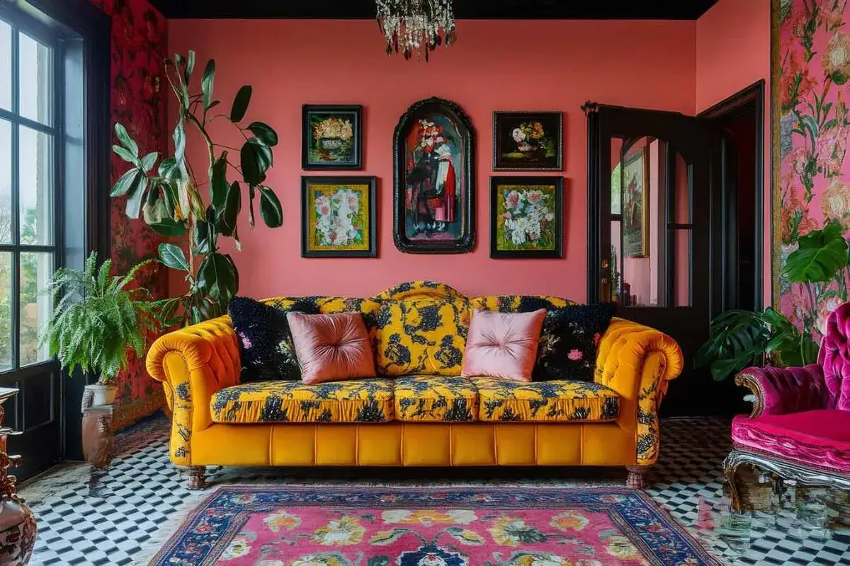
Choose one main color family and let it appear in several places. That might mean deep green with brass and walnut, or coral with navy and cream, or a softer branch of the style that leans on warm taupes, tobacco tones, and smoky blues. The point is not to match everything. It is to create a visual thread that makes the room feel intentional.
If color feels intimidating, color drenching can help. That means carrying one hue across the walls, trim, and sometimes the ceiling so the room feels wrapped in a single atmosphere. It is especially effective when you want a bold room to feel immersive instead of chopped up.
Mix pattern by scale, not by accident
One of the easiest ways to get this wrong is to use several patterns that all have the same visual weight. I prefer to combine one large print, one medium print, and one small print, then repeat a color in each. A big floral can sit next to a narrow stripe and a tiny geometric if they share a palette. The repetition keeps the mix readable.
Think of pattern as rhythm. If every beat hits at the same volume, the room feels loud. If the scales change, the eye can move comfortably through the space.
Layer texture so the room feels rich in daylight and at night
Texture is what keeps a room from becoming flat once the color is in place. Velvet, bouclé, lacquer, carved wood, woven baskets, linen, metal, and stone all behave differently in light. A room with only one surface type can look decorated but still feel thin.
I like to include at least three tactile categories in one room. For example, a velvet chair, a woven rug, and a lacquered side table create contrast without needing more color. That is a practical way to get depth even in smaller homes.
Curate objects in clusters
Collections look stronger when they are edited into groups. A stack of books, a ceramic bowl, and one framed photograph can feel richer than three objects spread across three shelves. The same rule applies to gallery walls, mantels, and console tables. Grouping creates rhythm; scattering creates visual static.
When I style shelves, I usually think in vignettes, which are small scenes that tell one story. A vignette can be as simple as a lamp, a book stack, and a piece of art. The trick is to repeat shapes or materials so the grouping feels related instead of random.
Once those building blocks are in place, the style becomes much easier to translate into specific rooms, which is where the design starts to feel real.
Room-by-room ideas that translate in real homes
Maximalist rooms do not all need to look the same. The best version of the style responds to function, light, and how people actually use the space. A lively living room can carry more visual weight than a bedroom, and a dining room can usually handle stronger contrast than a hallway.
Living room
This is the easiest place to go bold because the room already invites gathering and conversation. I like to start with one anchor piece, usually a sofa or rug, then build outward with art, lighting, and layered pillows. A gallery wall works well here because it gives you a place to mix frames, prints, and personal photos without making the room feel fragmented.
Use one large rug if you can. It grounds the furniture and keeps all the pattern from floating away. If the room has enough scale, a dramatic chandelier or sculptural floor lamp can act as the visual exclamation point.
Bedroom
Bedrooms need more restraint than living rooms, but they do not need to be plain. I usually keep the bed and bedding relatively calm, then bring in drama through wallpaper, drapery, lamps, and one strong piece of art. That gives the room personality without making it feel restless at night.
Headboards are useful here because they create a clear focal point. If you want the room to feel indulgent, use layered textiles and a rich wall color behind the bed. If you want it to feel softer, lean on tonal pattern and warm neutrals instead of high-contrast graphics.
Dining room
This is the room where bold moves often pay off fastest. A dining room can carry a strong wallpaper, painted millwork, or a dramatic pendant without feeling overworked because the furniture plan is usually simpler. I like this space for patterned chairs, glossy finishes, and art that would feel too intense elsewhere.
Because the room is used in a fairly defined way, you can be more theatrical with the envelope. That is one reason dining rooms often become the most memorable spaces in a house.
Read Also: Minimalist Home Decor - Calm, Functional, & Not Cold
Entryway or home office
Entryways are ideal for first impressions. A mirror, a console, a lamp, and one assertive pattern are often enough to set the tone for the rest of the home. In a home office, the style works best when the desk surface stays controlled and the personality lives in the walls, shelving, and accessories around it.
Both spaces benefit from a clear focal point. If you only have the budget for one bold move, this is where I would spend it because the impact is immediate.
Those room-level choices matter even more when the footprint is tight, because smaller spaces punish sloppy layering faster than large ones.
How to keep the look calm in smaller spaces
Small rooms can absolutely handle abundance, but they need more discipline. The goal is not to use fewer things. The goal is to make each thing work harder. I usually aim to leave about 25 to 30 percent of a small room visually quiet so the eye has a place to rest.
| Constraint | Better move | Why it works |
|---|---|---|
| Low ceiling | Use tall drapery, vertical pattern, or artwork that pulls the eye upward | It stretches the room visually instead of compressing it |
| Little natural light | Choose warm tones, glossy finishes, and layered lamps | Reflective surfaces and warm color prevent the room from feeling heavy |
| Limited storage | Use closed cabinets, baskets, and built-ins to hide loose items | Maximalism looks best when the everyday clutter is under control |
| One room does everything | Repeat the same palette across all functions | Shared color makes the space feel unified even when the uses change |
If bright color feels too strong, you can still keep the spirit of the style with rich neutrals, layered texture, and tone-on-tone pattern. That version is calmer, but it is still maximalist in structure because it relies on depth rather than emptiness.
The main idea is simple: in a smaller space, the room should feel edited, not depleted. That leads directly to the mistakes I see most often when people try this look on their own.
The mistakes that turn abundance into noise
- No anchor color. Without a repeated hue, the room never settles into one visual story.
- Too many small objects. A hundred tiny accents often look messier than a few larger, more deliberate pieces.
- Pattern without scale contrast. If every print has the same intensity, nothing stands out and the room feels flat.
- Ignoring lighting. Bold colors and glossy finishes need thoughtful light or they can look harsh instead of rich.
- Skipping storage. Open display is great for style, but hidden storage is what keeps the room functional.
- Making every wall important. A room needs places of rest; not every surface should be a headline.
When I troubleshoot a room that feels off, the fix is usually not to remove the personality. It is to sharpen the hierarchy. One strong focal point, one or two supporting patterns, and a few quieter surfaces almost always work better than adding more decoration.
That idea matters because the next question is practical: what does it actually cost to do this well, and where should the money go first?
What it usually costs in the U.S. and where to spend first
For a single room in the U.S., I think in tiers rather than fixed prices, because quality, region, and custom work change the numbers fast. These ranges are broad, but they are useful for planning.
| Budget tier | Typical scope | Best use |
|---|---|---|
| $250-$1,000 | Paint, pillows, lamps, thrifted art, small decor swaps | Testing the style without committing heavily |
| $1,500-$5,000 | Rug, curtains, accent chair, wallpaper or paint, new lighting, several art pieces | A full room refresh with visible impact |
| $5,000-$15,000+ | Quality upholstery, custom drapery, built-ins, custom wallpaper, designer styling | A substantial redesign with a more polished finish |
If the budget is tight, I would spend first on the rug, lighting, and window treatments. Those three elements do more to establish scale and mood than smaller accessories ever will. Custom upholstery and built-ins are beautiful, but they are also the items most likely to push both cost and lead time upward. In many projects, the hidden variable is timing: made-to-order pieces can add several weeks before the room feels finished.
Once you know what the budget can support, the smartest move is to test the look in a low-risk way before you commit to every wall and every piece of furniture.
A quick test before you commit to the style
- Pick one anchor piece, such as a rug, artwork, or sofa, and let it define the palette.
- Add three layers: one pattern, one texture, and one personal object grouping.
- Photograph the room from the doorway and check whether the eye knows where to land first.
- Remove one item for every new item if the room starts to feel crowded.
- Keep at least one surface or wall area noticeably quieter than the rest of the room.
If the room feels energetic, personal, and easy to live with, the style is working. If it feels crowded after the first few layers, slow down and edit before you buy more. The strongest rooms are usually the ones where the color, pattern, and objects all feel like they belong to the same story.