
Japandi style pairs Japanese restraint with Scandinavian warmth, and that balance is exactly why it works so well in real homes. In this article, I break down what defines the look, how to choose the right colors and materials, how to apply it room by room, and where people usually overdo it. I also cover practical budget ranges and the mistakes that make a serene space feel flat instead of calm.
The quickest way to get the look right is to edit first, then add warmth in layers
- Think of the style as a blend of minimalism, craftsmanship, and comfort, not a strict formula.
- Start with warm neutrals, natural wood, and matte finishes before adding decor.
- Keep furniture low, simple, and functional so the room feels open rather than empty.
- Use contrast sparingly, usually through black accents, charcoal textiles, or darker wood.
- Build in storage early; the look depends on visual calm, not just good accessories.
Why this look feels calm without feeling cold
At its best, the style is not about stripping a room bare. It borrows the Japanese respect for simplicity and imperfection, then adds the Scandinavian instinct for softness and livability. That is why the result feels grounded: every object earns its place, but the room still invites you to sit down and stay awhile.
I think that distinction matters because a lot of people confuse this approach with plain minimalism. Minimalism can become severe when it relies only on white surfaces and rigid symmetry. This hybrid style works better when it keeps a human scale, gentle texture, and a sense of use. A handmade bowl, a low bench, or a slightly irregular ceramic vase can do more than a wall full of decorative objects.
It also fits the way many American homes are used in 2026: open-plan spaces, hybrid work, smaller apartments in urban areas, and a growing preference for rooms that feel restorative instead of busy. Once you see that emotional logic, choosing the palette and furniture becomes much easier.
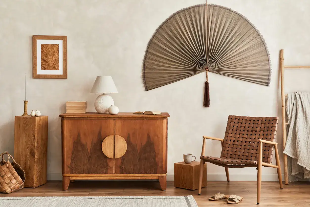
The palette and materials that do most of the work
The palette is where most rooms succeed or fail. I usually think in a 70-20-10 rhythm: about 70 percent quiet neutrals, 20 percent warm material contrast, and 10 percent darker accents. That keeps the space calm without turning it into a beige box.
| Element | Best choices | Why it works |
|---|---|---|
| Wall color | Warm white, soft greige, putty, stone | Creates brightness without harsh contrast |
| Wood | White oak, ash, walnut, smoked oak | Adds grain, warmth, and depth |
| Textiles | Linen, wool, cotton, boucle in moderation | Softens hard surfaces and reduces visual echo |
| Surface finishes | Matte plaster, clay, ceramic, honed stone | Feels quieter than glossy or high-shine materials |
| Accent tones | Charcoal, ink black, deep brown, muted sage | Gives definition without breaking the calm |
For furniture, I look for pieces with visible craftsmanship rather than heavy ornament. Think clean joinery, slim frames, rounded corners, and upholstery that feels tactile instead of slick. Low-profile sofas and beds are common because they keep the eye closer to the floor, which makes a room feel calmer and more spacious. If you want the look to read as intentional rather than trendy, skip matching sets and mix materials carefully instead.
The one material rule I would not ignore is this: avoid fake versions of natural finishes. Faux wood grain, overly shiny "stone," and plastic-looking rattan usually break the mood immediately. Real texture matters here, even if you keep the rest of the room very restrained. From there, the style becomes much easier to adapt room by room instead of copying a single showroom image.
How I would translate it room by room
The look works best when each room gets a slightly different interpretation. A bedroom should feel quieter than a kitchen, and a living room should feel a little more layered than a bathroom. I like that flexibility because it keeps the house from looking copied and pasted.
Living room
Start with one grounded seating piece, a simple wood coffee table, and a rug with enough texture to prevent the room from feeling flat. A lamp with a paper or linen shade can soften the light, and one sculptural object is usually enough on the shelf or console. If you have a TV, build in storage or keep the wall around it visually quiet so it does not dominate the room.
Bedroom
This is the easiest room to get right because the function already supports calm. I would use a low bed, crisp but soft bedding in layered neutrals, and two bedside surfaces that are almost empty. One or two meaningful objects are enough. The mistake I see most often is adding too many decorative pillows, which quickly turns a restful room into a staged one.
Kitchen
In kitchens, the style is about reducing visual noise. Flat-front cabinets, matte hardware, and a restrained backsplash usually work better than busy tile or heavy contrast. If open shelving is part of the plan, keep it edited to everyday ceramics and a few useful objects. That way the room feels lived in, not assembled for display.
Read Also: Modern English Cottage Interior - Your Guide to Timeless Charm
Bathroom
Here I would focus on touch rather than decoration: a wood stool, textured towels, a stone tray, and warm lighting can change the whole mood. Bathrooms are often too bright and too shiny, so replacing harsh bulbs and reducing reflective finishes makes a bigger difference than buying new accessories.
Once you think in room-specific terms, the style stops being a vague aesthetic and becomes a set of choices you can actually make. That leads directly to the question most people ask next: how much does a realistic version of this cost?
A realistic budget and rollout plan
For U.S. homes, I would treat the numbers below as planning ranges, not quotes. Final cost depends on room size, whether you buy custom pieces, and how much you can reuse.
| Scope | Typical planning budget | What usually changes |
|---|---|---|
| Small refresh | $300-$1,200 | Paint, textiles, lighting, a few decor pieces, minor storage tweaks |
| Room reset | $1,500-$5,000 | New rug, sofa or bed frame, side tables, better lamps, updated storage |
| Full room makeover | $5,000-$15,000+ | Upholstery, custom millwork, built-ins, cabinetry, higher-end finishes |
If I were starting from scratch, I would do it in this order: first clear out what does not serve the room, then choose the anchor furniture, then lock in lighting, and only after that add the small decorative pieces. That sequence matters because the style depends more on restraint than on shopping. A room with the right sofa, the right light, and the right wood tone already feels 80 percent there.
For smaller budgets, I would spend the money where the eye lands first: the sofa or bed, the rug, and the main lamp. For larger budgets, I would put more of the spend into built-in storage and custom joinery, because hidden storage is what keeps the whole scheme from drifting into clutter. That practical foundation is also what prevents the style from going wrong in the first place.
Common mistakes that make it look flat
The biggest mistake is confusing calm with emptiness. A room can be minimal and still feel warm, but only if the materials have enough variation. When everything is the same pale tone and the same smooth finish, the space loses depth fast.
- Using too much white and not enough warmth
- Buying matching furniture sets instead of mixing clean-lined pieces
- Adding too many decorative objects on open shelves
- Choosing glossy finishes that fight the soft, matte mood
- Ignoring storage and then trying to style clutter away
- Skipping layered lighting and relying on one overhead fixture
Another common error is making the room too precious to live in. The best versions can handle a mug on the table, a stack of books, or a throw draped across the sofa. That lived-in quality is part of the appeal; without it, the room starts to feel like a set rather than a home. If you keep those limits in mind, the result is a home that feels deliberate without becoming precious.
The details I would not skip in a modern home
If I were finishing a room today, I would pay special attention to three details: lighting temperature, texture balance, and storage discipline. Warm lighting does a lot of the emotional work, especially in the evening. Texture balance matters because the style needs something soft against something harder, such as linen against wood or ceramic against plaster. And storage discipline matters because visual clutter is the fastest way to lose the entire effect.
I would also be careful not to treat the aesthetic as a rigid rulebook. The strongest rooms usually include one or two personal elements that do not look fully styled on purpose: an inherited stool, a handmade bowl, a framed print with quiet color, or a plant with some height. Those pieces keep the room from becoming generic, which is the real risk with any popular interior trend.
In 2026, this look still feels relevant because it answers a very current need: people want homes that are calmer, easier to maintain, and more honest about how they live. If you focus on function first, then warmth, then restraint, you will get the parts of the style that last instead of the parts that age like a trend.
The simplest version of this approach is also the most durable: edit hard, choose better materials, and let a few well-made pieces do the heavy lifting. That is the version I would recommend for most homes, because it feels serene on day one and still makes sense after the novelty fades.