The style works when every visible choice has a job
- Keep the room centered on function first, then add only the pieces that improve comfort or clarity.
- Use a narrow palette, then add warmth through texture, wood, fabric, and light.
- Choose furniture with clean lines and useful storage so the room stays usable day to day.
- Limit decorative objects, but do not remove all personality or contrast.
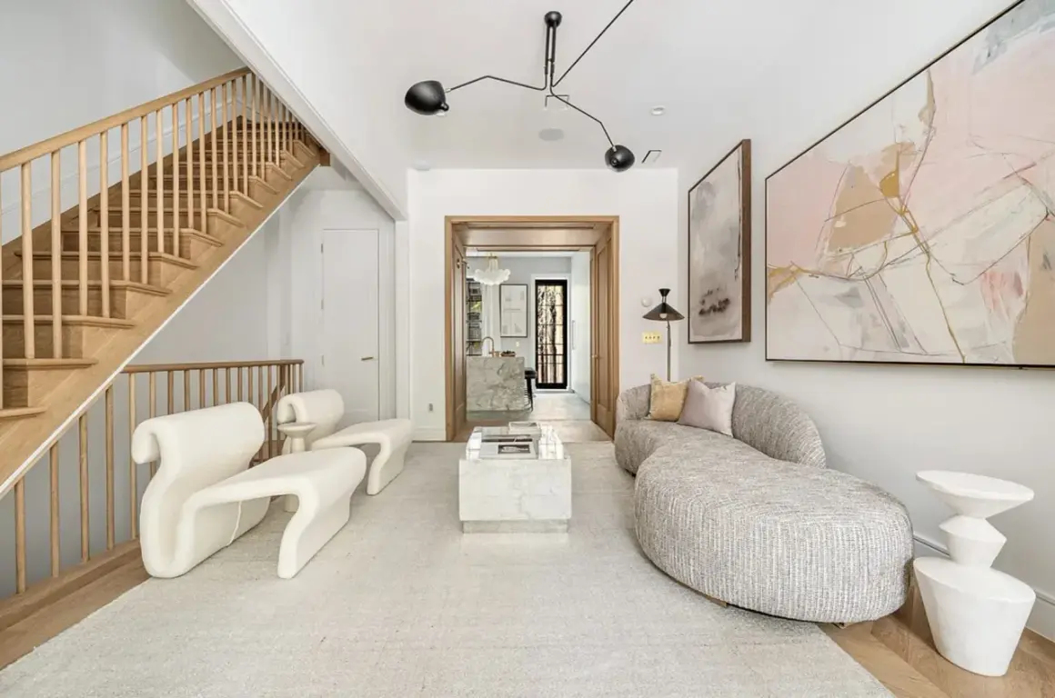
- In 2026, the strongest version of the style feels softer and warmer than the old all-white stereotype.
- The best rooms look edited, not stripped.
What the style really means in a home
I think of this approach as a design discipline, not a visual trick. The point is to reduce friction: fewer distractions, fewer unnecessary purchases, and fewer items competing for attention. In practice, that means clean lines, a restrained palette, practical storage, and a room layout that supports how people actually live.
That is also why the style has evolved. The cold, gallery-like version that once dominated inspiration boards has given way to a softer take with natural textures, quieter contrast, and more human warmth. The room still feels edited, but it no longer looks like nobody lives there.
| Approach | How it feels | Where it works best |
|---|---|---|
| Purely spare | Very clean, sometimes severe | Spaces where the architecture already has strong character |
| Functional | Calm, practical, easy to live with | Most homes, especially busy family spaces |
| Warm minimal | Quiet but inviting, with more softness | Living rooms, bedrooms, and open-plan homes |
For most readers, the second and third versions are the right target. A room should still handle daily life, and that is where the style either succeeds or falls apart. Once that part is clear, the next step is deciding what deserves to stay.
Start with the edit before you buy anything
If I were beginning from scratch, I would not start with decor shopping. I would start by asking what is actually doing work in the room. The fastest path to a calmer interior is usually subtraction, not replacement.
- Remove duplicates. Two extra side tables, three throw blankets, and four nearly identical frames create noise fast.
- Separate useful items from visual filler. If something is decorative but never noticed, it probably does not need to be out in the open.
- Keep objects that earn their place in one of three ways. They are used often, they solve a storage problem, or they add real emotional value.
- Give every surface one job. A console table can hold mail and a lamp, but it does not also need candles, books, a tray, a bowl, and a vase.
- Leave empty space on purpose. Negative space is not waste. It is what lets the room breathe.
One rule I use often is the 12-month test: if something has not been used or genuinely appreciated in a year, it is usually worth reconsidering. That does not mean everything has to be hard-edged or emotionally cold. It means the room should not carry visual debt. Once the edit is clear, furniture becomes much easier to choose well.
Choose furniture that earns its footprint
Furniture is where a lot of people get this wrong. They buy pieces that look minimalist but do not actually improve the room. I would rather see one generous sofa, one properly sized coffee table, and one strong storage piece than a collection of fragile-looking items that leave the room feeling awkward.
| Piece | What works | What to avoid |
|---|---|---|
| Sofa | Simple silhouette, comfortable depth, durable upholstery | Overly sculptural shapes that look good but sit badly |
| Coffee table | Low profile, honest material, enough surface for daily use | Glass tables that show every object underneath them |
| Storage | Closed cabinets, benches, or built-ins that hide visual clutter | Open shelving packed with small objects |
| Accent chair | One strong piece with clean lines and real comfort | Too many small chairs that make the room feel scattered |
| Dining table | A shape that fits the room and leaves easy circulation | Oversized tables that block movement and dominate the space |
As a practical guide, I try to leave roughly 30 inches of walking space in main pathways whenever the room allows it. That is not a law, but it keeps the layout from feeling cramped. I also prefer one or two larger, better-made pieces over several smaller items, because scale matters more than people think in pared-back interiors. If the furniture is wrong, the room will feel unfinished no matter how nice the decor is.
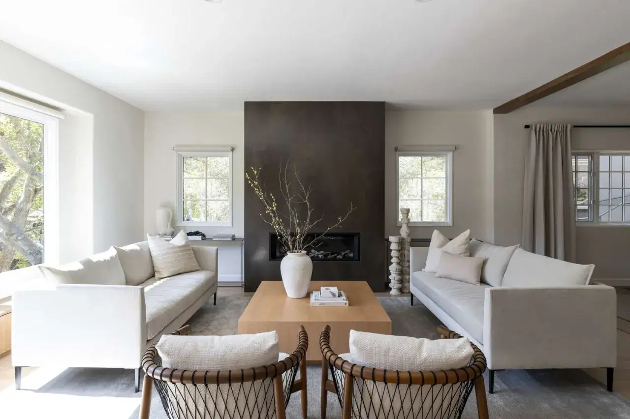
Color, texture, and light do the heavy lifting
This is where the style either becomes rich or turns flat. A narrow color palette is useful, but color alone cannot carry the whole room. Texture and light have to do part of the work, especially in 2026, when the more appealing version of the look leans warmer and more tactile.
Keep the palette narrow
I usually start with one dominant neutral, one supporting tone, and one restrained accent. That might mean warm white, oak, and charcoal; or cream, walnut, and muted sage. The exact colors matter less than the relationship between them. When the palette gets too broad, the room stops feeling intentional.
Use texture instead of visual clutter
Texture is what keeps a simple room from feeling thin. Linen curtains, a wool rug, matte paint, brushed metal, ceramic, stone, and natural wood all add depth without crowding the space. I would rather see three materials used well than six materials used randomly. In a minimalist room, texture quietly carries the personality that ornament would otherwise provide.
Read Also: Color Drenching - The Secret to Rooms That Feel Designed
Let lighting shape the mood
Good lighting is not optional here. I like a layered setup: ambient light for the whole room, task light where people actually read or work, and a little accent light to prevent the space from feeling flat at night. Soft, diffused light is usually better than a single harsh source. It makes clean lines feel calmer and materials feel more expensive.
When the palette, texture, and light are working together, you do not need much decoration. The room already has dimension. That is also why the next section matters so much: the wrong choices make the whole thing feel colder than it should.
The mistakes that make a pared-back room feel lifeless
- Everything matches too closely. Perfectly matched furniture sets flatten a room. Mix tones and shapes instead.
- There is no contrast. A room with only light neutrals can feel washed out. Add one darker anchor, such as a table, frame, or lamp base.
- Decor is too small. Tiny objects scattered everywhere read as clutter, not restraint. Fewer, larger pieces usually look more confident.
- Storage is hidden but not solved. Shoving everything into a closet only postpones the problem. The room still needs a system.
- Personal items disappear completely. The space may look polished, but it stops feeling like home. One or two meaningful objects are enough.
- The architecture is ignored. If the room has strong trim, beams, or old proportions, do not force it into a rigid box.
The biggest misunderstanding is that minimalism means removing character. It does not. It means being selective about which details deserve attention. A room feels dull when the owner has stripped out contrast, warmth, and memory along with the clutter. If you keep those three things intact, the style stays alive.
How to adapt it to apartments, rentals, and busy households
Real homes are not showroom spaces. They have backpacks by the door, chargers on the counter, pet toys under the sofa, and a constant need for storage that still looks decent. I design for that reality, because a style that only works when life is paused is not useful.
| Home type | Best move | What usually helps most |
|---|---|---|
| Small apartment | Use fewer, larger pieces and wall-mounted or closed storage | A big rug, a simple sofa, and one strong light source per zone |
| Family home | Choose durable fabrics and storage that absorbs daily mess | Baskets, cabinets, washable textiles, and a clear landing zone by the entry |
| Rental | Lean on portable solutions instead of built-ins | Neutral curtains, freestanding storage, and one or two quality anchor pieces |
| Older home | Respect the original architecture instead of erasing it | Simpler furniture, fewer competing patterns, and finishes that let the bones show |
If budget is limited, I would spend first on the largest pieces that shape daily use: the sofa or bed, the rug, the main storage unit, and the primary lighting. Decor can wait. The room will feel far more finished when the foundational pieces are right, even if there are only a few accessories on top. That is the practical side of this style, and it is the reason it lasts.
The decisions I would keep if I were styling the room from scratch
If I had to strip the whole approach down to its essentials, I would keep just four rules. First, buy less and choose better. Second, let storage do more of the work than decoration does. Third, keep the palette narrow enough to feel calm, but varied enough to feel human. Fourth, leave room for the room itself to breathe.
That balance is what separates a thoughtful interior from a bare one. The best version of the style is not about proving restraint. It is about creating a space that is easy to maintain, easy to live in, and calm enough to support the rest of your day.
When a room already feels clear, comfortable, and complete, stop editing. That is usually the point where the design has started to work.