What to know before you start
- Warm neutrals work because they rely on undertones, not just on white or beige.
- Texture is what keeps the room from feeling sterile.
- The 60-30-10 rule is still one of the easiest ways to balance a soft palette.
- Wood, linen, wool, stone, and matte finishes do most of the visual heavy lifting.
- Paint samples should be tested in morning, afternoon, and evening light before you commit.
What this style really means in a real home
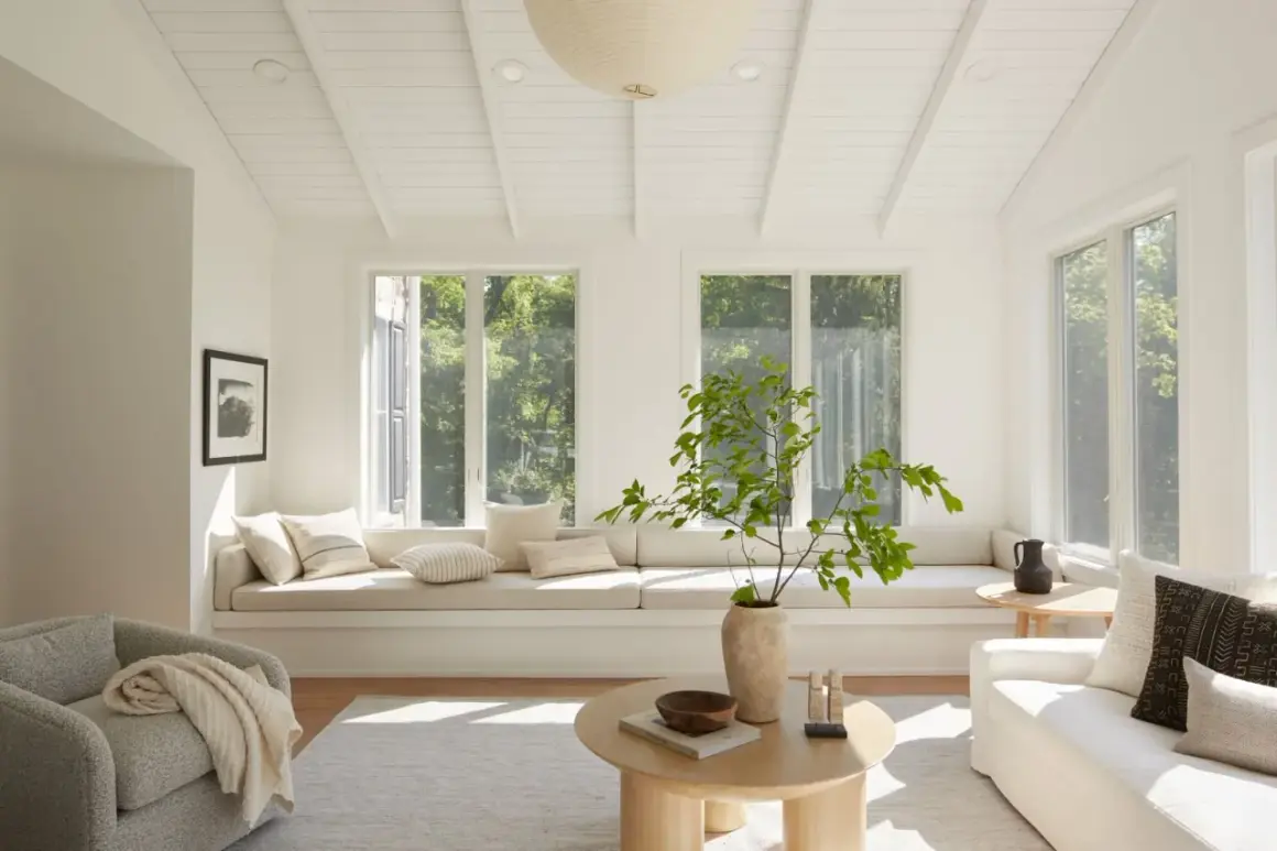
I think the easiest way to understand this look is to stop treating it as a lack of color. A strong neutral interior design scheme is built on undertone, texture, and contrast, not on endless beige surfaces. The best rooms I see right now lean into muted whites, greige, taupe, putty, clay, soft brown, and restrained green tones, all of which feel quieter than a saturated color but far more interesting than a flat builder finish.
That is also why the style has stayed relevant. In 2026, the mood is moving away from cool, lifeless gray and toward warmer, more dimensional neutrals that feel lived in rather than staged. I see that shift most clearly in homes that want calm without stiffness: a living room that needs to flow into a kitchen, a bedroom that should feel restful at night and bright in the morning, or a family room that has to handle real life without looking chaotic.
When this style works, it does not announce itself immediately. It feels settled, edited, and quietly layered. That subtlety is the point, and it is also what makes the next decision so important: the color palette has to be chosen carefully, not guessed at.
How to choose colors that feel warm rather than flat
I start every neutral palette with undertones. Two shades that both look beige on a paint chip can behave very differently once they are on a wall, especially in rooms with north-facing light, strong afternoon sun, or lots of reflected light from nearby flooring. The safest route is to pick one dominant base, one secondary tone, and one darker anchor so the room has structure.
| Color family | What it does | Best use |
|---|---|---|
| Warm white | Brightens a room without making it feel icy | Walls, trim, ceilings, and larger open spaces |
| Greige or putty | Bridges gray and beige for a softer, more flexible backdrop | Living rooms, bedrooms, and hallways |
| Taupe | Adds depth and a slightly more grounded mood | Cabinetry, feature walls, and upholstery |
| Clay or soft brown | Makes the palette feel earthy and rooted | Accent chairs, art, pottery, and textiles |
| Muted green | Acts like a quiet color with neutral flexibility | Paint, millwork, kitchen islands, and built-ins |
| Charcoal or blackened bronze | Gives the room an anchor and keeps the palette from drifting | Lighting, frames, hardware, and small furniture pieces |
The simplest formula is still the one I use most often: 60 percent base color, 30 percent secondary color, 10 percent accent. That does not mean the room has to look formulaic. It just gives the eye a clear structure. If you want the space to read softer, keep the 10 percent in natural objects like wood bowls, ceramic lamps, or linen pillows. If you want more definition, let the accent be black, dark bronze, or a deeper earth tone.
Before buying paint, I would test at least two or three large samples and move them around the room at different times of day. A shade that looks creamy in the morning can turn muddy by evening, and a taupe that feels rich in one room can look oddly pink in another. Once the color story is right, the next layer matters just as much: texture.
Layer texture so the room feels finished
This is where most neutral rooms succeed or fail. Without texture, the palette goes quiet in the wrong way. With it, the room gains depth even if the colors stay restrained. I usually build around a mix of soft, rough, matte, and slightly reflective surfaces so the space has movement without needing bright color.
The materials I reach for first are simple: linen for softness, wool for warmth, wood for structure, stone for weight, and woven elements for a bit of visual looseness. A neutral room can also handle contrast better than people expect. One dark frame, one aged brass lamp, or one blackened bronze detail can keep the whole composition from drifting into sameness.
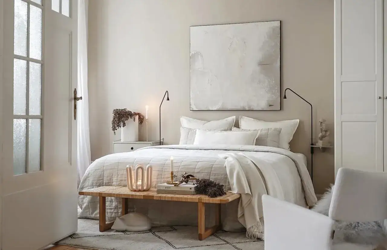
- Linen softens the look of sofas, drapes, and bedding without feeling fussy.
- Wood adds warmth, but I prefer mixing tones deliberately rather than forcing every piece to match.
- Stone or marble brings a cool counterpoint that makes warm neutrals feel more balanced.
- Wool and boucle create depth in pillows, throws, and upholstered pieces.
- Matte paint and satin accents stop the room from looking visually heavy.
I also pay attention to sheen. A matte or flat wall finish feels softer and more forgiving in low-traffic areas, while eggshell is usually a better everyday choice for living spaces. Satin or semi-gloss belongs where moisture and cleaning matter more, such as kitchens, bathrooms, and trim. That is a small decision, but it changes how the whole room reads.
Once the textures are in place, the palette becomes much easier to use from room to room, which is where practical design choices start to matter.
Room by room choices that work in U.S. homes
In many U.S. homes, especially open-plan layouts, the goal is not to repeat the same color everywhere. It is to keep the undertones related so the home feels cohesive as you move through it. A living room can be slightly warmer than the adjoining hallway; a bedroom can be softer and quieter than the kitchen; a bathroom can lean cleaner without breaking the overall mood.
| Room | What to emphasize | What to avoid |
|---|---|---|
| Living room | A warm wall color, one darker anchor piece, and layered textiles | All-white furniture and too many smooth surfaces |
| Kitchen | Cabinetry with a soft undertone, natural wood, and matte metal hardware | Cool gray cabinets that fight the rest of the house |
| Bedroom | Creamy walls, linen bedding, and low-contrast contrasts for rest | Sharp black-and-white contrast that feels too graphic |
| Bathroom | Warm tile, stone, and a restrained paint color that handles humidity well | Overly yellow beige that makes the room look dated |
| Home office | Muted green, putty, or taupe with a grounded desk and focused lighting | Too many decorative objects competing for attention |
For rentals or smaller homes, I like this style even more because it is flexible. You can change a room dramatically with one rug, one pair of curtains, and a few new lamps without repainting everything. If you are working with an open layout, repeat the same family of undertones in different intensities rather than the exact same color. That keeps the rooms connected without making them look copied and pasted.
The real challenge is usually not where to use the style, but where it goes wrong. A calm palette is easy to ruin if the details are lazy, so the next section is about the mistakes I would avoid first.
The mistakes that make a calm palette look bland
I see the same problems again and again, and none of them come from using neutrals themselves. They come from using them without enough judgment.
- Picking the wrong undertone. A beige that leans too yellow or too pink can look tired very quickly, especially in artificial light.
- Using only one texture. A room full of the same smooth finish loses depth, even if the colors are good.
- Matching every wood tone exactly. That can look accidental or overly curated. A better mix feels intentional but varied.
- Skipping contrast. Even one darker object, like a lamp base or coffee table, can stop the room from feeling washed out.
- Choosing decor before the base is set. Pillows cannot fix a wall color that is fighting the floor, cabinets, or natural light.
- Ignoring the room’s light. The same paint can feel cozy in one room and dull in another depending on orientation and window size.
If I had to narrow it down to one rule, it would be this: do not ask neutrals to do all the work by themselves. They need contrast, texture, and a clear hierarchy. Once those are in place, the room becomes much easier to live with and much harder to get wrong.
That same logic is what keeps the palette useful over time, even after the furniture is in place and the room is finished.
How to keep a warm neutral room from feeling dated
The best part of this palette is that it can evolve without a major overhaul. I like to keep the large, expensive pieces calm and durable, then let the smaller layers carry the personality. That means the sofa, rug, and key case goods stay grounded, while pillows, throws, art, ceramics, and table lamps can shift with the season or your taste.
If you want the room to feel current in 2026 without chasing every trend, focus on three things. First, choose materials with real texture instead of flat decorative fillers. Second, keep one or two objects slightly darker than everything else so the composition has a visual anchor. Third, let the room hold a little imperfection. A woven basket, a worn wood tray, or an irregular ceramic vase often does more for the mood than another polished accessory.
My own rule is simple: build the base to last, then change about 10 to 15 percent of the room when it starts to feel stale. That can be as small as swapping cushion covers, adding a deeper lamp shade, or replacing bright art with something more grounded. A warm neutral room should feel quiet, not frozen, and that small amount of change is usually enough to keep it alive.