Mid-century modern homes work because the architecture and the interior agree on the same idea: keep the plan open, let light move through the space, and use materials honestly. In practice, that means low furniture, warm wood, simple geometry, and just enough color to make the room feel alive. This article breaks down what defines the style, how to adapt it to a modern American home, and how to avoid the common traps that make it look dated or overly themed.
The style feels right when proportion, light, and material stay in balance
- It grew out of postwar American design, roughly from the mid-1940s through the late 1960s, and favors relaxed, efficient living.
- The strongest interiors are shaped by architecture first: open sightlines, low horizons, and a strong connection to daylight.
- Warm woods, matte finishes, and a controlled accent palette do more than decorative objects ever will.
- One vintage anchor piece per room is usually enough; too many retro references quickly turn the space into a set.
- The style still works in 2026 because it supports real life: storage, comfort, and visual calm.
What defines the style in an interior
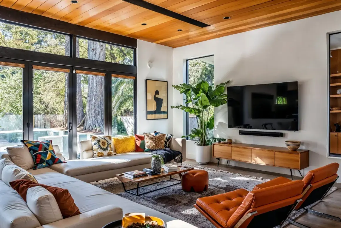
I always start here, because this look is not just about buying the right chair. Mid-century modern architecture is really a set of spatial habits: long horizontal lines, clear sightlines, modest ornament, and rooms that feel connected to the outside. The interior follows the same logic, which is why these homes often feel calm even when they are furnished simply.
Three features show up again and again. First, post-and-beam structure, which uses visible posts and beams so the house can open up more easily. Second, large windows and glass doors, which pull daylight deep into the room and make the boundary between inside and outside feel lighter. Third, built-in storage, because the style values a clean visual field and does not want storage furniture cluttering every wall.
- Horizontal emphasis. Low rooflines, long credenzas, and wide furniture profiles keep the room grounded.
- Open circulation. The layout should feel easy to move through, not packed with obstacles.
- Minimal trim. Fewer decorative interruptions let the materials and proportions do the work.
- Indoor-outdoor continuity. A view, a doorway, or even a well-placed plant can reinforce that connection.
The result is less severe than strict minimalism and warmer than a museum-like modernist space. Once that spatial logic is clear, the next step is deciding how to place furniture so the room still feels easy to live in.
How to translate the layout into a livable interior
When I work with this style, I try to keep the center of the room visually open and build around it instead of filling every edge. That usually means letting the furniture float a bit, using rugs to define zones, and keeping pathways clear enough that the room feels relaxed rather than staged. A good rule of thumb is to leave roughly 30 to 36 inches for main walkways wherever you can.
- Protect the main axis. Keep the most direct route through the room clear so the architecture reads at a glance.
- Let furniture float. Pull the sofa off the wall when the room can support it; it often makes the room feel larger, not smaller.
- Use rugs as boundaries. A well-sized rug gives structure without adding more visual weight.
- Build storage low. Credenzas, benches, and sideboards preserve the clean horizon line that the style depends on.
- Repeat shapes. If one element is round, echo that curve once or twice rather than scattering a dozen different silhouettes.
I also pay attention to the way the room receives light throughout the day. In a house with strong sun, a lighter linen shade or woven blind can soften glare without hiding the windows, and that balance is very much in the spirit of the style. From there, the materials and color palette do the rest of the work.
Materials and colors that keep it grounded in 2026
This style lives or dies on texture. If the surfaces feel flat or overly glossy, the room loses its warmth fast. I keep the palette simple: one neutral base, one dominant wood tone, and one accent color that appears in a few controlled places rather than everywhere at once. A practical ratio is 70 percent calm base tones, 20 percent wood and stone, and 10 percent accent color.
| Element | Classic choice | Modern substitute | Why it works |
|---|---|---|---|
| Wood | Walnut or teak | White oak with a warm stain | Keeps the room grounded without making it feel heavy |
| Upholstery | Leather or wool | Performance fabric in a matte weave | Feels period-appropriate and handles everyday wear better |
| Surfaces | Stone, terrazzo, laminate | Porcelain or engineered stone with a low sheen | Delivers the right visual quiet with less maintenance |
| Metal | Blackened steel or brass | Matte black or brushed brass | Adds contrast without looking shiny or decorative |
For color, I keep coming back to warm white, mushroom, sand, olive, rust, muted teal, and a restrained mustard. Those tones feel true to the period without turning the room orange or brown. Lighting matters too: I prefer bulbs in the 2700K to 3000K range, because cooler light can make all that wood feel flat and sterile.
One more practical note: if you want the room to age well, avoid using too many competing woods. Two is usually enough, three at most, and one of them should clearly play a supporting role. Once the palette is set, the next question is which pieces deserve the spotlight.
Furnishing it without turning the room into a showroom
People often overbuy in this style because the silhouettes are attractive and easy to recognize. I would rather see one strong credenza, one well-proportioned lounge chair, and one thoughtful lamp than a room packed with matching retro references. The point is to give the architecture room to breathe, not to recreate a catalog page from 1958.
| Approach | Best for | Strength | Watch out for |
|---|---|---|---|
| Vintage originals | One anchor piece that can carry the room | Authentic patina and strong design history | Can overwhelm a small space if everything is original |
| Contemporary inspired pieces | Most everyday homes | Easier to mix with current fabrics and finishes | Quality varies widely, especially in cheaper ranges |
| Reproductions | Budget-conscious updates | Recognizable silhouette at a lower price point | Can feel generic if the room has no material depth |
My rule is simple: choose one anchor piece per room, usually the sofa, dining table, or storage cabinet, and let everything else support it. After that, I look for tapered legs, low backs, slim profiles, and shapes that feel sculptural without being dramatic. A room reads as mid-century not because every object is from the period, but because the proportions, finishes, and spacing agree with each other.
- A low sofa with visible legs gives the room lift.
- A sideboard or credenza keeps storage quiet and horizontal.
- A sculptural floor lamp adds shape without crowding the floor.
- A round coffee table can soften all the straight lines around it.
- One graphic artwork is often stronger than a wall filled with small pieces.
Those choices look different in each room, which is why room-by-room planning matters more than copying a single shopping list. The good news is that the style is flexible once you understand where it needs restraint and where it can be a little bolder.

Room-by-room choices that work best
Living room
The living room usually carries the style best because it benefits from open sightlines and strong furniture shapes. I like a low sofa, one sculptural lounge chair, a round or oval coffee table, and a lamp that creates a clear vertical accent. If the room has big windows, keep the window treatments light and simple so the outside view remains part of the composition.
Dining room
This is the easiest place to show restraint. A clean-lined table, four to six chairs with slim frames, and a pendant centered over the table usually do more than any amount of wall decor. If you have space, a sideboard in wood or a lacquer-like matte finish adds storage without breaking the horizontal rhythm.
Kitchen
Mid-century influence in a kitchen works best when the cabinetry is quiet. Flat-front doors, minimal hardware, and a straightforward backsplash keep the room from feeling overdesigned. Open shelving can work, but I only use it when the objects on display are edited hard; otherwise the kitchen loses the calm that makes the style feel elegant.
Bedroom
The bedroom should be softer and more subdued than the rest of the house. A lower bed frame, simple nightstands, textured bedding, and one or two warm lamps are usually enough. I avoid overcrowding the room with decor because the style depends on a sense of rest, not accumulation.
Read Also: Maximalist Interior Design - Rich, Not Messy. Your Guide
Entry or bathroom
In smaller spaces, the details matter more than the amount of furniture. A floating vanity, a large mirror, and a clean-lined sconce can make a bathroom feel intentional without adding clutter. In an entry, a bench, a mirror, and a narrow tray for daily essentials often capture the style better than a shelf full of decorative objects.
The rooms that work best are the ones that make the architecture feel effortless, which is also why the common mistakes are so easy to spot once you know what to look for. A few small corrections can change the whole mood of the house.
The mistakes that make the style feel dated or fake
The quickest way to flatten this look is to decorate too literally. If every room has a starburst object, a matching walnut set, and a flood of orange and avocado, the house stops feeling designed and starts feeling costume-like. I see that happen most often when people confuse recognizable icons with the larger design logic behind them.
- Overmatching everything. The room needs variation in texture, even if the palette is restrained.
- Using too many retro symbols. One sculptural lamp is enough; ten of them feel forced.
- Ignoring scale. Small furniture in a large room looks timid, while oversized pieces crush the clean lines.
- Choosing the wrong light temperature. Cold white light makes wood and fabric feel harsh.
- Covering the windows too heavily. Thick drapery can erase the openness that defines the style.
- Mixing too many wood tones. The eye reads that as noise, not richness.
The easiest fix is to edit harder than you decorate. If a room already has strong windows, a good floor, or original built-ins, those features should lead the design; everything else should stay in a supporting role. That is where the style becomes durable instead of nostalgic.
What I would keep if I were designing this style for a 2026 home
If I were starting from scratch, I would keep three things at the top of the list: the architecture, the comfort, and the restraint. Preserve original beams, windows, or built-ins if the house has them. If it does not, recreate the feeling with low furniture, clean storage, warm materials, and a layout that gives the room space to breathe.
- Invest in one honest anchor piece, not a room full of lookalikes.
- Use performance fabrics and better lighting so the style actually fits daily life.
- Leave some negative space; it is part of the design, not wasted square footage.
- Mix one vintage reference with current pieces that are simpler, not louder.
That balance is why the style still feels current: it gives you structure without stiffness, warmth without clutter, and enough restraint to let a real home feel calm. If you keep the architecture first and the decor second, the room will read as confident rather than nostalgic.