Enduring rooms are built on restraint, good proportion, and materials that still feel believable after trends move on. I approach timeless interior design as a practical discipline, not a decorative mood: it is about making a home feel calm, well-edited, and easy to live with for years, not months. Here I break down the principles that matter most, the choices that age well, and the mistakes that make a space feel dated faster than it should.
The essentials that make a room age well
- Start with architecture, scale, and circulation before you think about accessories.
- Use a restrained palette and let texture do more of the visual work.
- Choose natural materials and classic silhouettes for the biggest investment pieces.
- Layer lighting, storage, and personal objects so the room feels lived in, not staged.
- Avoid overmatching, overly trendy finishes, and furniture that is too small for the space.
What timeless interior design really depends on
When I design for longevity, I do not start with throw pillows or accent colors. I start with the bones of the room: its proportions, its light, its circulation, and whether the architecture supports the mood the owner wants to live with. A room can be formally traditional, quietly modern, or somewhere in between and still feel enduring if the composition is thoughtful.
That is the part people often miss. A timeless room is not a museum and it is not blank. It has enough structure to feel settled, but enough personality to feel human. I usually ask three questions before I commit to a direction: does this suit the house, does it support daily use, and will it still make sense in five years?
If the answer is yes, the room is probably on the right track. If not, the problem is usually not the style itself but the way the pieces relate to each other. Once that foundation is clear, the next step is choosing materials that can carry the look without relying on novelty.
The materials and finishes that age gracefully
The easiest way to make a room feel durable is to choose finishes that look better with use, not worse. I lean on natural materials because they bring depth without needing explanation: wood, stone, linen, wool, cotton, ceramic, and metal with a real surface, not a plastic imitation of one.
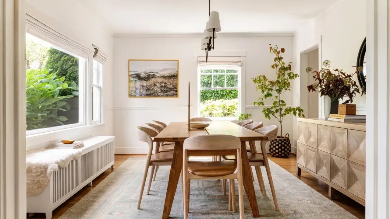
Wood gives a room warmth and visual memory. Oak, walnut, and maple are dependable because their grain reads well in both daylight and lamplight. Stone adds quiet weight, especially on a fireplace surround, tabletop, or countertop, but I prefer it when the veining is subtle rather than dramatic. Textiles soften the room; linen, wool, and cotton can look relaxed without feeling casual in a sloppy way.
I also pay attention to finish. High gloss can work, but too much of it can make a room feel showy or date itself quickly. Matte, honed, brushed, and softly sealed surfaces usually hold up better visually. That does not mean everything has to be rustic. It means the finish should support the architecture instead of competing with it.
There is one practical caveat: the most natural-looking materials are not always the lowest-maintenance ones. Unlacquered brass will patina, linen wrinkles, and real stone can stain if it is poorly sealed. If the room is going to take heavy daily use, I often balance the look with performance fabric, porcelain that mimics stone, or sealed wood finishes. The goal is not purity. It is longevity that still feels honest.
Once the material palette is right, scale becomes the next major lever. A beautiful surface cannot rescue furniture that is the wrong size for the room.
Scale and layout do more work than decoration
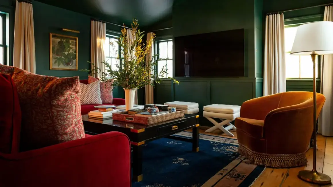
Good proportion is what makes a room feel composed instead of accidental. Even the best furniture can look wrong if it is too large for the circulation path or too small to anchor the space. I see this mistake constantly in living rooms and bedrooms: people buy pieces they like individually, then wonder why the room never settles.
| Design detail | Reliable starting point | Why it matters |
|---|---|---|
| Walkway clearance | 30 to 36 inches | Keeps circulation comfortable and prevents the room from feeling cramped. |
| Coffee table distance from sofa | 14 to 18 inches | Close enough to use, far enough to move through the seating area. |
| Rug size in a living room | 8 x 10 feet for smaller groups, 9 x 12 feet for larger ones | Anchors the furniture so the room does not look like it is floating. |
| Dining chair clearance behind seats | About 36 inches | Lets people sit down and move around the table without bumping into walls. |
| Curtain placement | 4 to 6 inches above the window trim, or higher near the ceiling | Makes the window read taller and the room feel more tailored. |
Those numbers are not rules carved in stone, but they are useful guardrails. If a room is smaller, I would rather use fewer pieces with better scale than crowd it with more items. If the architecture is already strong, I keep the layout quieter so the room can breathe. That balance becomes even more important when the same home has to work across different rooms, which is where the style becomes practical instead of theoretical.
How I adapt the look room by room
Timeless design does not look identical everywhere. A living room, kitchen, and bedroom have different jobs, so the ingredients should shift slightly while still feeling related. The common thread is restraint: one or two strong foundations, then a few layered decisions that make the space personal.
| Room | What I prioritize | What I avoid |
|---|---|---|
| Living room | A well-scaled sofa, a rug that anchors the seating group, mixed lighting, and at least one piece with character. | Furniture pushed too far apart, tiny accent chairs, and a space that depends on decor to feel finished. |
| Kitchen | Simple cabinet fronts, durable counters, clean hardware, and lighting that works for both task and atmosphere. | Overly ornate details, too many competing finishes, and trendy colors on every major surface. |
| Bedroom | Soft layers, a calm palette, bedside lighting, and a headboard or wall treatment that gives the room presence. | Visual noise, undersized nightstands, and bedding that looks styled but not comfortable. |
In a living room, I like one strong upholstered piece, one wood tone, and a controlled mix of textures. In a kitchen, I usually keep the big surfaces quieter because the room already has enough visual activity. In a bedroom, I push softness and proportion a little harder, since the room should feel restorative rather than performative. The principle is the same in all three spaces: let the architecture lead, then add layers that support the room’s purpose.
The mistakes that make a classic room feel dated too fast
The fastest way to lose the timeless feel is to decorate for a moment instead of a lifespan. Trend-led rooms often fail for the same few reasons, and once you see them, they become easier to avoid.
| Common mistake | Why it dates quickly | Better move |
|---|---|---|
| Matching everything too closely | The room starts to look purchased in one sitting instead of collected over time. | Mix eras, textures, and finishes while keeping the overall palette controlled. |
| Using too many finishes | Every surface starts competing for attention. | Limit the main finish group to two or three metals or wood tones. |
| Buying trend pieces for major furniture | Big items are expensive to replace, so the room ages around them. | Keep the sofa, dining table, and bed frame classic, then change smaller accents if needed. |
| Ignoring storage | Clutter kills even the best design idea. | Build in concealed storage or choose furniture that does double duty. |
| Going too hard on novelty | One dramatic choice can dominate the entire room and make it feel tied to a passing trend. | Use statement pieces sparingly and let them sit on a calm base. |
I am not against personality. I am against decorating a room so aggressively that it can only live in one year. If a space has solid bones, it can handle a little drama. If it does not, the drama becomes the only thing people notice. That is why the final pass matters just as much as the first purchase.
The last edit I make before I call a room finished
Before I consider a room complete, I walk through a short checklist. It takes minutes, but it catches the problems that usually turn into regrets later.
- Does the room work even when the accessories are removed?
- Is the largest furniture scaled correctly for the space?
- Are there at least two tactile materials that keep the room from feeling flat?
- Is the lighting layered enough for day, evening, and task use?
- Does every object earn its place, or is something there just to fill space?
If a room passes those checks, it usually feels calmer, stronger, and easier to live with. That is the real payoff of a lasting interior: it does not ask for constant correction, and it still feels right after the rush of decorating has passed.