The strongest palettes are the ones that fit the room before they try to impress it
- Start with the room’s purpose, fixed finishes, and natural light before choosing paint.
- Use the 60-30-10 balance as a guide, not a rule carved in stone.
- Monochromatic and analogous schemes are the easiest to live with; complementary and color-drenched looks need more control.
- Sheen, lighting temperature, wood tone, and textile texture can change a color more than the chip suggests.
- 2026 leans toward warmer neutrals, earthy greens, and richer browns rather than flat white-on-white rooms.
- Test large samples in more than one light condition before committing.
Start with the room’s job, not the paint chip
I always begin with the room itself, because the room usually tells you what the palette should do. A bedroom needs softness and rest, a kitchen needs clarity, a home office needs focus, and a living room usually has to balance all three: comfort, style, and enough visual structure to feel intentional.
The easiest mistake is choosing color in isolation. Walls are only one part of the story. Flooring, trim, cabinetry, stone, upholstery, and even art often carry more visual weight than the wall color does. If your sofa is a deep navy, your flooring is a warm oak, and your rug already has several colors in it, the palette should be built around those fixed pieces rather than fighting them.
My practical shorthand is simple: pick one dominant color family, one supporting color, and one accent. The classic 60-30-10 approach works well because it keeps the room balanced, but I treat it as a guardrail, not a law. If the dominant surface is a wall color, the supporting color might live in drapery, a rug, or upholstery, while the accent can appear in pillows, a lamp base, a piece of pottery, or a single chair.
- Identify what cannot easily change, such as floors, counters, tile, and large furniture.
- Decide whether the room should feel calm, bright, grounded, dramatic, or airy.
- Choose the largest color family first, then build contrast around it.
- Reserve the most saturated tone for the smallest visual area.
- Check that every color has a reason to be there.
Once that structure is in place, choosing the actual palette becomes much easier. From there, the question shifts from "What is pretty?" to "What kind of palette will actually hold the room together?"
The palette families that work most reliably
HGTV’s color-wheel guidance is still useful because it maps the main ways colors relate to one another. The point is not to memorize theory for its own sake; it is to know which kind of relationship creates the mood you want without making the room feel random.
| Scheme | What it feels like | Best use | Watch out for |
|---|---|---|---|
| Monochromatic | Quiet, tailored, cohesive | Bedrooms, small spaces, minimal interiors | Can feel flat if texture and sheen do not vary |
| Analogous | Soft, natural, easy on the eye | Living rooms, bedrooms, open-plan homes | Undertones can look muddy if the shades are too close but not aligned |
| Complementary | High contrast, lively, memorable | Dining rooms, offices, statement spaces | Can turn harsh if both colors are equally loud |
| Split-complementary | Balanced but still energetic | Homes that want contrast without visual noise | Needs discipline, or the room starts to feel overdesigned |
| Neutral-led with accent | Flexible, calm, easy to update | Family rooms, rental-friendly spaces, layered homes | Feels generic if texture, wood tone, or contrast is too weak |
| Color-drenched | Immersive, bold, architectural | Powder rooms, libraries, moody dining areas | Needs good lighting and a confident color choice to avoid feeling heavy |
If you want the safest starting point, I usually recommend analogous or neutral-led palettes. They are forgiving, they work with more furniture styles, and they are easier to adjust later. Complementary palettes are stronger, but they need a sharper eye for balance. Color-drenched rooms, which are very relevant in 2026, can look exceptional when the architecture supports them and surprisingly awkward when the room is poorly lit.
That leads directly to the part many people underestimate: the same palette can look completely different depending on how the room receives light and what materials sit beside it.
Light, sheen, and material do most of the heavy lifting
A color chip is a suggestion, not a verdict. Natural light changes everything, and artificial light can change it again. In north-facing rooms, colors often read cooler and a little grayer, so warmer whites, beige-based neutrals, and soft earth tones usually feel more comfortable. South-facing rooms can carry cooler colors more easily because the light is already warm and generous.
I also pay close attention to bulb temperature. Warm lighting, roughly in the 2700K to 3000K range, tends to flatter cozy palettes and wood tones. Cooler, more neutral task lighting around 3500K to 4000K can work well in kitchens, bathrooms, and offices where clarity matters more than softness. If a room needs both, dimmable lighting is not a luxury; it is the difference between a palette that adapts and one that feels wrong half the day.
Sheen matters just as much. Matte and flat finishes soften color and hide surface flaws, but they are less forgiving in high-traffic rooms. Eggshell and satin reflect a little more light, which can make a shade feel brighter and easier to clean. High-gloss is the most demanding and the most reflective, so it tends to emphasize architectural detail rather than disappear into the background.
Materials alter the reading too. Walnut and mahogany make nearby colors feel richer and deeper. Pale oak and light stone keep a palette airier. Brass warms up greens and creams, while chrome or polished nickel sharpens cooler schemes. This is why a palette that looks beautiful on a screen can fall apart in a real room: the surface context is doing more work than the swatch ever promised.
Room-by-room color ideas that solve different problems
When I move from theory to real interiors, I like to think in use cases. The room does not just need a pretty palette; it needs a palette that supports the way the space is used.
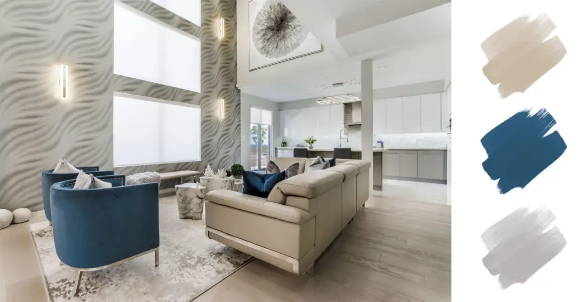
Living room
A living room usually works best with a grounded base: warm white, greige, soft taupe, or muted clay, then one deeper color to anchor the seating area. Olive, blue-gray, rust, or deep green can give the room enough personality without making it visually tiring. This kind of palette is especially effective when a large sofa, rug, and curtains all need to work together.
Kitchen
Kitchens benefit from clarity and restraint. Creamy whites, soft khakis, sage-leaning greens, and pale stone colors pair well with wood, marble, and brushed metal. If the cabinets are a color, I usually keep the walls quieter so the room does not feel overworked. That is one reason khaki-based schemes have become so useful: they read as neutral, but they are warmer and more lived-in than cold white.
Bedroom
Bedrooms usually reward lower contrast and softer saturation. I like muted blue-green, mushroom, dusty rose-beige, or smoky charcoal paired with linen and wood. The room should feel visually downshifted, which means the accent color should appear in small doses only. If the palette is too active, the room stops feeling restful.
Home office
For work spaces, I want enough color to create focus but not so much that it becomes distracting. Desaturated blue, green, or a balanced neutral with a darker accent wall can make a room feel collected and productive. If you spend long hours there, avoid overly bright reds and high-energy contrasts unless you have a very specific reason to use them.
Read Also: Coastal Grandma Style - Create a Calm, Elegant Home
Bathroom or powder room
These spaces can handle more personality because they are smaller and used in shorter bursts. A powder room is often the best place for color-drenched walls, dark paint, dramatic wallpaper, or a saturated jewel tone. Bathrooms with limited natural light usually do better with cleaner neutrals or soft greens that keep the space from feeling closed in.
What matters across all of these rooms is not novelty. It is fit. A palette works when it supports the room’s function, the existing materials, and the emotional tone you want every time you walk in.
How to use 2026 trends without making the room feel dated
In 2026, the color conversation is moving away from sterile white-on-white interiors and toward warmer, more tactile palettes. Sherwin-Williams’ 2026 direction leans into modern neutrals, soothing darks, and grounded tones, and that matches what I am seeing more broadly: people want rooms that feel restorative, not clinical.
The useful part of a trend is the direction it points, not the exact shade name on the can. Warm khakis, earthy greens, brown-based neutrals, and deep, enveloping hues all feel current right now because they connect with comfort, texture, and a little visual depth. Color drenching is also still strong, but it works best when the room has decent light, interesting trim, or enough architectural character to justify the all-over treatment.
My advice is to use trends where they are easiest to change. A saturated wall color in a powder room is a lower-risk commitment than painting an entire open-plan main floor in a dramatic shade. The same is true of upholstery, drapery, and accessories. If you love a trend but are unsure about living with it long term, let it show up in the soft furnishings first.
I would rather see one restrained, coherent palette than three trend-led colors fighting each other for attention. A room ages well when it feels deliberate, not when it checks every current box.
A testing routine that catches the mistakes most people miss
The last step is the one people skip, and it is usually where the expensive mistakes happen. Tiny swatches are not enough. A color that looks elegant on a sample card can turn muddy next to your floor, or too yellow in the afternoon, or too gray under your lamps.
- Paint large samples on more than one wall, not just one corner.
- Check the color in the morning, midafternoon, and at night.
- Look at it beside the flooring, trim, cabinets, sofa, and rug.
- Turn the planned lighting on and off, then compare the result.
- Live with the sample long enough to notice whether you still like it after a day or two.
If two colors seem almost identical, the undertone is usually the real decision-maker. One gray may lean blue, another green, another pink. One white may feel crisp, while another suddenly looks creamy or dingy next to the wrong trim. This is where patience saves money.
My rule is simple: if the color only looks right under one lamp or from one angle, it is not the right color yet. Keep testing until the palette feels stable in the room you actually have, not the one you imagined in the store.
What makes a color scheme feel finished
The best rooms are not the ones with the loudest palette. They are the ones where every color has a role, every finish supports the same mood, and nothing feels accidental. That is why I keep coming back to the same core questions: What is the room for? What is already fixed? How does the light behave? What do I want this space to do for the people using it?
When those answers are clear, the palette stops feeling like guesswork. You can choose a quiet neutral, a layered earth-toned scheme, or a bolder color-drenched look with much more confidence because the room has already told you what it can handle. That is the difference between decorating with color and designing with it.
If you remember only one thing, make it this: a successful palette is not the one that looks best on a sample card, but the one that still feels right after the furniture arrives, the lights turn on, and real life starts happening in the room.