Key takeaways for building a sharper, calmer interior
- Bauhaus is about function first, with geometry and restraint doing the visual work.
- Use neutrals as the base and add primary color only where it has a clear purpose.
- Choose materials that feel structural and durable: steel, glass, wood, lacquer, and textured textiles.
- Fewer, better pieces usually beat a room full of matching sets.
- The style translates well to American homes when you edit hard and keep the layout open.
What the Bauhaus approach asks a room to do
The original Bauhaus school lasted only from 1919 to 1933, but its interior logic has outlived plenty of trends because it solves a basic problem: how to make a room clearer, more useful, and less cluttered without making it lifeless. I think of it as a design discipline where art, craft, and modern production all have to agree on the same answer.
In practical terms, that means every object needs to earn its place. A chair should support sitting well. A lamp should throw light exactly where it is needed. A table should organize a zone instead of just occupying floor area. If an item exists only to decorate a surface, it is already working against the Bauhaus idea.
That does not make the style severe by default. It makes it edited, legible, and honest. Once that rule is in place, the next step is deciding which materials, colors, and shapes communicate it best.
The palette, materials, and geometry that make it work
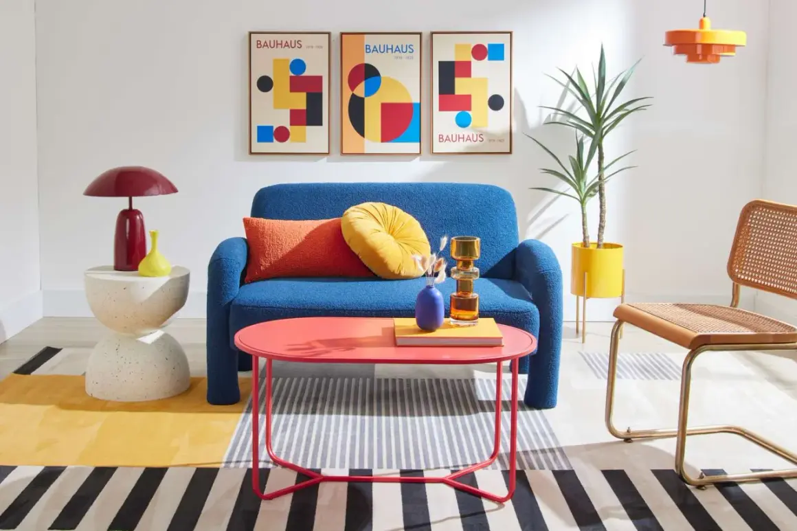
The Bauhaus look is built on a small visual vocabulary, but the combinations matter. Whites, creams, grays, and black create the structure; red, blue, and yellow work best as accents; and clean geometry gives the room its rhythm. I rarely push all three primaries at full strength in one space. One or two is usually enough to keep the room lively without turning it into a graphic poster.
| Element | What works | Why it helps | What to avoid |
|---|---|---|---|
| Walls and trim | Warm white, soft gray, or a crisp neutral with one darker frame color | Creates a calm background so forms read clearly | Highly saturated paint on every surface |
| Seating | Low, geometric silhouettes with visible structure | Keeps the room legible and visually lighter | Overstuffed curves and decorative tufting |
| Tables and storage | Flat planes, cantilevers, and simple built-ins | Supports the style’s order-first logic | Bulky case goods with carving or heavy ornament |
| Metals and glass | Tubular steel, chrome accents, clear or frosted glass | Adds precision and a sense of lightness | Mirror-like finishes everywhere |
| Textiles and art | Wool, linen, flatweave rugs, and graphic art | Softens the room without blurring the lines | Busy florals or faux-distressed textures |
One detail people miss is texture. A good Bauhaus room is not flat; it is simply disciplined. Smooth lacquer next to wool, steel next to oak, or glass next to linen gives the room depth without adding visual noise. That balance matters even more when you compare the style with other modern looks.
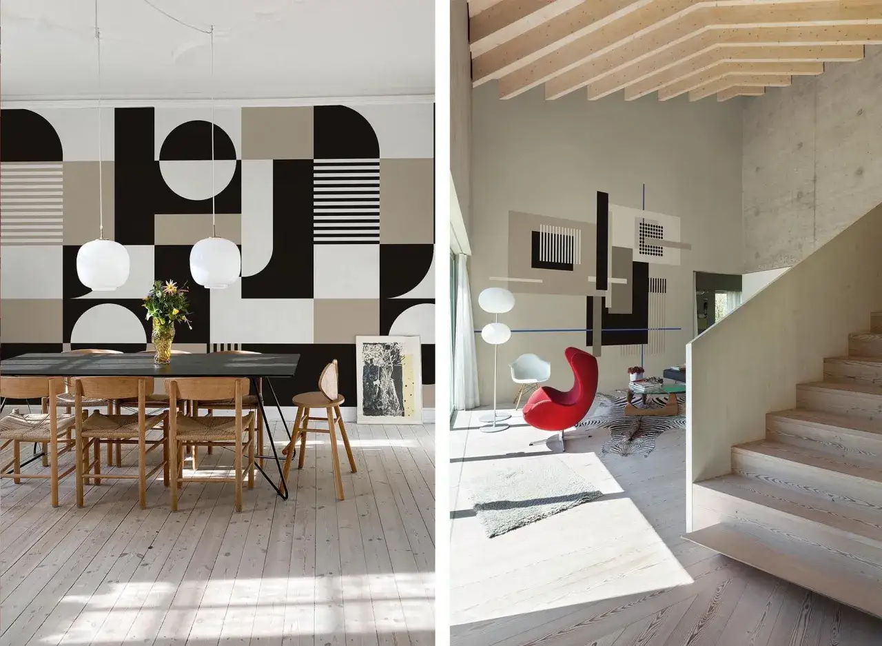
How it differs from mid-century modern and Scandinavian design
These styles overlap enough that they are often confused, especially in US homes where the furniture market blends them freely. But they are not the same thing. Bauhaus is the strictest of the three: more geometric, more industrial, and less sentimental. Mid-century modern softens the edges with warmer woods and more organic curves. Scandinavian design leans lighter, softer, and more tactile.
| Style | Visual language | Best quality | Risk if overdone |
|---|---|---|---|
| Bauhaus | Geometric, rigorous, industrial | Clarity and purpose | Feeling severe or overcontrolled |
| Mid-century modern | Warmer, slightly organic, wood-led | Approachable comfort | Sliding into retro pastiche |
| Scandinavian | Pale, tactile, airy | Softness and ease | Looking generic if it becomes too safe |
If you want more warmth, borrow one or two Scandinavian ideas such as linen, oak, or softer lighting. If you want the room to feel more welcoming, add texture and acoustic softness. But keep the Bauhaus skeleton intact: clear structure, minimal clutter, and furniture that has a reason to exist. From there, the real translation happens room by room.
How I would adapt the style room by room in a US home
American homes often work against the original Bauhaus ideal. Some are open plan, others are compartmentalized, and many need to keep existing trim, molding, or older proportions. I would not try to force every home into a museum-like rewrite. I would translate the logic room by room.
Living room
Choose one low-profile sofa with a clean silhouette, one side chair with a strong frame, and one rug that defines the seating zone without busy pattern overload. A single graphic artwork or a black-framed shelving system can give the room order. Keep coffee-table styling light; Bauhaus rooms look better when surfaces can breathe.
Kitchen and dining room
Flat-front cabinetry, simple pulls, and a restrained backsplash do more than decorative hardware ever will. In the dining area, a plain rectangular or round table with honest materials reads better than an ornate set. If you want color, use it in stools, a pendant, or one wall panel rather than scattering it everywhere.
Bedroom
The bedroom should be the calmest expression of the style. A platform bed, built-in or low storage, and linen or cotton bedding in quiet tones usually create the right balance. One strong lamp or a pair of symmetrical wall lights is enough; if the room becomes overdesigned, sleep quality starts to suffer visually, even if the furniture is technically beautiful.
Read Also: Japandi Style - Your Guide to a Calm & Modern Home
Home office
This is where the Bauhaus logic often feels most natural. A desk with a clear working surface, concealed storage, and task lighting gives you the cleanest result. I would reserve brighter color for one accent chair, a pinboard, or a single piece of art so the room stays focused rather than visually noisy.
The point is not to copy a catalog. It is to keep the layout legible, the circulation easy, and the furniture choices disciplined enough that the room feels intentional from every angle. That sets up the next decision: which pieces should carry the style visually.
Furniture and lighting should do most of the talking
Bauhaus rooms usually fail when accessories do too much work. The strongest spaces rely on a few anchor pieces that are both useful and visually precise: a cantilever chair, a tubular steel table, a pared-back storage unit, or a lamp with a clear geometric profile. If those pieces are right, you do not need a lot else.
| Piece | What to look for | Why it matters |
|---|---|---|
| Sofa | Simple block arms, slim legs, durable upholstery | Anchors the room without visual noise |
| Chair | Tubular steel, cantilever, or a crisp wood frame | Introduces the style’s signature structure |
| Table | Round or rectangular with honest proportions | Organizes circulation and seating |
| Lamp | Globe, cone, or linear pendant with clear geometry | Supplies both task light and sculptural order |
| Storage | Flat fronts, built-ins, and a balanced mix of open and closed space | Keeps clutter from undermining the look |
| Rug | Solid, striped, or graphically simple | Defines zones without overwhelming them |
I also pay attention to proportion. Bauhaus furniture is spare, but it is not flimsy. Thin frames need enough visual weight elsewhere so the room does not feel like it is floating apart. When the scale is right, even a very simple room feels composed and expensive without trying to look luxurious in the usual sense.
Where the look usually goes wrong
Most bad Bauhaus rooms miss the tone, not the vocabulary. They have the chrome, the black lines, the primary colors, and still feel awkward because the proportions are off or the room has been stripped so hard that it no longer functions. I see the same handful of mistakes over and over.
- Using primary colors everywhere instead of as controlled accents.
- Mixing too many shiny surfaces, which makes the room feel cold and commercial.
- Choosing uncomfortable chairs or low-quality replicas just because the silhouette is famous.
- Ignoring texture, so the space ends up visually flat.
- Forcing symmetry where the room layout does not support it.
- Treating minimalism as emptiness rather than clarity.
The fix is usually simple: reduce the palette, repeat materials more consistently, and add one soft layer, such as wool, linen, or a textured rug, so the room keeps its structure without losing warmth. Once the obvious mistakes are out of the way, the style becomes much easier to live with rather than just admire.
The easiest way to start without overcommitting
If I were building the look from scratch, I would start with the room’s skeleton, not the accessories. That means a neutral backdrop, a clear layout, one or two strong furniture forms, and only a limited amount of color.
- Keep the base quiet with white, cream, gray, or muted taupe.
- Choose one structural anchor, such as a sofa, desk, or dining table with a clean silhouette.
- Add one piece of visual geometry, like a circular mirror, rectangular shelving, or a graphic rug.
- Introduce a single accent color where it solves a problem or defines a zone.
- Repeat materials so the room feels deliberate, not assembled from unrelated finds.
- Stop before the space looks themed; Bauhaus should feel edited, not staged.
That approach gives you the discipline of the style without trapping the room in a period replica. In practice, that is what makes the Bauhaus idea still useful: it helps a home feel clearer, sturdier, and easier to live in.