A gallery wall can turn a blank stretch of drywall into the most personal part of a room, but only when the scale, spacing, and subject matter work together. In practice, the best version is less about filling space and more about building a visual rhythm that fits the furniture, the light, and the way you actually live.
The decisions that make the display feel intentional
- Start with the wall size and the furniture below it before choosing art.
- Pick one unifying thread, such as color, frame finish, subject, or material.
- Use paper templates first so you can adjust the layout without extra holes.
- Keep spacing consistent, then let one larger piece anchor the composition.
- A DIY setup can often be done for about $60-$200; a more polished version usually lands around $200-$600.
What makes a wall arrangement work
I usually start with the room, not the art. A strong arrangement does three jobs at once: it balances the furniture, adds personality, and gives the eye a clear path to follow.
That is why I treat a wall display like a composition, not a collection. If the sofa is wide, the art should hold its own. If the room is narrow, the arrangement should guide movement instead of stopping it. And if the space already has a lot going on, the safest move is often a quieter, more edited mix rather than another layer of visual noise.
My rule of thumb is simple: let the wall answer the room, not fight it. Once that idea is clear, choosing a layout becomes much easier.

Layouts that fit different rooms
There is no single correct pattern. The right layout depends on how formal the room feels, how much wall you have, and whether the space needs calm, energy, or a bit of both.
| Layout | What it feels like | Best for | Watch-outs |
|---|---|---|---|
| Grid | Clean and orderly | Offices, bedrooms, symmetrical furniture, modern interiors | Can feel flat if every piece is identical |
| Salon-style cluster | Collected and relaxed | Hallways, large blank walls, eclectic rooms | Needs a common thread or it can drift into clutter |
| Linear row | Calm and directional | Above sofas, beds, consoles, and long sideboards | Pieces need enough size to avoid looking underscaled |
| Corner or stair-step | Dynamic and site-specific | Stairwells, landings, corners, angled walls | Works best when you test the layout before making holes |
| Asymmetrical anchor | Modern and casual | Open-plan rooms and mixed furniture groupings | Needs one strong focal piece so it does not feel accidental |
When I am deciding between these, I look at the architecture first. A traditional room usually feels better with more structure, while a relaxed family room can handle a looser mix. Once you know the shape, the next decision is what goes inside the frames and what ties the whole thing together.
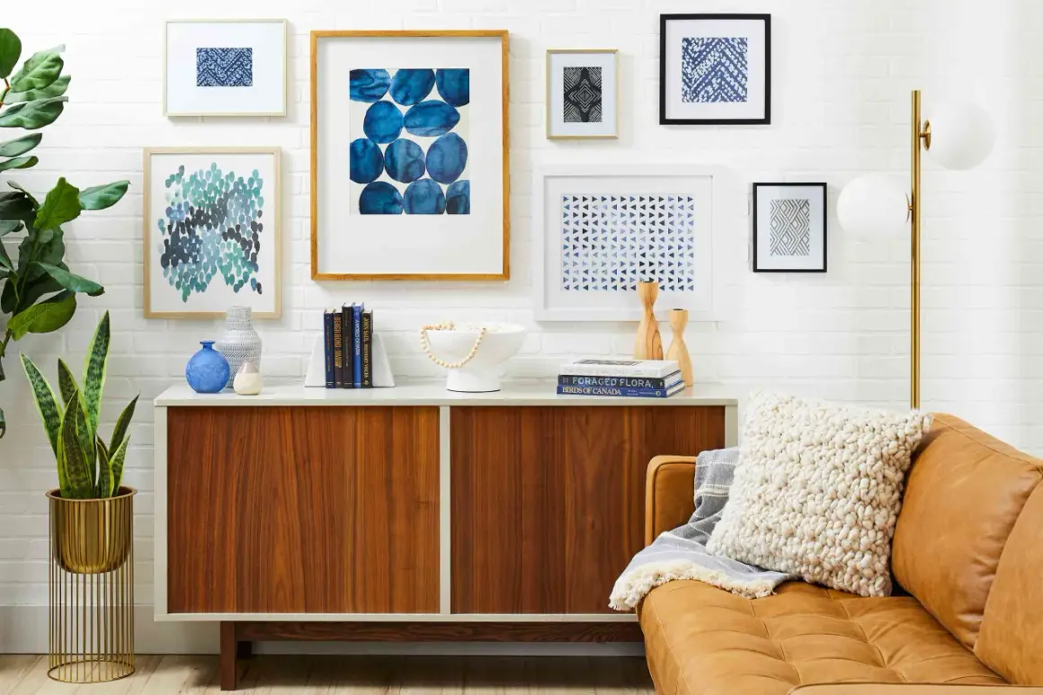
Choosing art, frames, and one clear thread
The fastest way to make the whole thing look intentional is to decide on one thread before you buy anything. That thread can be color, subject, frame finish, mat style, or material; I usually pick just one or two so the arrangement feels collected rather than random.
Right now, the strongest look is warmer and less matchy than it used to be. Mixed wood tones, matte black frames, brushed metal, textured paper, and a few dimensional pieces feel more current than a wall of identical prints in identical frames.
| Approach | Look | Best use | Cost note |
|---|---|---|---|
| Matching frames and monochrome prints | Calm and orderly | Bedrooms, offices, hallways | Usually the easiest and least expensive starting point |
| Mixed frames in one color family | Collected but cohesive | Living rooms and entries | Mid-range if you shop ready-made frames and prints |
| Art mixed with mirrors or textile pieces | Layered and tactile | Large blank walls that need depth | Can cost more because mounting gets more complex |
| Small prints inside oversized mats | More presence for less money | Budget-friendly focal walls | Often the smartest way to stretch a small print collection |
If you want to keep costs down, this is where the biggest savings usually happen. A simple DIY setup often lands around $60-$200, a more polished retail mix around $200-$600, and custom framing or originals can push a project much higher. I also like oversized mats because they make smaller artwork feel deliberate instead of undersized, which is a useful trick when the wall is large and the budget is not.
Once the mix is chosen, hanging it cleanly matters more than any one frame.
How to hang it without guessing
The best layouts almost always start on the floor or on paper, not with a hammer. I use full-size templates cut from kraft paper or recycled cardboard so I can move things around until the spacing feels right.
- Measure the wall zone. If the arrangement sits above a sofa, bed, or console, aim for a composition that is roughly two-thirds the width of the furniture beneath it.
- Choose an anchor. Pick the largest or most important piece first. It gives the rest of the arrangement a center of gravity.
- Test the height. In many homes, the center of the composition sits around 57-60 inches from the floor. Above furniture, leave about 6-8 inches of breathing room.
- Build the spacing. I usually keep smaller pieces about 2-4 inches apart and larger pieces about 3-6 inches apart, depending on how tight or airy I want the wall to feel.
- Use the right hardware. Lightweight frames can be simple, but heavier pieces need proper anchors or studs. On drywall, do not guess.
- Check the line. A level matters more than people want to admit. A slightly crooked arrangement reads as rushed even when the art itself is beautiful.
If you are working on plaster, masonry, or a wall with texture, the hardware matters even more. I would rather use the right anchor and wait an extra ten minutes than patch five holes later. Even with perfect measurements, a wall can still feel wrong if the composition fights the room.
Mistakes that make the wall feel crowded
Most disappointing arrangements are not bad because of the art. They are off because of scale, spacing, or inconsistency.
- Too many tiny pieces. Small frames can be charming, but if every piece is small, the wall starts to feel busy instead of balanced. I usually want at least one larger anchor.
- Ignoring the furniture below. Art should relate to the sofa, bed, or console, not float independently above it.
- Spacing that changes from frame to frame. Uneven gaps break the rhythm. The wall looks calmer when the distances repeat.
- Every frame trying to be different. If the artwork varies a lot, simplify the frames. If the frames vary a lot, calm the art.
- Hanging everything too high. The eye should meet the arrangement naturally, not look up at it like a sign.
- Filling every inch of the wall. A little negative space makes the whole thing feel more expensive and more breathable.
When I see a wall that feels crowded, the fix is usually subtraction, not addition. Remove one small piece, widen the gaps slightly, or introduce a single larger element, and the whole composition usually settles down. The good news is that none of these are hard to fix, and the wall does not need to be finished in one weekend.
What to change later without starting over
I like wall displays that can evolve. A rigid, frozen setup dates quickly; a flexible one can absorb new prints, travel finds, family photos, or a mirror without forcing a full redesign.
Picture ledges make this easier because they let you swap pieces without drilling again. So do oversized mats, which can make small art feel more substantial while leaving room to replace the image later. If you prefer a more curated look, keep one color thread intact and change only the subject matter over time.
That approach also keeps the budget realistic. Start with what you have, buy a few frames that repeat across the wall, and add higher-quality pieces only where they will matter most. In my experience, the result feels better than trying to buy a complete set all at once, because it grows with the room instead of pretending the room will never change.
The best walls leave room to grow
The strongest wall arrangement is not the one that looks finished the fastest. It is the one that can handle a new print, a moved sofa, or a better frame later without falling apart visually.
If you keep the scale honest, the spacing consistent, and one visual thread intact, the arrangement will read as personal instead of crowded. That is the finish I trust most, because it still has room for the room to change.