A small room can feel generous when the eye has room to travel and the furniture gives the floor some breathing room. Learning how to make a small space feel large is less about hiding the room and more about editing sightlines, choosing the right scale, and using light with intention. I will walk through the moves that matter most, plus the mistakes that quietly make a room feel tighter than it is.
The fastest ways to make a room feel larger
- Clear the path first. Good circulation matters more than any decorative trick.
- Choose fewer, better-scaled pieces. Furniture with legs and the right proportions makes a room read as open.
- Keep color and contrast calm. A restrained palette reduces visual breaks.
- Layer light. Natural light, lamps, and reflective surfaces create depth.
- Use the walls well. Vertical storage and high-mounted curtains pull the eye upward.
- Edit hard. Too many small objects, rugs, or dark window treatments can shrink the space fast.
Start with circulation and sightlines
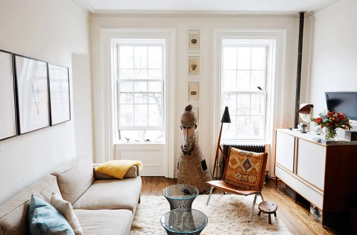
If a room feels cramped, I look at the path through it before I look at anything decorative. A space reads larger when you can move through it without side-stepping furniture, weaving around corners, or stopping at a visual dead end. In practical terms, I try to keep main walkways around 30 to 36 inches wide, with 18 to 24 inches between a sofa and coffee table when the room is tight.
The second thing I check is what the eye sees the moment it enters. A clear view toward a window, a focal wall, or even a simple lamp and chair grouping feels calmer than a room full of interrupted lines. This is why pushing every piece against the walls often backfires: it creates a ring of furniture and leaves the center looking accidental instead of intentional. Once the room can breathe, the next move is choosing pieces that support that openness instead of fighting it.
Choose furniture that looks lighter than it is
Furniture scale is one of the biggest determinants of whether a small room feels balanced or bulky. I would rather see one properly sized sofa and one thoughtful side table than three undersized pieces that try to save space but end up creating visual noise. Visual weight matters here, which simply means how heavy something looks, not how much it actually weighs.
| Better choice | Why it helps | Where it works best |
|---|---|---|
| Furniture on legs | Lets light and floor space continue underneath, so the room feels less boxed in | Living rooms, bedrooms, and entry areas |
| One larger rug | Anchors the zone instead of chopping it into smaller pieces | Small living rooms and studios |
| Nesting tables or an ottoman with storage | Gives you flexibility without permanent bulk | Compact seating areas |
| Wall-mounted shelves or nightstands | Frees floor area and keeps the room visually open | Bedrooms, baths, and narrow rooms |
| Round tables | Softens circulation and reduces corner collisions | Dining nooks and tight conversation zones |
I also avoid the common trap of buying smaller and smaller furniture in the hope that the room will feel larger. That usually produces a scattered look, not a spacious one. In a small room, one larger and better-proportioned piece often feels calmer than several mini versions of the same category. After scale is right, color has a much easier job.
Use color to reduce visual breaks
A small room does not have to be white, but it does need continuity. When walls, trim, and larger textiles live in a narrow color family, the eye reads the room as one connected volume instead of a series of unrelated parts. Soft neutrals, muted earth tones, and low-contrast palettes tend to work especially well because they blur edges without making the room feel flat.
I like to think of color in terms of interruption. Every strong contrast creates a stop for the eye, and too many stops make a room feel chopped up. That does not mean you must eliminate personality. A deeper cushion, a patterned throw, or a darker accent chair can absolutely work, but I would keep the major surfaces quiet and repeat the same few tones around the room. A ceiling that is slightly lighter than the walls can also help the room feel taller without looking artificial. Once the palette settles down, light can start doing real work.
Layer light instead of relying on one fixture
Small rooms often depend too heavily on a single overhead light, and that almost always makes them feel flatter. I prefer layered lighting because it creates depth: ambient light for overall brightness, task light for reading or work, and accent light to pull attention toward a corner, artwork, or architectural detail. That mix gives the room dimension, even when the square footage is limited.
- Ambient light: a ceiling fixture, recessed lights, or a flush mount that gives even coverage.
- Task light: a floor lamp by a chair, a desk lamp, or a bedside lamp where you actually use the room.
- Accent light: a picture light, a small uplight, or a lamp in a darker corner to create depth.
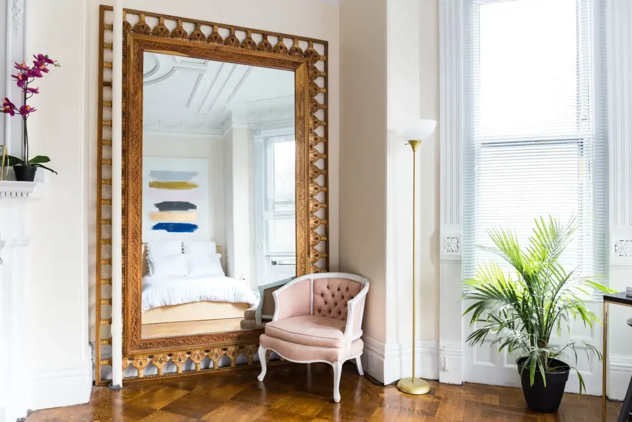
Natural light matters too, but only if you let it travel. Sheer or linen-look curtains soften the window without blocking it, and mirrors work best when they reflect daylight or a nice view rather than clutter. I usually prefer one larger mirror over several tiny ones because the bigger surface reads as a deliberate architectural move. The room feels brighter, and the brightness feels calmer. From there, the walls themselves can start helping.
Make the walls work harder than the floor
In small-space design, vertical lines are powerful. The eye naturally follows height, so anything that emphasizes the wall plane can make the room feel taller and more spacious. That includes tall bookcases, vertically stacked art, floor-to-ceiling drapery, and wall-mounted storage that frees the floor from visual clutter.
For curtains, I usually mount the rod 4 to 6 inches above the window frame, or even higher when the ceiling allows it, and I extend it 4 to 6 inches beyond each side so the fabric can stack outside the glass. That simple move makes the window look larger than it is. The same logic applies to storage: tall and narrow often beats short and wide because it keeps the floor visible, which is one of the easiest ways to make a small room feel less boxed in.
- Use tall shelving instead of low, bulky cabinets when possible.
- Keep drapes long enough to touch the floor instead of stopping halfway down the wall.
- Hang art in a deliberate vertical cluster rather than scattering small frames everywhere.
- Choose continuous flooring or limit hard visual breaks between connected zones.
Once the room is reading taller, the final step is making sure the decor does not undo that effect by adding visual clutter.
Avoid the moves that quietly shrink a room
Some design choices make a small space feel smaller almost immediately, and I see the same ones over and over. They are easy mistakes to make because each one seems harmless on its own, but together they crowd the room fast. If you want the space to feel open, these are the habits I would correct first.
| Common mistake | Better move |
|---|---|
| Using a rug that is too small | Choose a rug large enough to anchor the main furniture grouping |
| Pushing every piece against the wall | Leave purposeful breathing room and define a clear seating zone |
| Collecting lots of tiny accessories | Use fewer, larger decorative objects with more empty space between them |
| Choosing heavy curtains that stop at the window frame | Hang lighter drapes higher and wider so the window feels larger |
| Relying only on overhead light | Add lamps and accent lighting to create depth and softness |
| Letting counters, tabletops, and shelves fill up | Keep surfaces edited so the room feels intentional, not crowded |
One subtle mistake I see a lot is buying too many small things because the room is small. That logic sounds reasonable, but it usually creates a choppy, busy effect. A compact space often looks better with a few larger decisions and a little restraint. With that in mind, the last section is the order I would actually follow if I were starting from scratch.
The order I would use in a real small apartment
If I were making over a studio, condo, or compact townhouse, I would not start with shopping. I would start with the room’s structure, then add pieces only where they solve a real problem. This sequence is usually the fastest way to get a better result without wasting money.
- Clear the circulation path. Remove anything that blocks the natural route through the room.
- Fix the largest visual issues. Replace a too-small rug, shorten visual clutter, or hang curtains properly.
- Add one mirror and one additional light source. These two changes usually deliver more impact than a stack of accessories.
- Edit the decor. Keep the items that add texture or personality, and remove the rest.
- Only then buy new furniture. Once the room is organized, it is much easier to know what size and shape you actually need.
In a bedroom, I would prioritize bed scale, nightstand clearance, and soft, long lines. In a living room, I would focus on rug size, seating layout, and layered light. In a kitchen or bath, the biggest wins usually come from clear counters, wall storage, and fewer visual interruptions. The room does not need to be empty to feel larger; it needs to feel edited, proportioned, and easy to read.
That is the version of small-space design I trust most in 2026: not severe minimalism, but a room with better proportions, fewer interruptions, and enough visual calm to let the architecture work. If you start with movement, scale, and light, the space will usually feel bigger long before you buy anything new. And if you do shop, you will know exactly what the room is missing instead of guessing.