A dresser is one of the easiest pieces to make feel intentional, but it is also one of the easiest to overload. If you want how to decorate a dresser in a way that looks calm, current, and actually livable, I focus on three things: function, scale, and a clear focal point. The rest is just editing.
A polished dresser usually comes down to a few smart choices
- Start by deciding what the dresser top needs to do every day, not just how it should look.
- Use one anchor piece, like a mirror or framed art, sized to about half to two-thirds of the dresser’s width.
- Keep the surface edited to three to five objects, mixing tall, medium, and low shapes.
- Use a tray or dish to contain small items so the top does not turn into a catchall.
- Leave visible breathing room; empty space is part of the design.
- Match the styling to the room’s colors, materials, and level of daily use.
Start with the dresser’s real job
I always begin by asking what the dresser top is supposed to solve. In a bedroom, it may need to hold perfume, a watch, jewelry, a charger, or a lamp. In a guest room, it might only need to look welcoming. In a hallway or living space, it can act more like a display surface than storage.
That matters because the best styling depends on use. A dresser that collects daily essentials needs a tray, bowl, or box to keep small items under control. A dresser that is mostly decorative can carry a larger vase, art object, or stack of books without feeling crowded. When I ignore that first question, the surface usually ends up looking pretty for a week and annoying for the next six months.
- If you use the dresser every day, leave room for access and quick cleanup.
- If the top is mostly decorative, give yourself more freedom with sculptural objects and layered styling.
- If the dresser sits in a tight room, keep the arrangement shallow so drawers and knobs stay easy to reach.
Once I know the surface’s job, I can choose a focal point that supports it instead of fighting it.
Choose one anchor piece that sets the scale
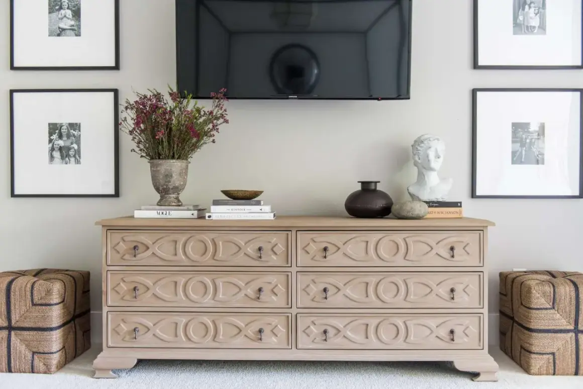
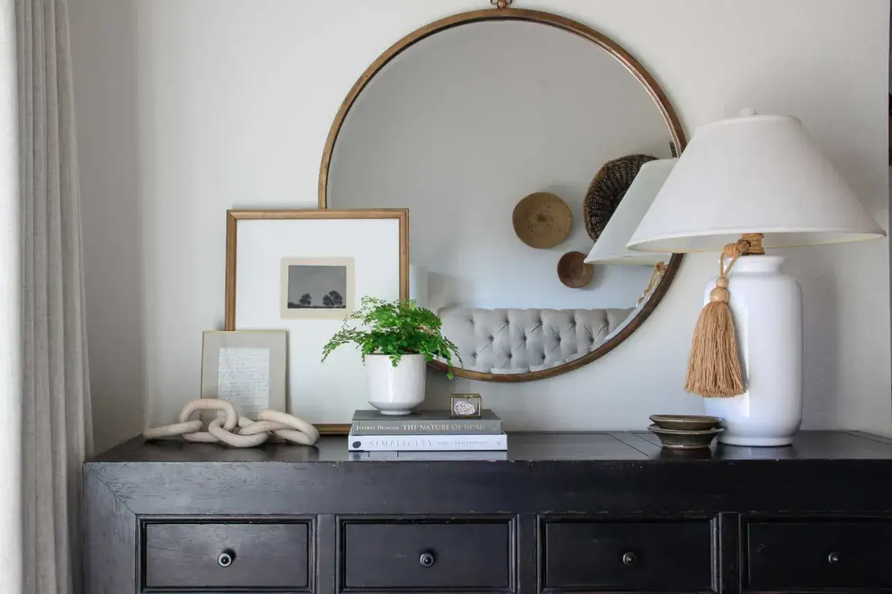
The fastest way to make a dresser feel finished is to give it one large anchor above or behind it. A mirror is the most common choice because it reflects light and makes a room feel larger, but framed art works just as well if you want a softer, more collected look. I reach for a mirror when the room needs brightness and for art when I want warmth or personality.
Proportion is the part people often miss. As a rule of thumb, I like the anchor piece to measure about half to two-thirds of the dresser’s width. So if the dresser is 60 inches wide, a mirror or frame around 30 to 40 inches wide usually feels balanced. If the piece is wall-mounted, leaving about 6 to 8 inches between the top of the dresser and the bottom of the mirror or frame keeps the composition visually connected.
Shape matters too. A round mirror softens straight dresser lines and helps a room feel less rigid. A rectangular mirror or piece of art feels more tailored and structured. If the dresser is already tall or visually heavy, I usually avoid a tiny anchor because it makes the whole arrangement feel disconnected.
After the anchor is in place, the styling underneath it becomes much easier to balance.
Build balance with height, texture, and breathing room
The dresser top should not look like a row of random objects. I get a much better result when I think in layers: one tall piece, one medium piece, and one low piece. That combination creates movement without clutter. It also gives the eye a place to land instead of forcing everything to compete for attention.
Here is the basic rhythm I use most often:
- Tall: a lamp, vase, mirror, or stem arrangement.
- Medium: books, a small box, a candle, or framed photo.
- Low: tray, dish, bowl, or one compact decorative object.
Texture is the next layer. A ceramic vase, a woven tray, a linen-lined box, and a glass lamp all catch light differently, which keeps the surface from feeling flat. In 2026, I think the strongest dresser looks lean warmer and less polished: matte finishes, natural wood, soft ceramics, and one or two personal objects usually look better than overly matched sets.
Leave some open space around the arrangement. That empty area is not wasted; it gives the eye rest and makes the objects you do choose feel more deliberate. With that structure set, the easiest way to style the top is to use a formula that already works.
Three dresser styling formulas that actually work
When I am styling a dresser quickly, I rarely start from scratch. I use one of these three combinations and adjust the finishes to fit the room. They are simple, but they work because each one solves a different design problem.
| Formula | Best for | What to place | Why it works |
|---|---|---|---|
| Minimal and airy | Small bedrooms, narrow dressers, busy rooms | Mirror, lamp, tray, one plant or stem vase | Keeps the surface light and visually open |
| Collected and layered | Primary bedrooms, guest rooms, more decorative spaces | Framed art, stacked books, bowl, candle, vase | Adds personality and depth without looking staged |
| Functional and tidy | Shared bedrooms, high-use surfaces, everyday storage zones | Tray, jewelry box, small catchall, lamp, framed photo | Contains clutter while still looking intentional |
If I had to pick one default, I would choose the minimal and airy version for most homes. It gives enough structure to look finished, but it does not trap the dresser in a decorative layout that becomes hard to live with. The more the room is used, the more important that flexibility becomes.
These formulas still fail if the proportions are off, which is why the next section is the one I revisit most often.
Avoid the mistakes that make a dresser look crowded
Most dresser styling problems are not about taste; they are about scale, repetition, or clutter. I see the same handful of mistakes over and over, and they are easy to fix once you know what to look for.
| Mistake | What it does | Better move |
|---|---|---|
| Too many small objects | Makes the top look busy and accidental | Use fewer, larger pieces with clearer shapes |
| Mirror or art that is too small | Breaks the visual connection between wall and dresser | Size the anchor to roughly half to two-thirds of the dresser width |
| Everything lined up in a straight row | Feels flat and unfinished | Create depth by placing one item slightly forward |
| Decor pushed tightly against the wall | Looks stiff and unconsidered | Let some pieces overlap visually and leave breathing room |
| Styling that blocks drawers or knobs | Makes the dresser annoying to use | Keep the center and front edge clear where needed |
| Using only one finish or material | Feels overly matched and less dimensional | Mix one hard surface, one soft texture, and one natural material |
The biggest trap is treating the dresser top like a shelf that must be filled. It does not. A dresser looks better when it feels edited, even if that means leaving part of it empty. Once you stop trying to cover every inch, the arrangement starts to look more expensive and much more relaxed.
From there, the final step is making the look fit the room instead of forcing the room to fit the decor.
Make the styling fit the room and the season
The same dresser can look completely different depending on where it lives. In a primary bedroom, I usually keep the palette soft and coordinated with the bedding, curtains, or rug. In a guest room, I lean lighter and simpler so the space feels easy to read. In an entry or living area, I make the arrangement a little more expressive because the dresser is acting as a display piece as much as storage.
For a current look, I would prioritize warm wood, brushed metal, matte ceramic, linen, and glass with a little texture. Those materials feel grounded in 2026 without looking trendy for the sake of it. The goal is not to chase every new style shift; it is to make the dresser feel like part of the room’s language.
Seasonal changes should be small. Swap one stem arrangement, trade a candle or bowl, or change the book stack color. That is usually enough. A dresser does not need a full reset every season, and in my experience, that kind of constant restyling usually makes a room feel less coherent, not more.
- Spring and summer: lighter ceramics, fresh stems, glass, and pale books.
- Fall: richer wood tones, amber glass, dried branches, and warmer textiles.
- Winter: candles, darker accents, metallic details, and fewer but fuller objects.
Once the style fits the room, keeping it edited is mostly a matter of routine.
The easiest routine for keeping it finished
The dresser that looks best is usually the one that gets edited a little, not endlessly decorated. My simplest routine is to keep three permanent pieces in place, use one tray for small items, and allow one object to change when the season or mood shifts. That gives the surface enough consistency to feel designed and enough flexibility to stay practical.
If you want a reliable formula, this is the one I would use first: anchor piece, one tall object, one contained group of essentials, and one natural element. It is simple, adaptable, and hard to mess up. Most importantly, it works whether the dresser is in a bedroom, guest room, or hallway because the structure is clear before the decor gets personal.
When a dresser feels finished, it should look useful before it looks decorated, and that is the balance I would aim for every time.