Mixing patterns in home decor works best when the room has a clear color story, a few scale changes, and one print that leads instead of competes. I treat patterned decor as a way to add depth, not noise: a rug can ground the room, pillows can bridge colors, and wallpaper or drapery can set the mood. In this article, I’ll break down the rules that actually help, the combinations that feel natural, and the mistakes that make a space feel overworked.
The simplest way to build a balanced room
- Start with one dominant pattern and let the others support it.
- Repeat 2-3 core colors across fabrics, rugs, and accents.
- Mix different scales so the prints do not fight for attention.
- Use solids, wood, metal, or woven texture as visual rest stops.
- In most rooms, three active patterns is enough; four can work only when the palette is restrained.
Why layered prints make a room feel more complete
A room with only solids can feel clean, but it can also feel unfinished. Pattern adds rhythm. It gives the eye places to land, creates movement between furniture and architecture, and helps a space feel collected rather than staged. That is why a striped chair, a floral pillow, and a checked curtain can feel more harmonious than a room full of expensive but unrelated pieces.
I also think prints are useful because they do what paint alone cannot. A pattern can soften a boxy sofa, warm up a hard floor, or make a large wall feel less empty. In open-plan homes, it can even help separate zones without adding physical barriers. Once you understand that, the real question becomes which rules keep the mix disciplined.
The rules that keep different prints working together
The easiest way to avoid chaos is to give every pattern a job. One should lead, one should support, and one should quietly add texture or contrast. When I am building a room, I usually start with color, then scale, then texture. That order matters more than the specific prints you choose.
| Design move | What it does | Simple example |
|---|---|---|
| Repeat color | Ties separate patterns into one palette | Navy in a rug, pillow, and curtain trim |
| Vary scale | Prevents prints from visually competing | Large floral, medium stripe, tiny check |
| Add texture | Softens contrast and gives the eye a break | Linen, bouclé, jute, woven shades |
Start with color families
I rarely let a room wander outside a small palette. Three to five related colors is usually enough, and in many rooms I would narrow that further to two main colors plus one accent. The goal is not perfect matching. The goal is repetition. If a dusty blue appears in the rug, the pillows, and the art, the room starts to feel intentional even if the prints are very different.
Mix scales, not just styles
Scale means the size of the motif as it reads from across the room. A large-scale print makes a statement, a medium-scale print fills space without dominating, and a small-scale print acts almost like texture. This is the part people skip, and it is usually why a room feels busy. Two bold prints in the same size often compete, while a large motif paired with a tighter repeat feels balanced almost immediately.
Read Also: Mirror Wall Ideas: Design Tips for a Brighter, Bigger Home
Use texture as the quiet stabilizer
Texture is the overlooked third ingredient. A woven basket, a nubby throw, or a matte linen shade can calm a print-heavy room without making it bland. I like this especially in living rooms and bedrooms, where soft surfaces absorb some of the visual energy. If a pattern mix feels too sharp, I do not add another print first. I add texture or a solid block of color.
Once these rules are in place, the next step is seeing how they look in rooms people actually live in.
Pattern pairings that work in real rooms
The best combinations are rarely the loudest ones. They are the ones that feel like they belong to the same home, even if the motifs are different. I keep coming back to a few pairings because they are easy to live with and forgiving when the rest of the room changes.
| Room | Pattern mix that works | Why it feels balanced |
|---|---|---|
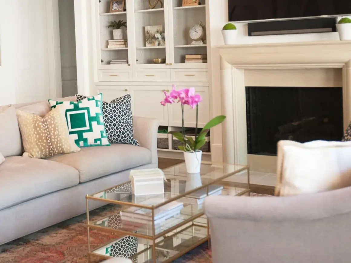
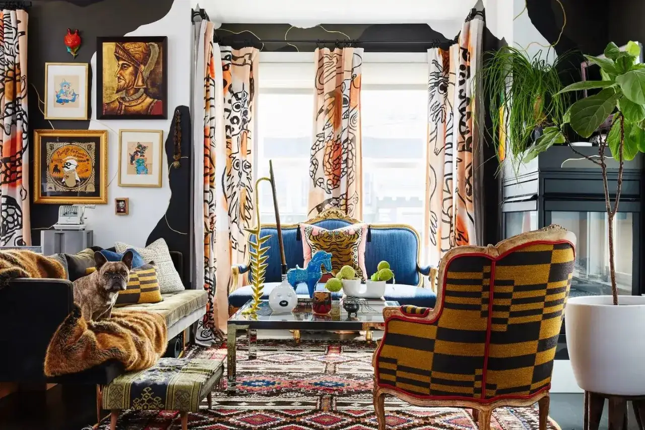
| Living room | Striped upholstery, floral pillows, and a geometric rug | The stripe gives structure, the floral adds warmth, and the rug anchors everything |
| Bedroom | Small-check bedding, botanical drapery, and a solid headboard | The bed stays calm while the windows bring in personality and height |
| Dining room | Patterned wallpaper, plain upholstered chairs, and a textured shade | One strong surface carries the story, while the other pieces keep the room usable |
| Entry | Bold runner, simple mirror, and one patterned seat cushion | The pattern has impact, but the space still reads quickly as you pass through |
What matters in each of these examples is not the motif itself. It is the relationship between intensity and restraint. A room can handle a vivid print if the surrounding pieces are quieter. It can also handle several smaller patterns if they are all pulled back into the same palette. That balance becomes even easier when you place prints on the right surfaces first.
Where to place the boldest pattern first
I always start with the largest or most permanent surface, because that decision sets the tone for everything else. If the rug is patterned, the sofa and walls usually need to be calmer. If the wallpaper is strong, the upholstery should work harder as a neutral base. The more permanent the piece, the more careful I am with the print.
| Surface | Best pattern intensity | Why |
|---|---|---|
| Wallpaper | Moderate to bold | It defines the room, so it needs enough presence to justify itself |
| Rug | Moderate | It anchors the layout, but it should not overpower the furniture |
| Sofa or headboard | Moderate if the room is quiet, subtle if the room already has pattern | These are major visual blocks and are hard to ignore |
| Pillows and throws | Bold is fine | These are the easiest pieces to change if the mix needs editing |
| Window treatments | From subtle to bold, depending on the rest of the room | They affect height and light, so they should support the overall rhythm |
If you want the safest order, build from the floor up: rug, seating, window treatments, then pillows and accessories. That sequence gives you more control and keeps the room from becoming crowded too early. It also makes it much easier to spot when a print is doing too much.
The mistakes that make a room feel noisy
Most pattern problems are not really about the prints themselves. They come from poor editing. The room gets too many competing stories at once, and nothing gets enough visual space to breathe.
- Using the same scale everywhere makes the prints fight for attention instead of supporting each other.
- Adding too many unrelated colors breaks the visual thread that holds the room together.
- Mixing every style at full strength can turn a room into a sample board instead of a finished space.
- Forgetting solids leaves no resting point for the eye.
- Buying pieces in isolation often leads to combinations that look fine in a cart but awkward in the room.
When a space feels loud, I usually remove one pattern before I add anything new. That is the faster fix almost every time. If the room still needs energy after that, I add contrast through texture or a slightly stronger accent color, not another print. That editing mindset is what keeps the final result polished.
The editing pass I use before I call a room finished
When the basics are in place, I do one last pass and look at the room from the doorway, not from arm’s length. At that distance, problems show up fast. If every patterned surface shouts at the same volume, the room usually needs one quieter piece. If the palette is there but the room feels flat, it usually needs one more layer of texture or one stronger focal print.
- Check whether one pattern clearly leads.
- Confirm that two or three colors repeat in more than one place.
- Make sure at least one large surface is solid or very quiet.
- Compare the scales and keep only the combinations that create contrast.
- Remove one accessory if the room looks finished but slightly overworked.
That last edit is usually the difference between a room that looks decorated and one that looks composed. If you keep the color story tight, vary the scale, and leave enough quiet space between the prints, pattern becomes a strength instead of a risk.