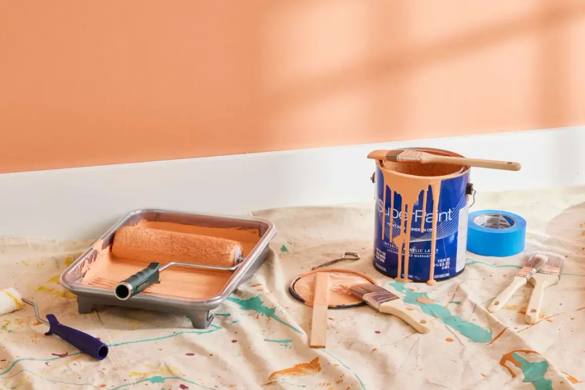
Choosing the right wall finish changes how a room feels as much as the color does. A satin paint finish sits in the middle of the sheen scale, giving you enough light reflection to feel polished without turning every patch, roller mark, or dent into the main event. In renovation work, that balance matters because it affects both the look of the room and how easy it is to live with afterward.
What matters most before you choose a satin finish
- It gives walls a soft, moderate sheen that looks cleaner than matte or eggshell.
- It works especially well in hallways, family rooms, kitchens, baths, kids’ rooms, and on trim.
- It is easier to wipe down than flatter paints, but it will still reveal flaws in rough drywall or patch work.
- Prep makes or breaks the result: sanding, priming, and using the right roller matter more with this sheen.
- It is not a moisture solution by itself; in kitchens and bathrooms, the paint formula matters as much as the sheen.
What a satin finish actually changes in a room
I think of satin as the finish that makes a room look finished without shouting about it. It reflects more light than matte or eggshell, so color feels a little richer and surfaces read a little cleaner, but it stops well before the mirror-like look of semi-gloss. That makes it useful when you want a space to feel lived-in, not showroom-hard.
The practical side matters just as much. A smoother finish is usually easier to wipe, which is why it holds up well in households with kids, pets, or a lot of daily traffic. The tradeoff is simple: the more light a surface reflects, the more it will expose uneven patching, roller texture, and small drywall defects. That balance is what makes the finish useful in some rooms and frustrating in others, which is exactly why placement matters next.
Where it earns its keep in a remodel
In U.S. homes, I reach for a satin sheen when a room needs to handle contact, cleaning, or both. It tends to work best in spaces that get touched constantly or washed more often than a quiet bedroom wall.
| Area | Why it works | My practical take |
|---|---|---|
| Hallways and stairs | These areas take scuffs, hand marks, and constant movement. | One of the safest places to use it because durability matters more than hiding every imperfection. |
| Family rooms and living rooms | They benefit from a slightly richer look without feeling glossy. | Good choice if the room gets daylight and regular use. |
| Kitchens and baths | Wipeability helps with splashes, grease, and moisture-prone spots. | Choose a moisture-resistant formula as well; sheen alone does not do the job. |
| Kids’ rooms | Crayon, fingerprints, and general wear clean up more easily. | Worth it when the room needs frequent touch-ups and wipe-downs. |
| Trim and interior doors | A subtle glow highlights profiles and makes details pop. | Often looks more refined than flat paint and less shiny than semi-gloss. |
That said, I do not treat satin as a default for every surface just because it is durable. The real question is whether the room can carry a bit of reflection without exposing every repair line, and that is where the decision gets more nuanced.
Where I would use something flatter instead
Satin is honest. That is the problem in the wrong room and the reason it looks so good in the right one. If the wall has imperfect drywall work, uneven patching, visible seams, or heavy texture mismatch, the sheen can make those issues stand out instead of disappear.
I am also cautious on ceilings, especially in rooms with strong overhead lighting. Even a careful paint job can show roller direction, flashing, or minor surface waves more clearly when the light hits at an angle. In low-light rooms where you want a softer, more cocooned feel, a flatter finish often looks calmer and more forgiving.
- Choose flatter paint when the wall finish is rough or old and you want to hide flaws.
- Choose satin when the surface is sound and the room needs more cleanability.
- Choose semi-gloss only when you want stronger reflection and can live with more visible surface detail.
Once you see that tradeoff clearly, comparing satin with the other common sheens becomes much easier.
How it compares with matte, eggshell and semi-gloss
Brand names vary a little across the U.S. market, but the practical hierarchy stays the same. The closer you move toward gloss, the easier a surface is to wipe and the more surface flaws it reveals.
| Finish | Look | Best use | Main drawback |
|---|---|---|---|
| Matte | Soft, low reflection, relaxed | Bedrooms, ceilings, older walls with flaws | Less forgiving when it needs frequent cleaning |
| Eggshell | Subtle glow, still fairly soft | Living rooms, dining rooms, lower-traffic walls | Not as wipeable as satin in busy spaces |
| Satin | Noticeable but restrained sheen | Hallways, kitchens, baths, trim, family spaces | Shows surface flaws more than eggshell or matte |
| Semi-gloss | Clearly reflective and crisp | Trim, doors, cabinets, moisture-prone surfaces | Highlights every sanding mistake and repair line |
If I had to boil it down, eggshell is usually the closest alternative when you want a softer look, and semi-gloss is the step up when you need more wipeability and sharper definition. The real success factor, though, is not just the sheen you choose. It is how carefully you apply it.
How to apply it so the result looks smooth
A satin sheen rewards prep and punishes shortcuts. If you want the wall to look intentional, not slightly shiny in all the wrong places, I would handle the job in this order:
- Repair and sand first. Fill dents, feather patch edges, and sand until the repair disappears under raking light.
- Prime every patched area. Unprimed patches often flash differently and stand out once the sheen hits them.
- Use the right roller nap. On smooth drywall, a 3/8-inch nap is often enough; on light texture, a 1/2-inch nap may lay the paint down more evenly.
- Work in thin, consistent coats. Heavy coats can exaggerate texture and leave lap marks.
- Keep a wet edge. That reduces visible overlaps, especially on larger walls and in strong daylight.
- Let it cure before hard cleaning. Many interior paints need days or even a few weeks to fully harden, so I avoid aggressive scrubbing too early.
The finish usually looks best when the prep work is almost invisible. If the wall is smooth, a satin sheen feels clean and tailored; if the prep is sloppy, it tends to advertise the mistake. After that, maintenance becomes the final part of the equation.
The decision rule I use on real remodels
When I am choosing between finishes, I ask two questions: how much traffic does the room get, and how good is the substrate? If the answer is “a lot of traffic” and “the walls are in decent shape,” satin is often the most practical middle ground. If the surface is older, patched, or uneven, I lean flatter. If the surface is trim, doors, or cabinetry, I usually move one step glossier.
One detail people miss is that touch-up behavior is not perfect on any mid-sheen finish. Keep leftover paint from the same batch if you can, label the can clearly, and test a small repair in daylight before committing to a larger patch. I also recommend looking at the sample in morning light, afternoon light, and at night under your actual bulbs. That extra ten minutes is often the difference between a room that feels deliberate and one that just feels newly painted.
If the space needs to be cleaned often and still look calm, satin is usually a strong choice. If you want the softest possible wall surface, pick something flatter. The best result comes from matching the sheen to the room, not from chasing the shiniest or safest option by habit.