For me, empty corner ideas work only when they solve a layout problem and make the room feel more finished. In this guide, I break down the most practical ways to turn those awkward spots into something useful, from reading nooks and slim storage to plant displays and compact work areas. The goal is simple: make the corner earn its footprint without crowding the room.
The fastest way to make a corner feel intentional
- Decide whether the corner should store, display, seat, or simply soften the room.
- Use at least one vertical element, such as a tall lamp, mirror, plant, or shelf, so the space reads as designed.
- Keep traffic flow clear; if a piece makes the route tighter than about 30 inches, choose something slimmer.
- Match the scale of the corner to the room, not to the idea board.
- Layer in light and texture so the corner feels finished, not randomly filled.
Start by deciding what the corner has to do
When I style a corner, I start with the job description, not the decor. A corner that needs to hold books, a laptop, or a charging station should be treated very differently from one that simply needs a visual anchor. That distinction saves money and keeps you from buying a piece that looks nice for a week and then becomes clutter.
The most useful corner functions usually fall into five buckets: seating, storage, display, lighting, or greenery. If a room already feels full, I lean toward lighting or greenery because both add presence without much bulk. If the room feels underused, a small chair, a console, or a compact desk can give the corner a real purpose. In tight layouts, I also check clearance first; if the addition would squeeze movement, I either go vertical or leave the floor open and style the wall instead.
Once you know the job, the rest of the choices become much easier, because you are no longer decorating an empty shape - you are solving a room problem.
Room-by-room setups that solve the most common corner problems
Different rooms ask for different solutions, and that is where many corner styling attempts go wrong. A dining room corner does not need the same treatment as a bedroom corner, and a living room usually needs more comfort than a hallway.
| Room | Best use for the corner | Typical footprint | Approximate budget |
|---|---|---|---|
| Living room | Reading chair, floor lamp, plant, or slim cabinet | Medium | $150-$700 |
| Bedroom | Vanity, accent chair, full-length mirror, or small shelf | Small to medium | $80-$500 |
| Entryway | Drop zone, bench, hook rail, or narrow console | Small | $60-$400 |
| Home office | Corner desk, task light, file storage, or pinboard | Medium | $120-$800 |
| Dining area | Bar cart, buffet, plant, or art-led vignette | Small to medium | $100-$600 |
In a living room, I usually want the corner to support conversation or relaxation, so a chair-and-lamp pairing often works better than a decorative object on its own. In a bedroom, the best corners usually serve a quieter purpose: a place to dress, read, or store daily essentials without making the room feel crowded. Entryways are different again. They work best when the corner helps with real-life movement, which is why a bench, basket, or slim shelf often feels more useful than a purely decorative piece.
The important part is that the solution should feel native to the room. If it needs explanation, it usually is not the right fit.
Three corner setups I return to most often
Some corner arrangements keep working because they solve several problems at once. They add structure, use the wall height, and make the room feel more deliberate without demanding a full renovation.
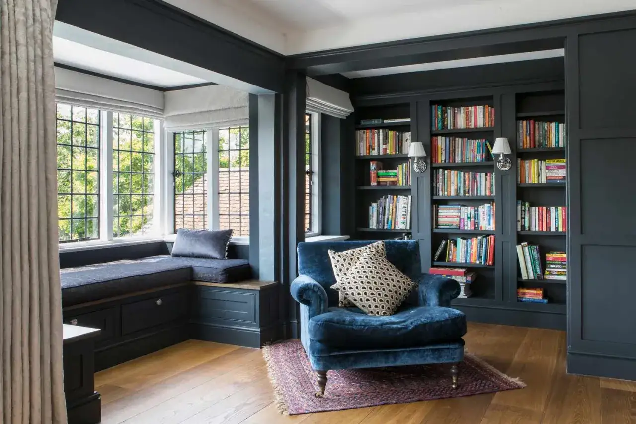
A reading nook that feels lived in
A comfortable chair, a small side table, and a floor lamp can turn a dead corner into a real pause point. I like this setup when the room needs softness, but not more storage. The trick is scale: choose a chair with a visual presence, then keep the table small enough that the whole group still breathes. A 24- to 28-inch side table is often enough for a book, a mug, and a lamp base without overtaking the space.
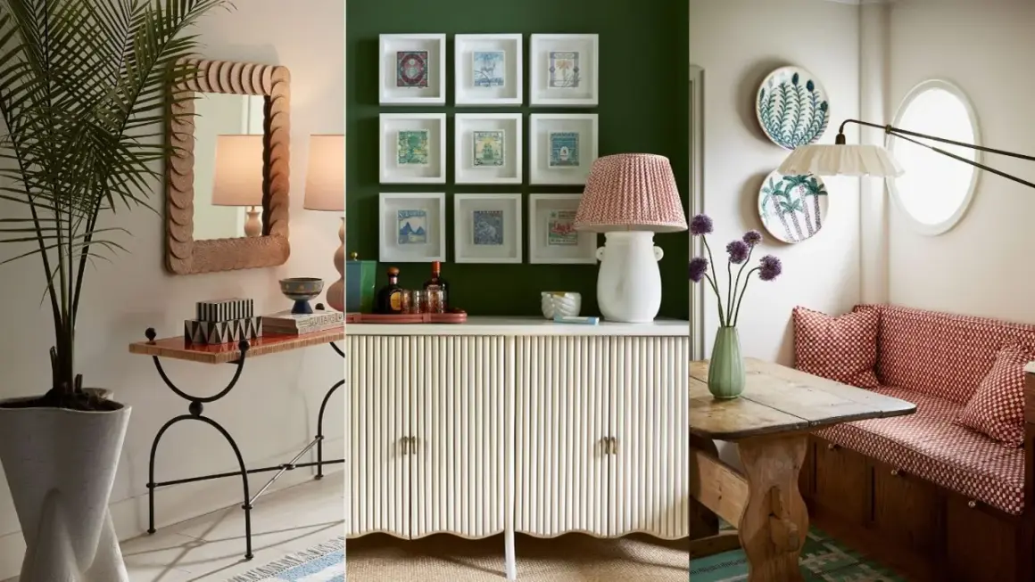
A plant corner with height and movement
Plants are one of the easiest answers because they fill vertical space and soften hard edges. A tall tree in a woven basket, a layered grouping of two or three plants, or a single sculptural pot can make the corner feel intentional even if the rest of the room is minimal. I prefer this move when the room already has enough furniture and just needs a little life. It is also one of the most budget-friendly options, especially if you already own a pot or stand.
Read Also: Kids Art Gallery Wall - Design a Stunning Display
A slim storage moment that actually earns its place
For corners that attract clutter, I like narrow cabinets, floating shelves, or a petite bookcase with closed storage below. The reason this works is simple: corners often collect things anyway, so giving them a defined home reduces visual noise. If you use open shelves, keep the palette restrained and repeat a few materials rather than filling every inch. That makes the corner feel curated instead of crowded.
These setups are not flashy, but they are reliable. They also translate well across styles, from modern farmhouse to clean contemporary, which is why I return to them so often.
How to make the corner feel designed, not just filled
The difference between a polished corner and a random one usually comes down to four design moves: height, light, repetition, and negative space. If you skip those, even expensive furniture can look like an afterthought.
Height matters because the eye needs something to travel upward. A tall mirror, a lamp with a visible stem, a large plant, or wall art stacked vertically will make the corner feel taller and more finished. Light matters because corners are naturally shadow-prone; one warm lamp often does more than another decorative object. Repetition matters because it ties the corner to the rest of the room. If the room has brass details, wood tones, or black accents elsewhere, repeat one of those materials in the corner so it does not feel disconnected.
Negative space is the part people hesitate to use, but it is doing a lot of work. A corner does not need to be packed to be effective. In fact, leaving a little air around the chair, plant, or cabinet makes the whole arrangement feel more expensive and more intentional.If you are styling with a rug, I like one that touches at least one front leg of the main piece; it helps the setup feel anchored instead of floating in isolation. That small choice can change the whole read of the space.
The mistakes that make a corner look accidental
The most common mistake is using something too small. A tiny vase or decorative object in a large corner often disappears, which leaves the room feeling unfinished rather than styled. The second mistake is choosing pieces that fight the circulation path. If people have to squeeze around a chair or cabinet, the corner is no longer helping the room.
Another problem is overdecorating with unrelated small items. Three or four little pieces scattered across the floor and wall usually read as clutter, not composition. I would rather see one strong object, one supporting piece, and clean space around them. A mirror and lamp can be enough. So can a plant and a basket. You do not need to keep adding objects just because the corner is visible.
Finally, do not ignore the architecture. If the room already has a strong fireplace, window, or built-in on one side, the corner should support that feature rather than compete with it. Corners work best when they feel like part of the room's structure, not a separate decorating problem.
Budget-friendly fixes that still look intentional
Not every corner needs custom millwork or a designer chair. In many homes, a well-edited budget setup looks better than a more expensive one that is too large or too busy. For less than $100, you can usually combine a small plant, a thrifted lamp, a basket, and a piece of art already on hand. That is often enough to give the corner shape.
In the $150 to $500 range, you can build a much stronger arrangement: a real reading chair, a slim side table, better lighting, or a compact storage piece. This is the sweet spot for most people because the corner starts to feel like a destination instead of a leftover spot. If you are willing to spend more, custom shelves or built-ins can be worth it, especially in awkward layouts or rooms that need serious storage. In the U.S., custom work typically becomes the expensive option fast, so I only recommend it when the corner will be used every day.
Renters should lean toward movable pieces: a lamp, a tall plant, a freestanding shelf, peel-and-stick art, or a narrow console that can move with you. That approach keeps the room flexible while still making the corner look considered.
When the best choice is to leave the corner open
There are times when the smartest styling move is restraint. If the corner sits in a tight walkway, sits next to an already busy focal point, or would make the room feel heavier, I leave it open on purpose. Empty is not the same as unfinished.
I also leave corners alone when the room already has enough visual weight and the absence gives the layout room to breathe. That decision often makes the rest of the furniture look better, which is easy to miss when you are focused on filling every visible gap. In other words, good corner design is not about eliminating every blank spot. It is about choosing the right spots to activate and letting the rest stay calm.
If you use that standard, the room usually feels more balanced, more practical, and much easier to live in.