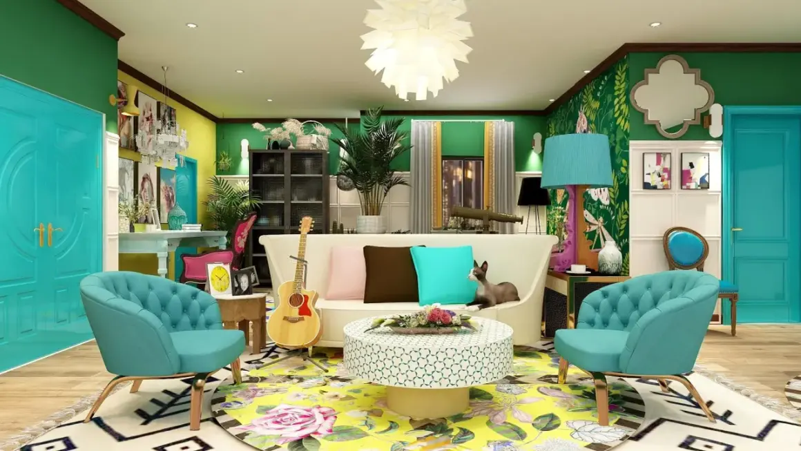
The friends apartment works because it feels lived in, recognizable, and just chaotic enough to feel human. That balance is worth studying if you care about interior design: the color story, the flexible layout, and the mix of pieces that look collected rather than purchased as a set. Here I break down what gives the apartment its identity, what translates into a real home, and where a literal copy starts to fall apart.
What matters most in the design at a glance
- One bold wall color gives the apartment instant identity.
- The furniture mix feels collected, not showroom-perfect.
- The layout prioritizes conversation and clean sightlines.
- Warm woods, lamps, books, and art soften the color.
- Borrow the mood, then adapt the scale and the budget.
Why Monica and Rachel’s place still feels so livable
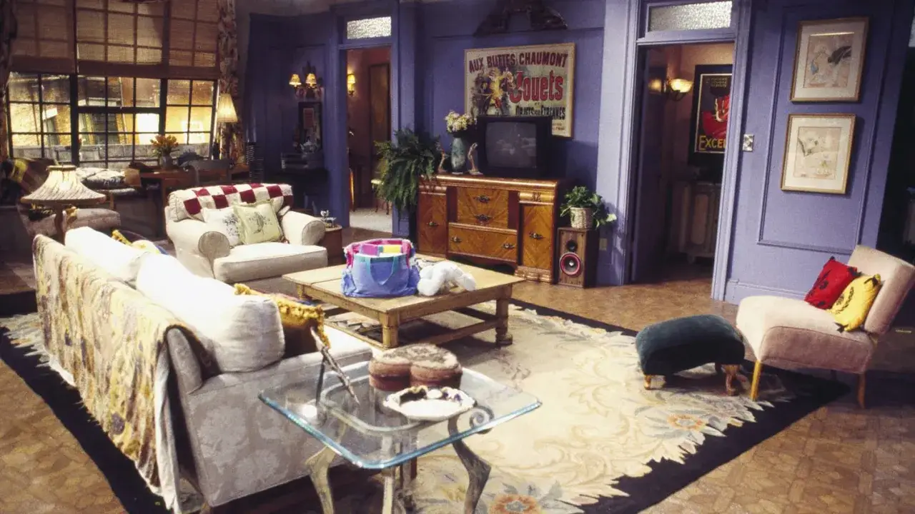
The room feels like a real home because it has pressure points and imperfections. Nothing is perfectly symmetrical, and nothing is so polished that it stops looking inhabited. Architectural Digest noted that the set was built on a tight budget of about $45,000, which explains why the design leans on a few strong choices instead of expensive finishes.
That decision actually helps the room age well. Strong character, modest materials, and a believable amount of visual clutter create a space people remember without needing a checklist of decor rules. The next step is to look at the specific moves that give it that identity.
The set design choices that give it identity
The most obvious choice is the wall color. The purple is bold but not neon, and the shade most often associated with the set is Benjamin Moore’s Persian Violet 1419. It gives the room a signature, frames the action, and lets nearly everything else play a supporting role.
Just as important is the way the furniture and accessories are handled. The pieces feel thrifted or inherited, not bought as a coordinated package. RoomSketcher’s floor-plan recreation makes the spatial logic easier to see: the apartment is arranged around conversation zones and clean movement paths, so the room reads clearly even when the decor is busy.
| Signature choice | Why it works on screen | How to adapt it in a real home |
|---|---|---|
| Bold purple walls | Creates instant recognition and a strong backdrop for the cast | Use one saturated wall, a painted niche, or a deeper accent in a smaller dose |
| Collected seating | Makes the room feel casual and conversational | Pair one clean sofa with one vintage-looking chair or ottoman |
| Books, art, and objects | Suggests a home with history instead of a staged showroom | Mix personal pieces with a few edited decorative items |
| Warm wood and brass touches | Softens the cool color and keeps the room inviting | Repeat two or three finishes so the room feels cohesive |
| Open sightlines | Helps the set read clearly from a camera perspective | Keep pathways open and avoid oversized furniture blocking traffic |
That combination - strong color, mixed furniture, and a layout that keeps people facing each other - is the real lesson. Once you understand those building blocks, translating the look into a real living room becomes much easier.
How to translate the look into a real home
I would start with scale, not accessories. In a typical U.S. living room, a sofa around 72 to 84 inches long usually feels more natural than a massive sectional, and you want enough circulation space that nobody has to squeeze around the coffee table. My rule of thumb is simple: make one thing bold, two things supportive, and the rest quiet.
- Choose one dominant wall color and repeat it in at least two smaller places, such as pillows, art, or a lamp shade.
- Anchor the room with a sofa in a durable fabric that can handle daily use.
- Add one vintage-style piece for character, such as a side table, chair, or coffee table.
- Layer lighting from overhead fixtures, table lamps, and one floor lamp so the room still works at night.
- Edit shelves and surfaces so the room breathes instead of feeling crowded.
For a realistic budget, a paint-and-textile refresh can land around $300-$900, a secondhand-led update often falls between $900 and $2,500, and a fuller room makeover with a new sofa, rug, lamps, art, and storage usually ends up around $3,000-$8,000. The cheapest version works when the room already has decent bones; the pricier version matters when you are starting from scratch or fighting bad lighting.
That leads to the practical question of what to keep, what to soften, and what to leave behind.
What to copy and what to leave on the soundstage
The smartest move is to copy the attitude, not the props. Keep the mix of old and new, the comfortable seating, and the visible personality, but leave behind the oversized set dressing and anything that only works because a camera is pointed at it.
- Copy the warm, collected feeling.
- Copy one strong color anchor.
- Leave behind fake clutter and novelty objects.
- Leave behind awkwardly large pieces that block real circulation.
- Leave behind the idea that every wall needs art.
If you want the room to feel authentic rather than themed, spend on the pieces you touch every day. A durable sofa, a good rug, and layered lighting will always do more than a pile of references. That is true whether you are furnishing a studio or a family room.
Where the style breaks down in real life
This is where the romantic version meets reality. Too much saturation can shrink a small room, open shelving demands discipline, and a cluttered surface can make a cozy room feel simply messy. The set can get away with more because it is designed to be seen from one side; your living room has to work from every angle.
- Too much purple or plum can flatten the space.
- Too many tiny accessories become visual noise.
- Weak lighting makes rich color look muddy.
- Open shelves only work when they are edited.
- Storage matters more than the show ever had to admit.
If the room is small, I would use the bold color on one wall, keep the largest upholstery piece neutral, and let texture do more work than pattern. That approach keeps the reference visible without trapping you inside a theme. The last step is seeing what the apartment still teaches about good design, even now.
What this set teaches about timeless interiors
The apartment stays relevant because it has a point of view. It is colorful but not precious, casual but not careless, and expressive without leaning on trends that age quickly. That is still the most reliable formula I see in 2026 homes: choose a strong mood, repeat a few materials, and leave enough breathing room for daily life.
If I were redesigning the same idea today, I would keep the purple energy, reduce the visual clutter, and make the storage smarter. The result would still feel like Monica and Rachel’s place, just with a little more comfort and a little less sitcom magic.