The finish people reach for here is small in the jar but big in impact: it can turn tired brass, dated hardware, picture frames, and trim into something that feels intentional. This guide breaks down the current rub and buff colors, how each shade behaves in a real renovation, and which options make the most sense when you want a metallic look without repainting everything. I’m also covering the limits that matter, because wax metallic finishes reward the right prep and punish shortcuts.
The short version before you choose a shade
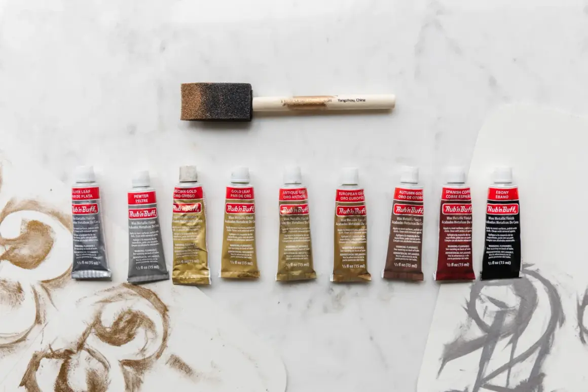
- The current retail lineup is built around nine core shades: Antique Gold, Autumn Gold, Ebony, European Gold, Gold Leaf, Grecian Gold, Pewter, Silver Leaf, and Spanish Copper.
- Warm golds are best for aged brass, traditional trim, and decorative frames; cooler silvers and pewters work better in modern spaces.
- Ebony is the odd one out, but it is useful for shadowing grooves, deepening carvings, and creating a more antique look.
- The finish is wax-based, so clean prep and thin coats matter more than brute-force coverage.
- Sealing can help on higher-wear pieces, but you should test first because the sheen can change.
- I choose the shade by the room’s existing metals, not by the lightest swatch on the shelf.
The current shade lineup and what each one gives you
As of 2026, I see nine core shades on the current AMACO shop page, which is why older tutorials and newer shopping pages sometimes seem out of sync. I treat that mismatch as a cue to focus on what is actually available now, not on every historical mention that still circulates online. The practical question is simple: which finish reads like warm brass, which one reads like soft silver, and which one works as an aging accent?
| Shade | Tone | Best use | How I read it in a room |
|---|---|---|---|
| Antique Gold | Warm, slightly aged gold | Brass-like hardware, frames, trim | Dependable and traditional without looking too yellow |
| Autumn Gold | Coppery warm gold | Decorative accents, carved details, vintage-inspired pieces | Richer and redder; good when warmth matters more than brightness |
| Ebony | Charcoal black with a metallic softness | Shadowing grooves, dark accents, faux aging | Surprisingly useful when you want depth instead of shine |
| European Gold | Cool, light gold | Transitional spaces, lighter brass effects | Cleaner and less yellow than the warmer golds |
| Gold Leaf | Soft, bright gold | Most hardware updates, mirror frames, general metallic refreshes | The safest “classic gold” choice in the lineup |
| Grecian Gold | Warm yellow gold | Ornate décor, traditional rooms, carved surfaces | Sunnier and more old-world than Antique Gold |
| Pewter | Slate silver | Cabinet hardware, industrial accents, cooler finishes | Muted and steady rather than flashy |
| Silver Leaf | Bright silver | Mirrors, modern trim, chrome-like updates | The most reflective, crisp, and high-contrast option |
| Spanish Copper | Deep iron-brown copper | Aged copper notes, moody décor, antique touches | The darkest warm metallic, with more earth than shine |
Once you know where each shade lands, matching it to a specific room becomes much easier. The next step is less about names and more about undertone, because that is what makes one finish feel natural and another one feel off.
How I group the shades by temperature and mood
I split the palette into three families: warm golds, cool metals, and dark accent tones. That is the fastest way to avoid buying a finish that looks beautiful in the tube but wrong against cabinet pulls or a mirror frame. If you are matching an existing room, the undertone usually matters more than the label.
- Warm and classic: Antique Gold, Gold Leaf, and Grecian Gold.
- Warmer and slightly redder: Autumn Gold and Spanish Copper.
- Cool and restrained: European Gold, Pewter, and Silver Leaf.
- Shadow and age: Ebony.
Gold Leaf is the most flexible if you want one gold that works in a lot of homes, while Pewter is the easiest silver-adjacent choice when you do not want a mirror-bright result. That tonal split is useful, but the real test is the piece you are trying to update, which is why I always move from color family to actual renovation scenario.
How to match a shade to the room you already have
When I am choosing a finish for a real project, I do not start with the prettiest swatch. I start with the room: existing metal finishes, wood tone, wall color, and how much natural light the piece gets. That keeps the result from looking accidental.
| Project scenario | Best fit | Why it works |
|---|---|---|
| Traditional brass hardware in a cream or beige kitchen | Gold Leaf or Antique Gold | Both read as believable brass without looking too orange |
| Older picture frames, lamps, or carved décor | Grecian Gold or Autumn Gold | They add warmth and a slightly collected feel |
| Transitional spaces with mixed metals | European Gold or Pewter | These tones stay quieter and blend more easily with other finishes |
| Mirror frames or accent pieces that need more brightness | Silver Leaf | It gives the cleanest reflective pop |
| Carved details, grooves, or faux aging | Ebony | It deepens recesses and creates believable shadow |
| Decorative pieces that need a darker copper note | Spanish Copper | It feels earthy and antique rather than shiny |
I also look at lighting. Warm bulbs make golds read redder, while cooler LEDs can flatten them into something that feels less layered. If the piece has to sit next to another metal, I compare them in daylight first and only then decide what belongs in the room.
That choice matters even more once you understand what the finish can and cannot do on the surface itself, because this product is less forgiving than paint.
Where the finish performs well and where it needs caution
Rub ’n Buff is a wax metallic finish, not a conventional paint, and that difference is the reason it looks so convincing on the right project. I use it most often on previously painted furniture, frames, hardware, decorative molding, and small detail work where a thin metallic skin can mimic aged metal without bulk. It can also be used on post-fired ceramics and other decorative surfaces, but renovation work is where its strengths are easiest to see.
- Best surfaces: clean, dry, lightly sanded, or already painted pieces with a bit of tooth.
- Best prep: scuff sanding or a primer if the surface is too slick to grip.
- Best use case: small to medium details where a patina-like effect looks better than a heavy coat.
- Use caution: moisture-heavy areas, direct heat, and anything outdoors unless it is sealed and you accept more maintenance.
- Watch the finish: Ebony can arrive a little thinner or grainier, but that tends to buff out if you work in small sections.
AMACO’s own directions say a water-based or acrylic sealant can help extend the finish, but they also note that different sealers can change the sheen and color, so I always test on a hidden spot first. The product sheet also treats 120°F as the temperature ceiling, which is a good reminder to keep it away from heat sources and harsh sun whenever possible. Once the limitations are clear, the application process becomes much easier to control.
How I apply it for a cleaner, more believable result
The standard tube is 1/2 fl. oz., so the trick is to use it sparingly and let texture do some of the work. I want a finish that looks rubbed on, not painted on, and that usually means thin layers, a light touch, and patience between passes.
- Clean and degrease the surface thoroughly, then let it dry completely.
- Scuff-sand smooth areas, or use a primer if sanding is not practical.
- Apply a tiny amount with a soft cloth, cotton swab, paper towel, or gloved finger, depending on the detail size.
- Build the color in thin layers instead of chasing full coverage in one pass.
- Buff as you go so the sheen lands where you want it.
- Test any sealer on an inconspicuous area before committing to the whole piece.
My rule is simple: if the surface starts to look muddy, I have used too much product. A thin layer with a bit of texture usually looks more authentic than a heavy coat trying to impersonate plated metal. That is especially true on furniture hardware, where the finish should support the design instead of becoming the first thing people notice.
The shades I reach for in common renovation scenarios
When I am working through real home updates, I keep the choice practical rather than theoretical. These are the combinations I reach for most often, and they cover the majority of small renovation jobs without making the palette feel overcomplicated.
- Most brass hardware: Gold Leaf first, Antique Gold second.
- Traditional trim and frames: Grecian Gold.
- Muted vintage warmth: Autumn Gold or Spanish Copper.
- Modern or transitional rooms: Pewter or European Gold.
- High-contrast or aged detail: Ebony.
- Bright reflective accent: Silver Leaf.
If I had to narrow the drawer to three essentials, I would keep one warm gold, one cooler metal, and Ebony. That small set covers most furniture and décor updates, and it avoids the common mistake of picking a finish that looks good alone but wrong in the room. The best result is the one that matches the existing metals in daylight, holds up to handling, and still looks deliberate next to the rest of the space.