A Minwax stain color chart is most useful when you treat it as a decision tool, not a promise. It helps you narrow color families, compare product types, and understand why the same brown can read warm on oak, muted on maple, or almost black on walnut. In this guide, I break down how the chart is organized, which finish type does what, and how to choose a shade that fits the room instead of fighting the wood.
What matters most before you choose a stain
- Minwax currently lists more than 240 color options, organized by family, opacity, product, and shade.
- Wood species changes the result, so the same stain can look warmer, darker, or more transparent on different boards.
- Semi-transparent stains show more grain, while solid stains hide more of it.
- Oil-based, water-based, gel, and PolyShades solve different problems and are not interchangeable.
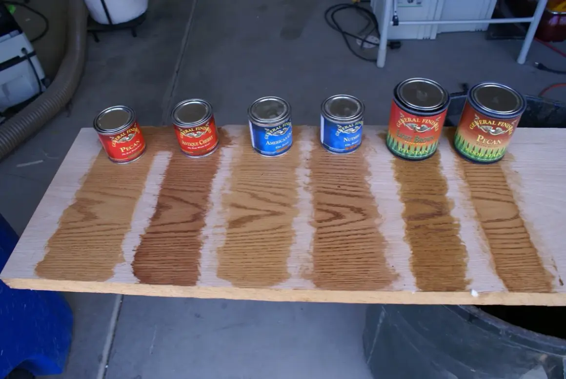
- Sample boards matter more than screen swatches or printed charts.
How the color guide is organized
I start with the chart’s filters, because that is where most people save time. Minwax organizes its library by color family, product, opacity, and shade, which means you can think in layers instead of staring at hundreds of swatches at once. The order matters: mood first, grain visibility second, exact name last.
| Filter | What it tells you | Why it matters |
|---|---|---|
| Color family | Reds and oranges, yellows, greens, blues, gray and blacks, browns, whites | Helps you narrow the overall look before you compare individual shades |
| Product | Oil-based, water-based semi-transparent, water-based solid, gel stain, PolyShades, and more | Explains how the color will behave on wood and how much grain will show |
| Opacity | Semi-transparent or solid | Shows whether the wood grain will stay visible or become more muted |
| Shade | Light, medium, or dark | Gives you a quick first pass before you compare names and undertones |
The part many people miss: the swatches are reference images, not a guarantee. Minwax notes that the displayed colors are digitally reproduced, and that wood species and product type can shift the final result. That is why a color that looks clean and modern on screen can turn softer, redder, or darker on an actual board.
Once that is clear, the next question is not the shade name, but the finish system behind it. That choice changes the whole project.
Why the finish type changes the result
Two stains with the same name can look different once opacity and product chemistry enter the picture. Oil-based Wood Finish penetrates deeply and gives a classic stained-wood look; Minwax lists it in 36 colors and says it dries in about 2 hours. Water-based colored stains move faster, offer water cleanup, and come in both semi-transparent and solid versions, which is why I think of them as the better choice when color control matters more than traditional stain feel.
For bigger projects, the numbers matter. The oil-based line covers about 250 square feet per quart, while the water-based semi-transparent stain covers about 100 square feet per quart. The water-based colored stain line also dries in about one hour, which is useful when you want to finish a project in a day and are not trying to nurse a long open time across a large floor.
| Product family | Visual result | Timing and handling | Best use |
|---|---|---|---|
| Oil-based Wood Finish | Deeply penetrating color with a traditional stained-wood feel | Dries in about 2 hours and resists lapping for more even color | Furniture, cabinets, trim, molding, and floors |
| Water-based semi-transparent | Grain stays visible and the color feels lighter on the surface | Dries in 2 to 3 hours, recoats in 1 hour, and cleans up with water | Fast interior projects where you still want the wood to read as wood |
| Water-based solid | More color, less grain | Dries in about 1 hour with one-coat coverage | Modern looks, inconsistent grain, or projects where a stronger color is the goal |
| Gel stain | Thicker, non-drip finish with more control on vertical surfaces | Usually dries 6 to 8 hours between coats | Doors, veneer, fiberglass, metal, and other tricky surfaces |
| PolyShades | Stain color suspended in a clear topcoat | Needs very thin coats and careful application | Refreshing an existing finish when you want color and topcoat in one system |
My practical rule: if you want a familiar stained-wood look, start with oil-based or semi-transparent. If you want stronger color control or a more modern result, solid stain is usually the cleaner move. That distinction matters even more once you start comparing actual shade families.
The shades I see chosen most often in real projects
When people ask for a stain chart, they are usually not looking for every possible tint. They want a short list of shades that feel dependable in actual homes. These are the colors I keep seeing because they solve different design problems rather than just looking good in isolation.
| Shade | What it gives you | Where it tends to work well |
|---|---|---|
| Natural | Very light color that lets the wood itself do most of the talking | Scandinavian spaces, pale floors, and projects where you want the least visual interference |
| Golden Oak | A classic honey-gold tone with a familiar finish feel | Traditional trim, built-ins, and furniture that should feel warm without turning heavy |
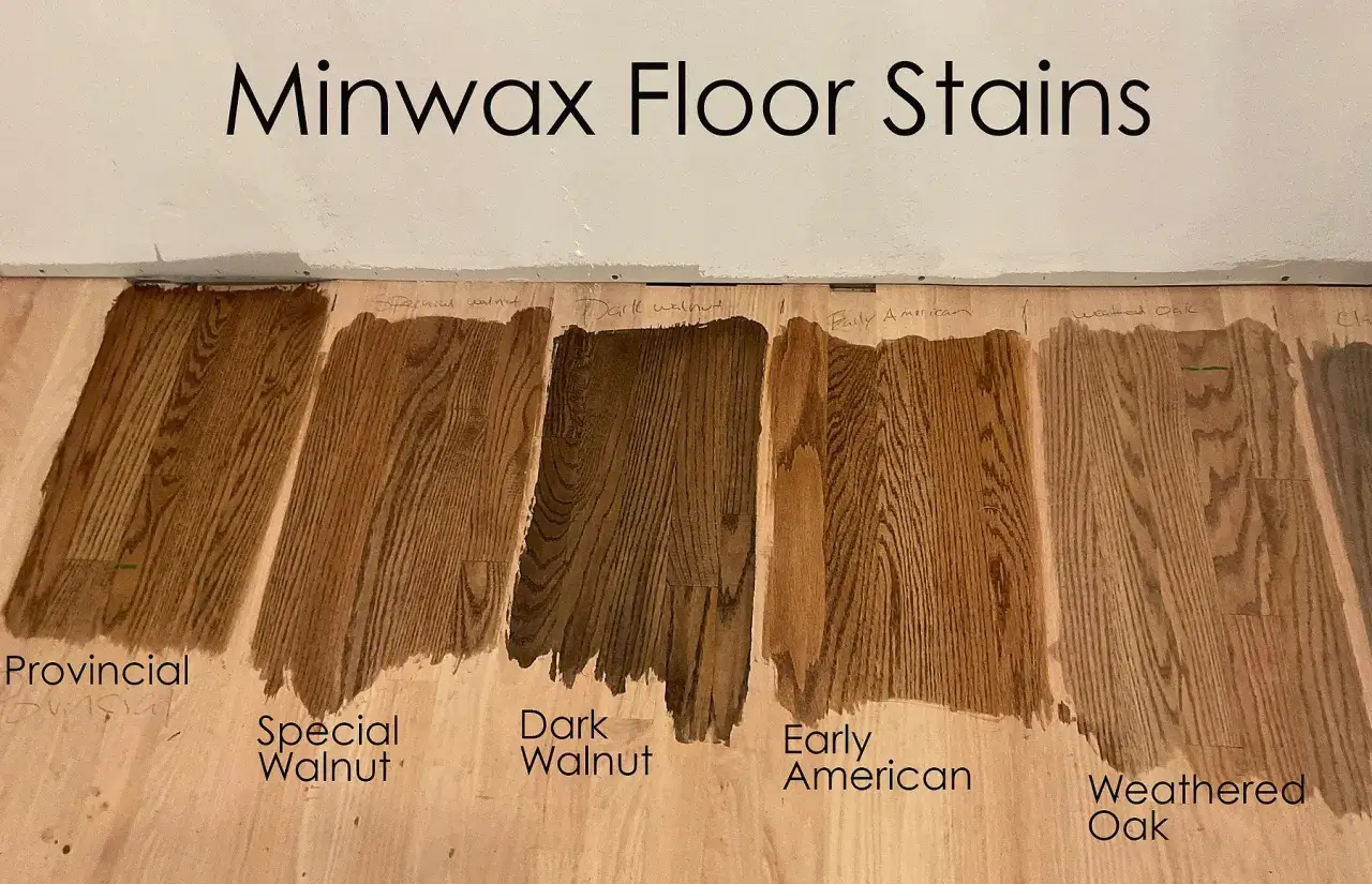
| Early American | Amber-brown warmth with a heritage look | Oak floors, dining tables, and pieces that need a lived-in but polished character |
| Special Walnut | A balanced medium brown that feels calm rather than loud | Transitional interiors, cabinets, tables, and most rooms that need one dependable middle ground |
| Dark Walnut | Deeper brown with stronger contrast and more visual weight | Statement millwork, larger furniture, and modern-rustic rooms |
| Red Mahogany | Richer red-brown undertone with more formality | Traditional furniture and accent pieces that should feel a little dressier |
| Ebony | Near-black drama with crisp contrast | Modern details, high-contrast trim, or strong-grain woods that can carry a darker finish |
| Weathered Oak or Classic Gray | Muted brown-gray with an aged, softened look | Coastal rooms, casual interiors, and contemporary spaces that do not want a heavy brown stain |
If I only had to sample three directions, I would pick one warm medium brown, one darker brown, and one lighter or grayer option. That gives you a real visual spread without turning the whole project into a color lab.
The next variable is the one people underestimate most: the wood itself.
How wood species and lighting reshape the same color
Wood species really is the hidden variable. Minwax notes that the final color can change with the wood, and that tracks with what I see on project boards all the time. Oak and ash usually make grain more visible; pine and poplar can blotch if you rush; maple and birch often need more testing because they can read unevenly with darker stains; walnut already brings a lot of depth, so new color often shifts it more subtly than expected.
| Wood type | What usually happens | What I would test first |
|---|---|---|
| Oak | Open grain reads clearly and takes on strong visual depth | Medium browns, dark browns, and gray-brown finishes |
| Pine and poplar | Can blotch or turn uneven without prep | Pre-stain conditioner, lighter browns, or solid colors when consistency matters more than grain |
| Maple and birch | Fine grain can make dark stains look patchy | Natural, lighter brown, or solid stain options |
| Walnut | Already dark and rich, so extra stain can flatten the character | Subtle browns or a clear finish if the natural wood is already strong enough |
| Ash | Pronounced grain, often with a lighter base color | Warm browns, weathered grays, and other muted modern tones |
Lighting changes the conversation too. Warm bulbs make brown stains feel richer and redder, while daylight exposes gray and green undertones faster than a showroom light ever will. That is why I do not judge a stain in one room under one bulb and call it done.
When the wood and the room are both clear, choosing becomes much easier. The trick is to narrow the field before you get attached to one swatch.
A simple way to narrow the chart without guessing
I use the same sequence on most renovation projects because it keeps the process practical instead of emotional. It is not glamorous, but it works.
- Pick the mood first. Decide whether the room needs warmth, contrast, softness, or a more modern muted look.
- Choose how much grain you want. Semi-transparent stains keep the wood story visible, while solid stains quiet it down.
- Match the product to the job. I lean oil-based for larger surfaces and water-based when I want faster turnaround or easier cleanup.
- Make sample boards from the same species. Use the actual board or an offcut, not a random scrap from the garage.
- Check the sample in the real room. Look at it in daylight, at night, and beside the wall color, flooring, and upholstery.
If you are working with a soft wood like pine, a conditioner is worth the extra step because it helps the stain go on more evenly. And if you want a deeper tone, build it the right way instead of hoping dried residue will darken the surface for you. That rarely ends well.
The last choice is not just about color. It is also about how the finish will protect the wood and how the surface will age once the room starts getting used.
The test that keeps a good stain from looking wrong
A stain gives color, but it does not protect the wood by itself. The clear finish does that work, and it can also change the final look slightly, so I never trust the chart alone. I want to see the stain dry, then see it under the finish I plan to use.
- Test on a hidden area or a real sample board from the same wood.
- Let the stain dry completely before you judge the color.
- Compare the sample against the room’s paint, flooring, and fabric.
- Check it in more than one type of light.
When I use the Minwax stain color chart this way, it becomes a shortcut instead of a gamble. The chart points me toward the right family; the sample tells me whether the finish actually belongs in the room.