The right paint sheen changes both the look and the maintenance of a room. A paint sheen chart is useful because it shows, at a glance, how flat, matte, eggshell, satin, semi-gloss, and gloss behave once they are on the wall. In a renovation, that difference can mean the gap between a soft, forgiving finish and one that turns every patch or roller mark into a distraction.
The practical takeaway before you buy
- Lower sheen hides wall flaws better, but it is less forgiving when you scrub it.
- Eggshell and satin are the safest all-purpose choices for most U.S. homes.
- Semi-gloss and gloss make sense on trim, doors, cabinets, and other high-touch surfaces.
- The same color can look deeper, lighter, or more dramatic depending on sheen.
- Surface prep matters more as the finish gets shinier.
What sheen really changes on a finished surface
Sheen is not just about shine. It changes how much light bounces off the surface, how clearly you see texture, and how easy the finish is to clean. That is why two paints in the same color can feel completely different once they are on drywall, trim, or cabinetry.
I usually think of sheen as a tradeoff triangle: appearance, durability, and forgiveness. Flat and matte finishes soften flaws and quiet a room. Satin and semi-gloss are tougher to live with and easier to wipe down, but they also reveal more of what is underneath. The middle finishes, especially eggshell and satin, are popular because they balance those two jobs better than most people expect.
Brand names vary a little, too. One company’s eggshell may read closer to another company’s low-lustre or pearl, so I never buy by label alone. I always read the product description and imagine the surface in real light, because that is where the finish either works or disappoints.
Once that part makes sense, the next step is comparing the actual finish levels side by side.
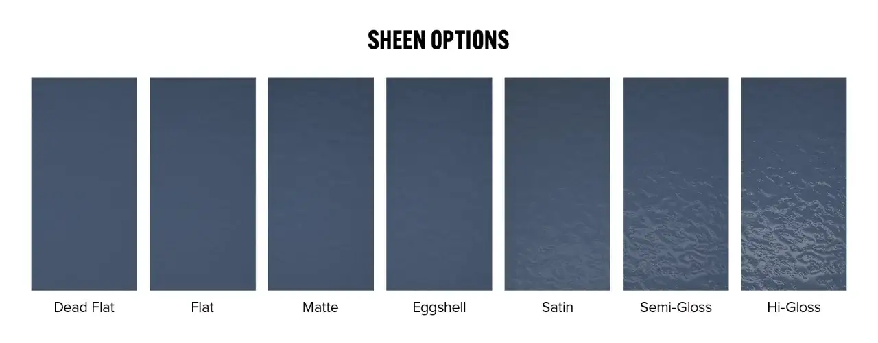
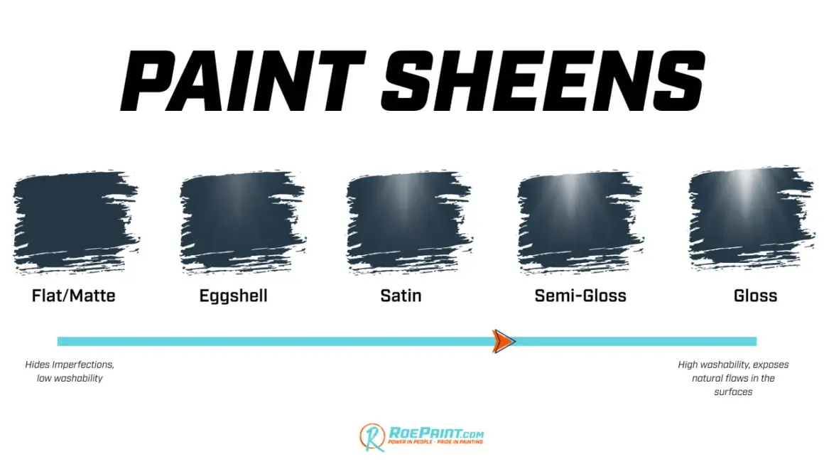
The main finishes side by side
When I need a quick visual decision, I look at the finish ladder from least reflective to most reflective. This is the simplest way to read a sheen chart without getting lost in brand language.
| Finish | What it looks like | Best for | Strengths | Tradeoffs |
|---|---|---|---|---|
| Flat | Completely non-reflective, soft, and muted | Ceilings, low-traffic walls, textured surfaces | Hides imperfections very well, gives a calm look | Most prone to scuffs and harder cleaning |
| Matte | Very low sheen with a velvety look | Living rooms, bedrooms, dining rooms | Hides flaws better than shinier finishes, feels modern | Still less washable than satin or semi-gloss |
| Eggshell | Soft glow, subtle and versatile | Main walls in most homes, family rooms, hallways | Best all-around balance of appearance and durability | Can still show patches in strong side light |
| Satin | Gentle reflection with a smoother, richer feel | High-traffic walls, kitchens, baths, kids’ rooms | Wipes clean more easily, holds up well to daily wear | Shows wall prep more clearly than eggshell |
| Semi-gloss | Clearly reflective and crisp | Trim, doors, cabinets, moisture-prone areas | Very durable, easy to clean, sharp architectural look | Exposes brush marks, seams, and surface flaws |
| Gloss | Highly reflective, polished, and dramatic | Furniture, statement doors, detailed trim, accent pieces | Maximum wipeability and a strong design statement | Most unforgiving finish, prep has to be excellent |
Some brands insert pearl, low-lustre, or soft gloss between eggshell and satin. I treat those as bridge finishes, useful when you want a little more durability without jumping straight to a clearly shiny surface.
Once you can read the ladder, the real question becomes where each level actually belongs in the home.
How I match sheen to room and surface
I rarely choose sheen by room name alone. I choose it by how the surface will be used, how smooth it is, and how much light hits it during the day. That is why the same finish can be perfect in one room and awkward in another.
Walls and ceilings
For ceilings, I almost always start with flat or matte. Overhead surfaces catch a lot of light, and a lower sheen keeps joints, patches, and roller patterns from jumping out at you. On main walls, eggshell is usually the safest first choice for a typical American home because it feels finished without looking plasticky.
Matte still has a place in living rooms, dining rooms, and bedrooms when the wall condition is not perfect or when the design calls for a softer, more architectural mood. In premium formulas, matte is also more practical than the flat finishes many people remember from years ago.
Trim, doors, and cabinets
Trim and doors can take more sheen because they are usually smoother, straighter, and easier to prep well. Semi-gloss is the workhorse here. It is easy to wipe, it looks crisp, and it gives the room a cleaner edge against lower-sheen walls.
For cabinets, I am more selective. Satin can be enough for some built-ins and furniture-style cabinetry, but semi-gloss is still the safer option if the surface gets frequent handling or cleaning. Gloss works when the joinery and sanding are excellent, but it will expose every shortcut.
Read Also: Paint a Ceiling Like a Pro - Flawless Finish Guide
Moisture and daily wear
Kitchens and bathrooms are where people often overthink sheen and underthink the rest of the paint system. A washable satin or semi-gloss helps, but ventilation, primer choice, and product quality matter just as much. A cheap glossy paint on a poorly prepped wall is still a bad result. A better-formulated satin can be the smarter choice if you want a softer look with solid cleanability.
That leads into the part most DIY painters underestimate: the room’s light and the condition of the surface can change the result as much as the finish itself.
Why light and prep change the result so much
Shine becomes more obvious when light hits the wall at an angle. That means a room with big windows, strong afternoon sun, or recessed lighting can make a finish look glossier than it did in the store. North-facing rooms or dim spaces can flatten the appearance and make the same paint feel calmer.
I always tell people to test paint in the real room, not just on a small chip. A sample board moved around the space during morning, afternoon, and evening light will tell you more than a dozen online photos. LED bulbs can also shift the look, especially with whites and grays, so check the paint under the actual bulbs you plan to keep.
Prep matters just as much. If you can feel a repair with your hand, you will probably see it in satin or above. That does not mean you must sand every wall to perfection, but it does mean that patching, feathering, and priming get more important as the sheen rises. On darker colors, the effect is even stronger because the finish reads deeper and more reflective at the same time.
In practice, that is why a sheen that looks great on one wall can fall apart on another, even when the color is identical.
Interior and exterior projects do not reward the same finish
Outside, the priorities shift. Lower-sheen finishes are often chosen for siding because they hide substrate irregularities and look quieter across a large surface. Trim, shutters, doors, and architectural details can handle more sheen because those areas are meant to stand out a bit more.
Interior and exterior jobs also age differently. Sun, rain, dust, and temperature swings put more stress on the coating outdoors, so I care less about whether a finish sounds elegant in theory and more about whether the product is designed for the surface it is covering. Sheen alone does not make an exterior paint durable.
This is also where many people mix up product type with finish. A flat exterior body color and a satin exterior trim color can look coordinated and still perform very differently. The finish choice is part of the system, not the whole system.
Once you separate interior from exterior priorities, it becomes easier to spot the mistakes that cause most sheen regrets in the first place.
The mistakes that cause disappointment
- Choosing from a tiny color chip only. Small samples do not show how much light the finish will reflect across an entire wall.
- Using a shiny finish to hide problems. It does the opposite. Higher sheen makes patching and sanding work more visible, not less.
- Picking the same sheen for every surface. Rooms usually look better when walls, trim, and doors each play a different role.
- Ignoring touch-up behavior. Some finishes are harder to blend later, especially in strong light, so even small repairs can flash.
- Assuming washable always means glossy. Modern premium matte and eggshell paints can clean better than older products people still have in mind.
The easiest mistake to avoid is sheen mismatch within the same space. If a wall, a patch, and a touch-up all reflect light differently, the room starts to feel unfinished even when the color is right.
That is why I keep one simple rule in mind when I want a decision that will still feel right after the furniture is back in place.
The fastest way to choose well the first time
When I have to make the call quickly, I use this order: hide flaws first, handle traffic second, and add shine only where the surface can support it. That one rule keeps most renovation projects on track.
- Choose flat or matte for ceilings and low-traffic walls with visible imperfections.
- Choose eggshell for most everyday living spaces.
- Choose satin for hallways, kitchens, kids’ rooms, and other busy areas.
- Choose semi-gloss for trim, doors, and cabinets that need a cleaner edge and easier wiping.
- Choose gloss only when the surface is smooth, the prep is strong, and the shine is part of the design.
If you are stuck between two finishes, I usually step down one level for walls and step up one level for trim. That small move keeps a room balanced, makes the architecture read more clearly, and avoids the common mistake of making every surface feel too shiny for the space.